


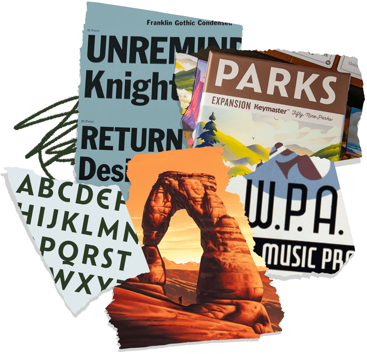
custom fonts for


A LETTERMATIC CASE STUDY:
A Contemporary Vision of Nostalgia
By Riley Cran

We’re very fortunate at Lettermatic to be asked to work on big complicated projects. Type families with dozens of styles, romans and italics, support for many different languages, etc. But today I want to talk about a typeface that is quite the opposite. A small project, just 26 letters, that have been put to use on a beautiful series of posters, over the course of many years.
Information
- Lead Designer:Riley Cran№ of Styles:1Classification:Display№ of Families:1
Catlin Sans is a proprietary typeface for The Fifty-Nine Parks Print Series, a poster series that uses beautiful illustrations by many different artists to extoll the beauty of the American National Parks. And while many different artists have contributed to the series, the letters have remained the same, at the bottom of each poster, helping to tie the series together. Fifty-Nine Parks is the creation of Mr. JP Boneyard, who has been curating poster shows for years with his National Poster Retrospecticus, a touring poster show. But this time, over the last half a decade, JP has been curating this series to celebrate the beauty of the American landscape, and its preservation via the National Parks. I first spoke to him about the Fifty-Nine Parks series in 2015, when he asked if I was interested in illustrating one of the prints. I proposed the idea of a typeface, with two primary goals in mind: it was a chance to dive deeper into a source of inspiration I had admired for many years (the lettering of the WPA posters), and I imagined that it may be a convenient way to create another consistent visual thread through the series, simply by styling the way the park names appear.

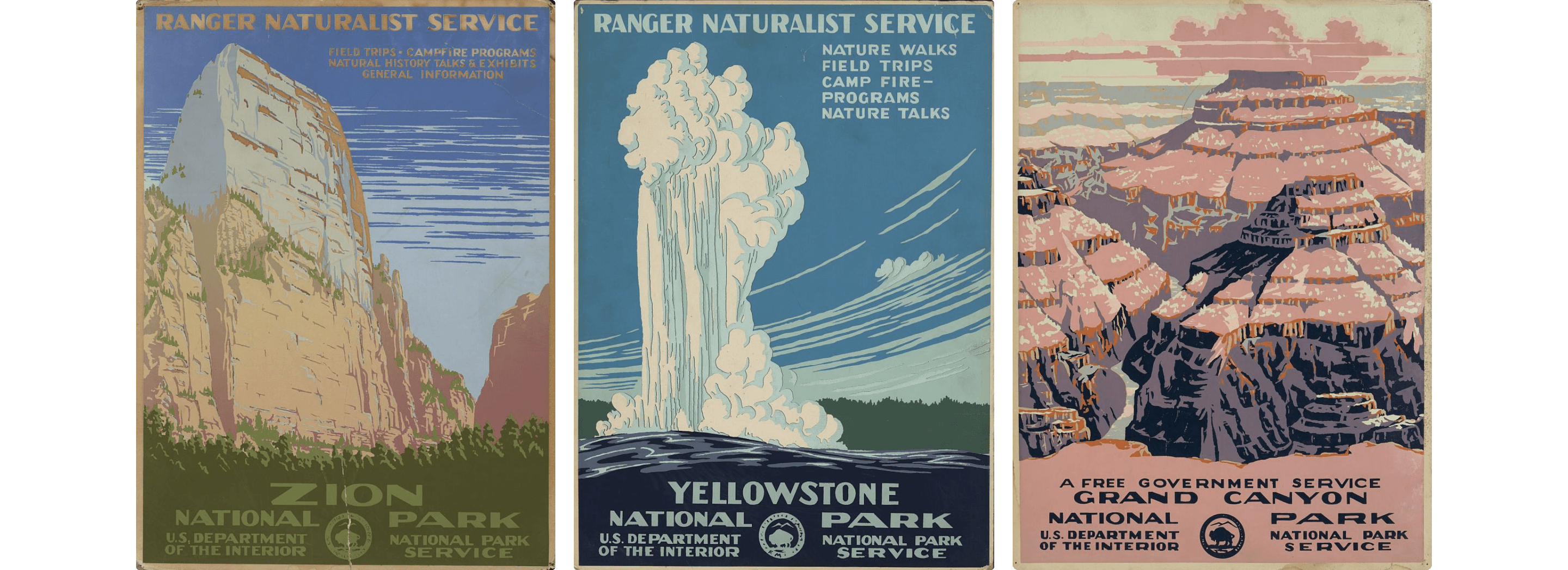
![<b class="accent">FIG. 1 — </b> Original WPA Posters featuring (left to right) Zion, Grand Canyon, and Yellowstone National Parks.
Artist C. (Chester) Don Powell and printed by Dale Miller. [ca. 1938]. [Source: Library of Congress.](https://www.loc.gov/pictures/search/?st=grid&co=wpapos) See carousel below for full poster designs.](/_next/image?url=https%3A%2F%2Fcdn.sanity.io%2Fimages%2Fblwjvcya%2Fproduction%2Fe997ca4c7b9f867b539e72e22567ed0652bb8a65-1340x1282.png&w=3840&q=75)
FIG. 1 — Original WPA Posters featuring (left to right) Zion, Grand Canyon, and Yellowstone National Parks. Artist C. (Chester) Don Powell and printed by Dale Miller. [ca. 1938]. Source: Library of Congress. See carousel below for full poster designs.

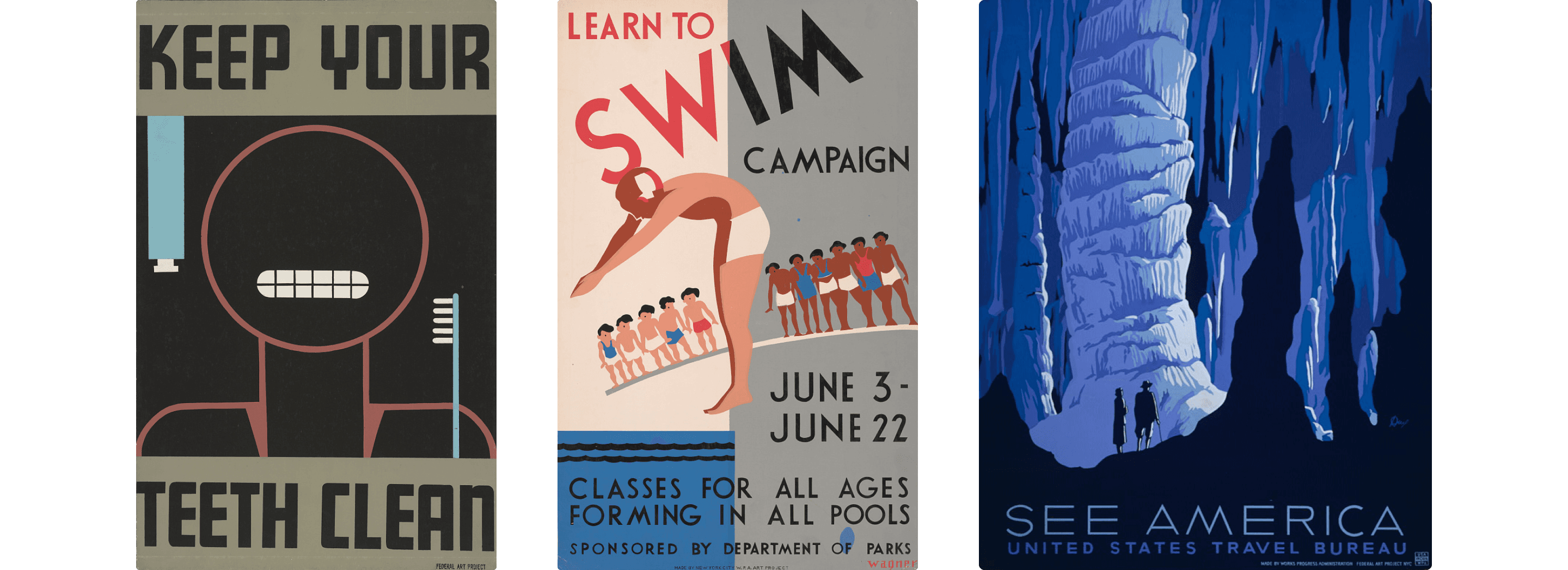
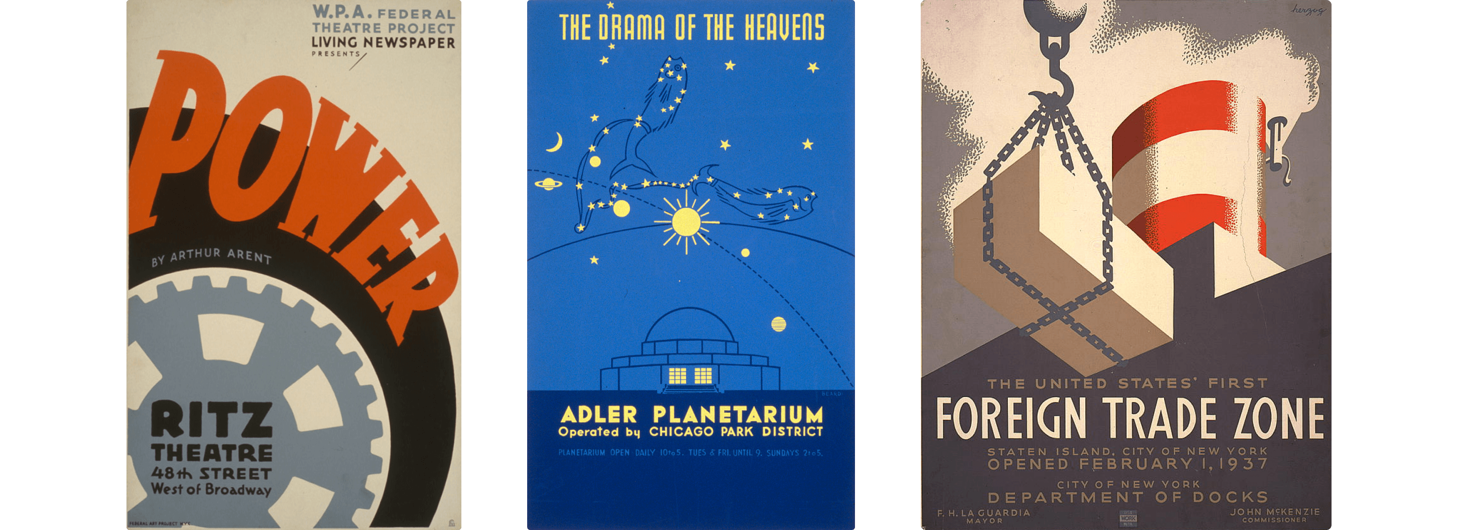
The Works Progress Administration (WPA) was a truly massive endeavor architected by the Roosevelt Government to bring America out of the great depression and into an era of job security and infrastructure improvements, employing millions of Americans and bringing American icons like the Griffith Observatory in L.A. into existence. It also introduced federal programs for music, theater, writing, and the documentation of American history. But in addition to all of this, the WPA also commissioned over 500 original poster designs, in an effort that truly brought new validity to design-as-communication in America. In an era long before the computer, these posters were created by the skilled hands of craftspeople, like a visual megaphone pointed across America. And while people often focus (rightfully) on the illustrations in these posters, as a letter-obsessed person I have often been struck by their absolutely beautiful letterforms as well.
At the time that these posters were created, typefaces were primarily recorded in wood or metal, with each letter existing as a physical block called a ‘sort’. While there are certainly examples of these typefaces being put to use beautifully in posters of the time, to my eye the letters in the WPA posters rarely came from typefaces. Instead, almost all of the letters are ‘lettering’ rather than ‘type’. Lettering, meaning a set of letters drawn to appear in this specific order, for this specific purpose. And there is no arguing — the particular tone of lettering that is implemented in these posters, despite their having been made by a wide variety of artists, craftspeople, printers, etc, is something that screams this moment in time.
These are letters absolutely overflowing with humanity and energy, and they helped their audience absorb messages ranging broadly in topic from “Keep your teeth clean” all the way to “See America”, the latter representing an entire subgenre of travel and tourism posters designed to help encourage Americans to venture out and prop up the local economies of these places, while observing the varied beauty of the American landscape. At one of the darkest moments in American history, the WPA posters were optimistic, bright, colorful, meaningful, and patriotic in their own way.
The Fifty-Nine Parks series takes tons of inspiration from the WPA posters (in its format, the subject matter, and even in stylization), but it is not a pastiche. It is not an imitation, trying hard to replicate the feeling of something gone-by, it is a reimagining through the lens of Fifty-Nine Parks’ curation, and the artistic voice of these contemporary artists. And so it seemed fitting that a new typeface would also be successful when described this way: taking inspiration from the WPA posters, without being an imitation. Although I’d only seen a few brief art samples when I began the project, it was clear that the overall goal and execution of this poster series was to show a contemporary vision of nostalgia. So that seemed to describe the typeface brief pretty clearly: to take these historical references and make them sing in a contemporary way that didn’t distract from the poster art itself. I wanted to evoke the original letterforms, while making an alphabet that consistently got along with itself, anchoring the bottom of each Fifty-Nine Parks poster with a consistent visual message.
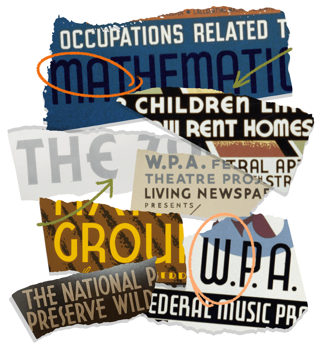
FIG. 3 — Lettering samples from WPA Posters, with unique characteristics highlighted, such as: rounded capital ‘E’, ‘W’ with rounded bases, and ‘A’ with rounded top. Source: Library of Congress.
7 years prior in 2008, marking the 75th anniversary of the New Deal, and the inception of the WPA, an incredible book was published: Posters for the People by Ennis Carter. My love for the posters had partially been born from this book, and I immediately turned to it when researching the letterforms for what would become Catlin Sans. The book is overflowing with so many letters that obviously took inspiration from the typefaces of their time, but were clearly hand-drawn. It became obvious to me while looking through the book that these were ‘American’ letters, in their tone and rendering. They felt distinctly of that time (the 30s/40s), and that place (pre-WWII USA), and I was fascinated as to why and how this could be conveyed so clearly. What are American letters?
While chasing the ‘American letters’ idea, it was natural to pull some inspiration from the ATF Gothic typefaces (Franklin Gothic, Alternate Gothic, etc) which originated at the turn of the century. In a general way, that inspiration (and the lettering from the posters) made me realize that all-caps condensed sans serif typesetting seemed to be one of the most quintessential American typography traditions. That’s why Catlin Sans ultimately took the form it did: an all-caps display face.

FIG. 4 — Various lettering samples in the American Gothic tradition, including Franklin Gothic Regular and Condensed, News Gothic, and Blair Series.
I also can’t talk about the inspiration for this typeface without touching on the tradition of American sign painting. There exists a dialogue in history between sign painters (spontaneously rendering letters by hand with a brush, for one specific use, pulling the letterforms from memory), and type founders (recording letters in an immutable and concrete way, for use many times over). The inspiration seems to flow back and forth between these two disciplines, particularly in the 19th century, with both sides influencing the other. In my opinion this can be seen very clearly in the WPA poster lettering. A given WPA headline will be very reminiscent of the letters that can be found in the pages of the 1912 American Type Founders specimen book, for instance. But they have their own heart, their own departures, their own statements and traditions. I picture it like a historical skeleton, informed by the typefaces, with the heart and spontaneity of the lettering artist draped over it, like a mannequin in a store front.
With a display typeface like this one, I think part of the art is balancing what I might call ‘the AM and FM of style’. The FM (or Frequency Modulation) way to get character into this typeface would be to pick a handful of very characterful, on-the-nose stylistic letterforms, and place them in an otherwise neutral design. This way, whenever someone happens to spell something with those letters, BAM — there’s your character. In contrast, the AM (or Amplitude Modulation) approach would be to find some sort of core WPA-isms, and distribute them evenly and equally across the alphabet, no letter standing out any more than any other. Finding the right balance of these two approaches is very important when making a typeface that is intended, specifically, to convey a careful awareness of source material. I wanted to make a design which immediately put the reader into the mindset of the inspiration, without it seeming like a cheap imitation.

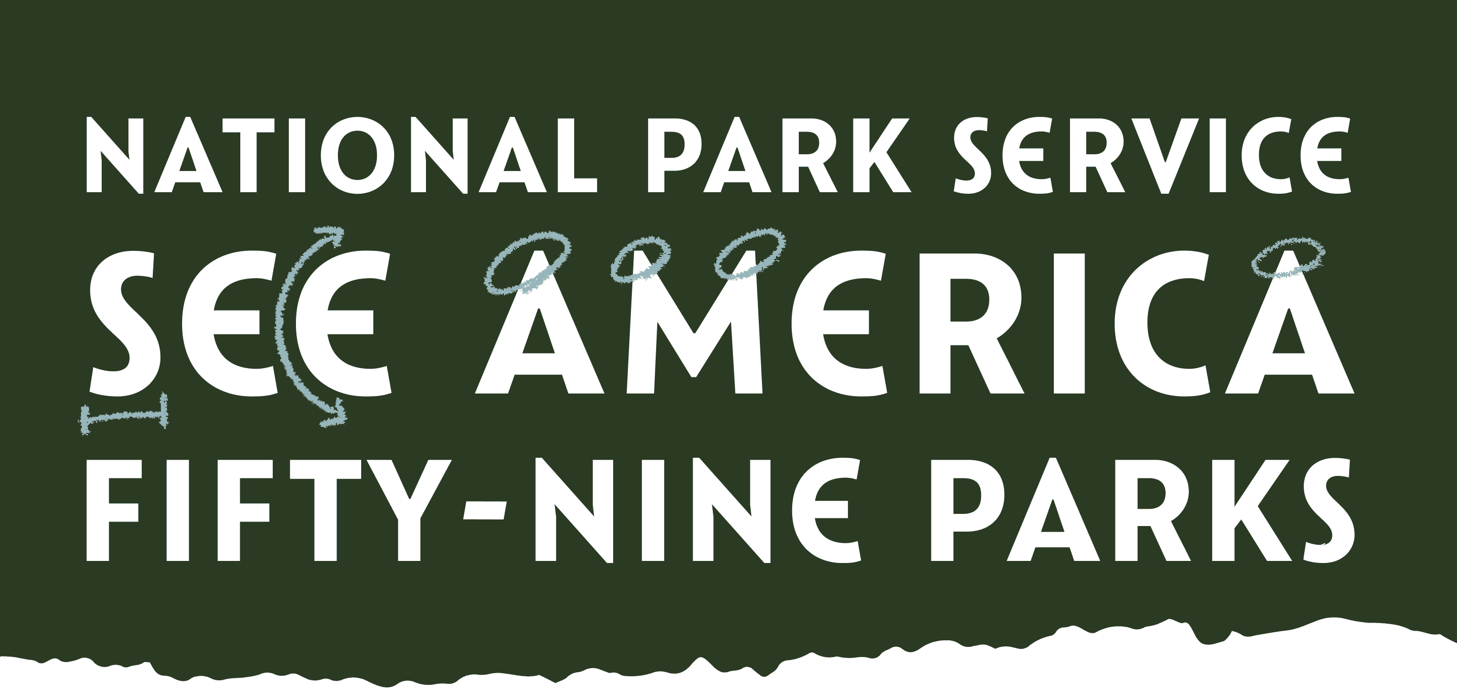
FIG. 5 — Catlin Sans’ unique drawings, included a rounded ‘E’ such as those seen on the WPA Posters, a narrow ‘S’, and pointed terminations on A, M, N, and V.
Ultimately I couldn’t help but cherry pick a few letterform constructions that spoke to me in the WPA posters. I was drawn to this construction of ‘E’ which is distinctly ‘C’-like, turning a rectangular glyph into a round one (quite a distinct textural change). And what I might refer to as a ‘lazy s’, which in an Art-Deco-like way runs narrower than the ‘S’ form you might see in typefaces of the time. Beyond these two letterform constructions (perhaps representing the FM aspects of Catlin Sans, interspersing little chunks of character wherever they appear), the rest of the letterform constructions in Catlin are quite traditional.
For shapes like A/V/W/N, I opted for moments of sharpness. This is a detail that shows up in the lettering a lot, but which is much less common in typefaces of the time, which typically have quieter, blunted equivalents, rather than spiky letterforms that look like something you wouldn’t want to step on in the middle of the night. I enjoyed the process of taking these moments of character and life, and draping them over a skeleton of a more neutral ‘American Gothic’ set of caps. The mixture of these influences produced something that felt aesthetically alive, while consistently producing results that looked confident and considered.
For the letter ‘Q’ I went in a direction that felt like a subtle nod to sign painting, with this gestural tail which juts out with a sense of cheeky spontaneity. And I went for a very open and somewhat minimalist ‘G’ form, that can be found often in the original lettering. I gave the design generous spacing, knowing it would be used in all-caps settings. It may seem like an insignificant detail, but just like the way a human carries themselves, the ‘stance’ of a typeface is partially inherited from the general amount of air in the letters. Catlin Sans breathes, and it makes a confident statement while doing so.

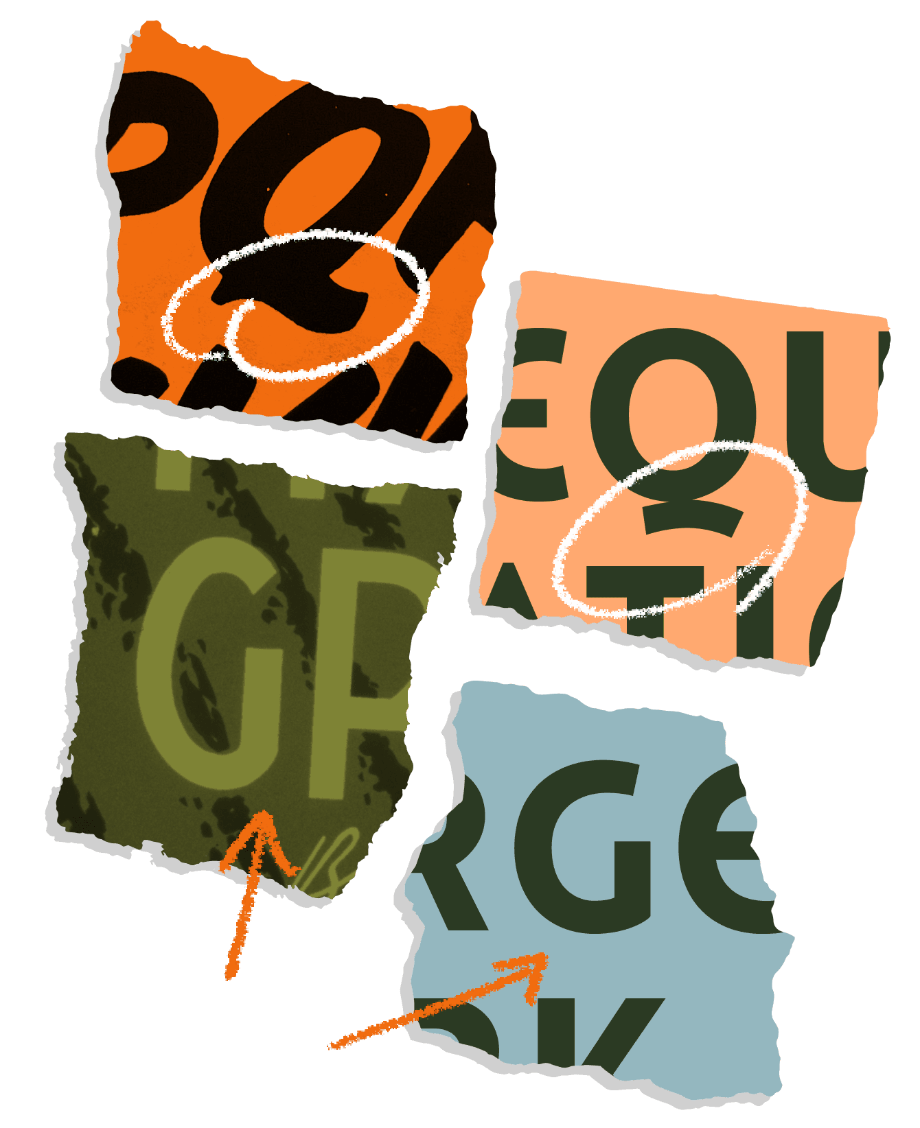
FIG. 6 — Left, the sign painting samples that inspired unique characteristics of Catlin including the brush-like ‘Q’ tail (top right) and minimal ‘G’ form (bottom right).

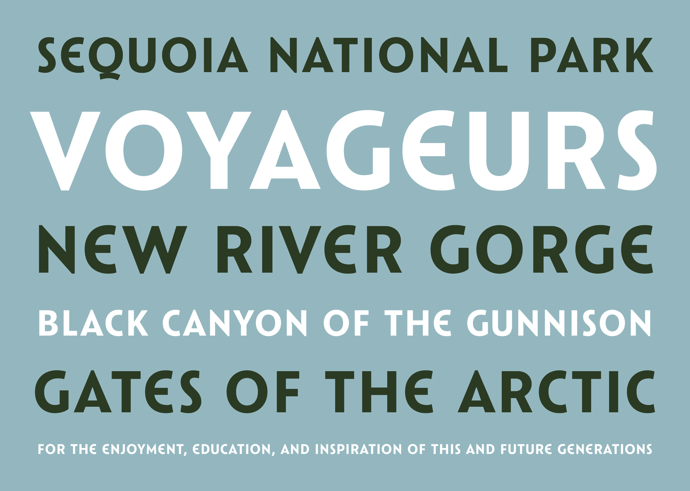
FIG. 7 — Catlin Sans in-use.
During my research about the parks I discovered that the actual concept of the National Parks was (albeit somewhat abstractly) described originally by a painter named George Catlin, 2–3 decades before the first parks were actually founded.
He once wrote: “…by some great protecting policy of government… in a magnificent park… a nation’s park, containing man and beast, in all the wild[ness] and freshness of their nature’s beauty!” After learning this, it seemed only fitting that a poster series celebrating that idea would carry his name.

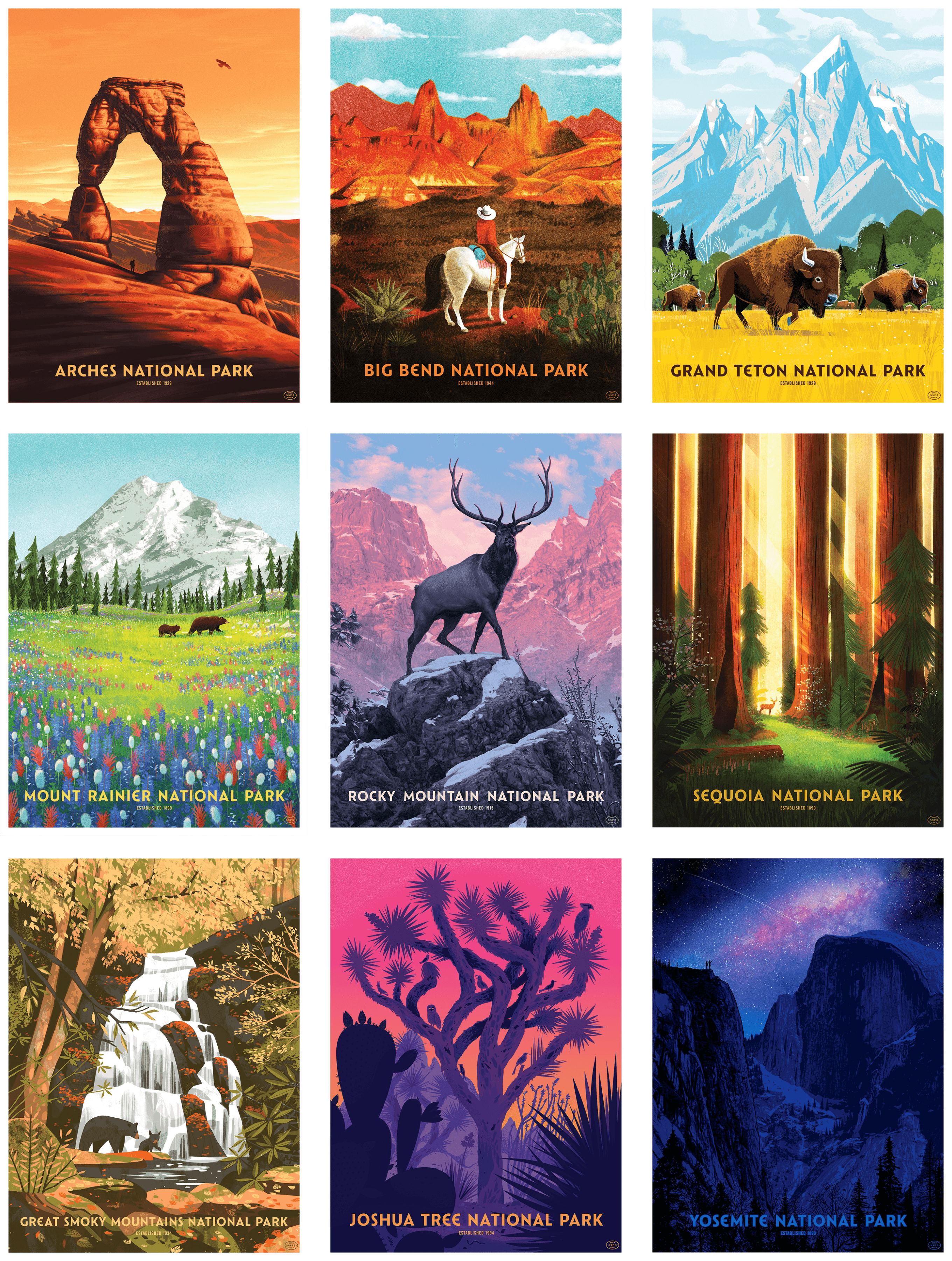
FIG. 8 — Arches National Park by Nicolas Delort, Big Bend National Park by Brave the Woods, Grand Teton National Park by Kim Smith, Mount Rainier National Park by Glenn Thomas, Rocky Mountain National Park by Rory Kurtz, Sequoia National Park by Glenn Thomas, Great Smoky Mountains National Park by Chris Turnham, Joshua Tree National Park by Little Friends of Printmaking, and Yosemite National Park by Dan McCarthy.
One of the most exciting parts of the typeface design process is seeing where the type gets used as it goes along its journey into the world. I have had a wonderful experience with Catlin Sans in this regard, as the Fifty-Nine Parks series has continuously added new posters by talented artists in the over half a decade since I designed these letters. I’ve even had the fortune of seeing a tube of posters arrive from time to time, full of the latest prints, which I’ve hung on the wall of our studio here. I can’t list a favorite, mostly because there are so many wonderful entries; this series is more than just its breadth; the curation and illustration are at a standard rarely seen, period.
Occasionally Fifty-Nine Parks has broken from the format for their posters, particularly with their series of prints by illustrator Tom Whalen, focusing on the wildlife of the parks. The Catlin typeface is used here as well, and it takes on a new tone of sophistication and stoicism when placed next to Tom’s beautiful illustrations.

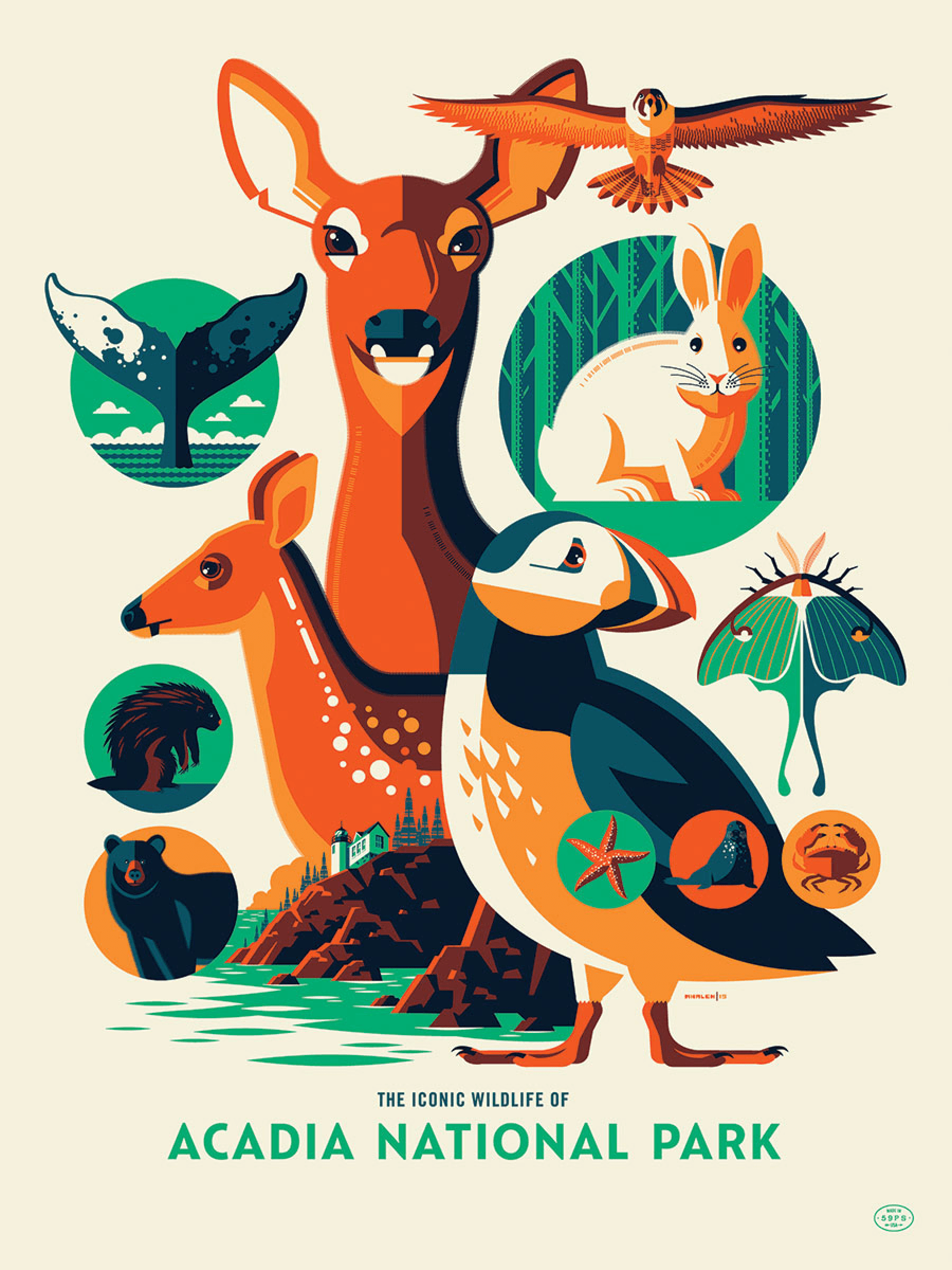
FIG. 9 — The Iconic Wildlife mini-series, illustrated by Tom Whalen.
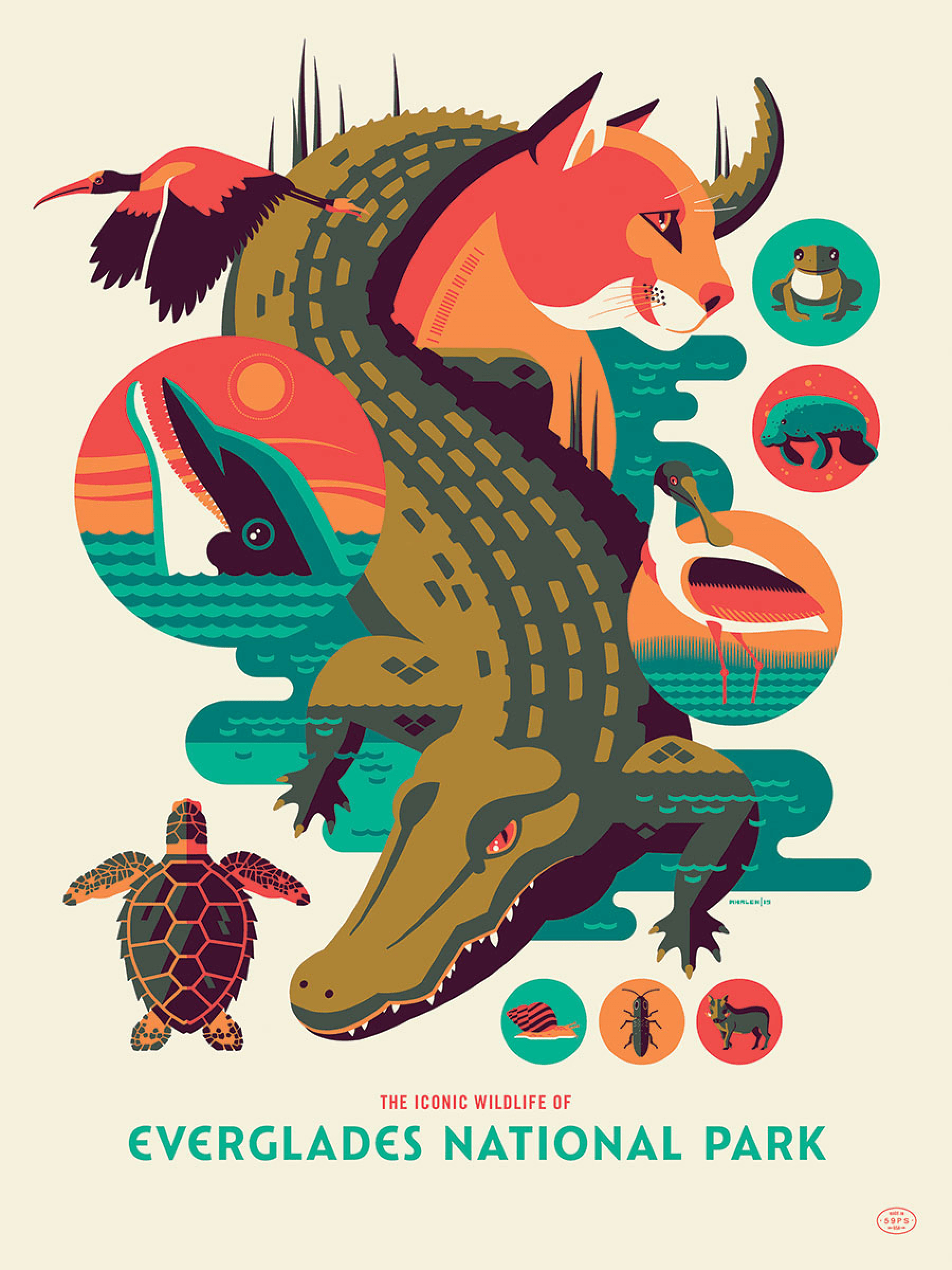
FIG. 9 — The Iconic Wildlife mini-series, illustrated by Tom Whalen.
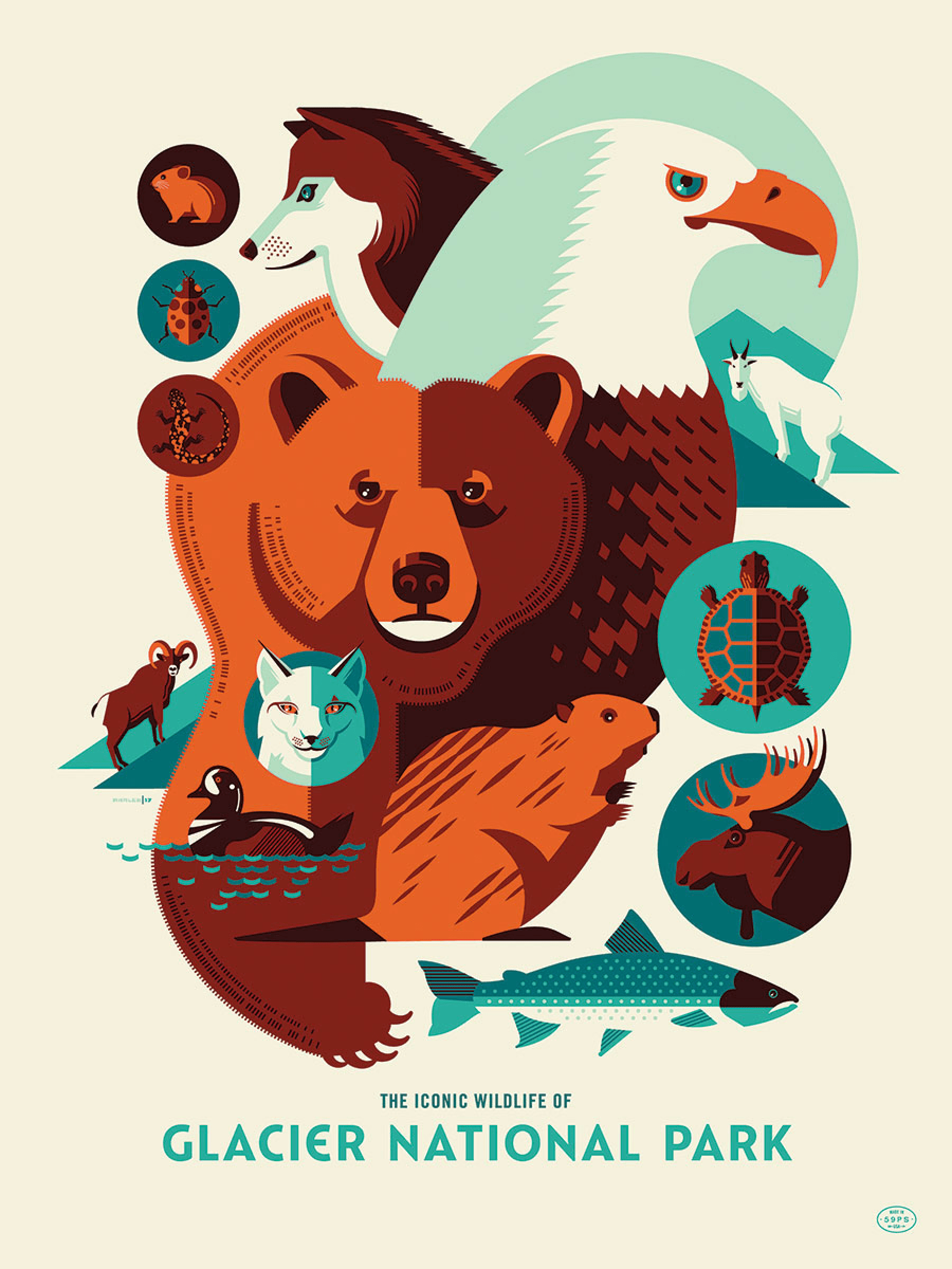
FIG. 9 — The Iconic Wildlife mini-series, illustrated by Tom Whalen.
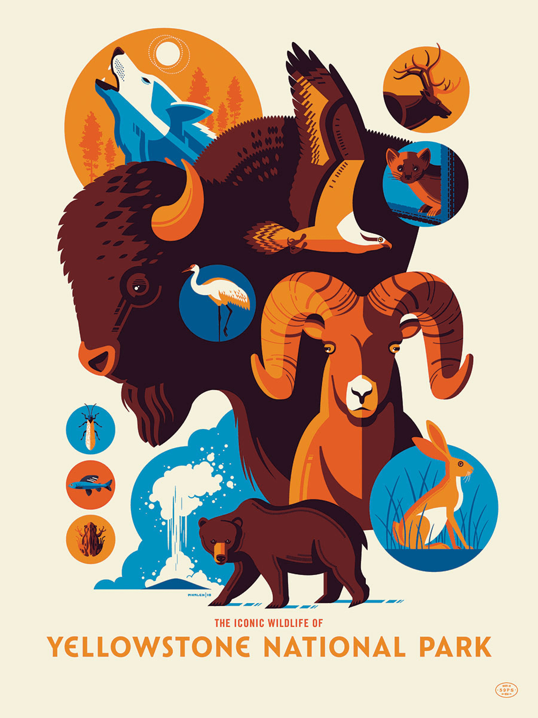
FIG. 9 — The Iconic Wildlife mini-series, illustrated by Tom Whalen.
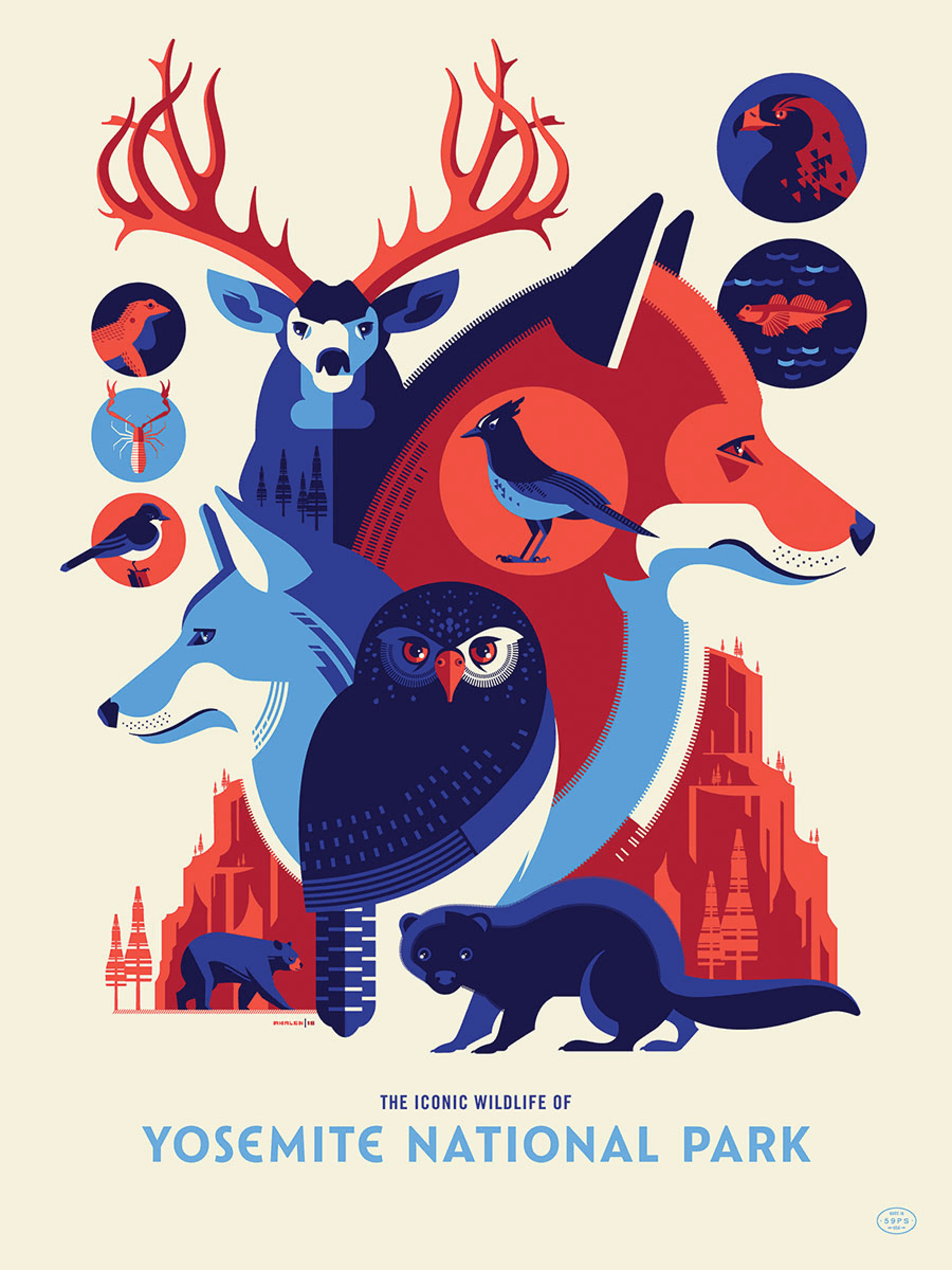
FIG. 9 — The Iconic Wildlife mini-series, illustrated by Tom Whalen.

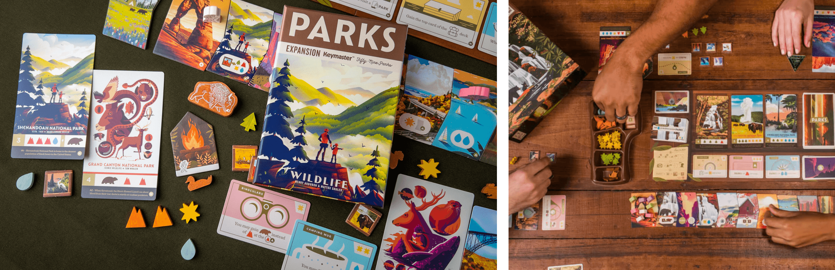
FIG. 10 — The Parks game by The Fifty-Nine Parks Print Series and Keymaster Games.
And the fonts have found their way to other formats and mediums as well! Fifty-Nine Parks has partnered with Keymaster Games to produce a board game that make use of the fonts. It has been wonderful seeing the ways Catlin Sans has been put to use in the packaging and design of the Parks game and its expansion packs.
The entire game has this jovial quality to it, and the illustrations (originally intended for large format prints) do a wonderful job in this context of turning the varied and beautiful scenery of the parks into this colorful world unto itself. It makes you appreciate that the fantasy worlds we create for ourselves owe so much to the splendor of the earth as it exists in real life.

I love this The National Parks map that was produced by Fifty-Nine Parks and illustrated by the talented folks at Brave the Woods. And I love the tradition, as can be seen here, of Fifty-Nine Parks showing the prints appearing layer by layer, screenprinted one pass at a time. I grew up in a screenprinting shop, so its also very nostalgic for me, seeing this glimpse into the magic process between ‘a piece of paper’ and ‘a beautiful print I will cherish’. It reminds me of the craftsmanship that was once employed by the WPA posters, because it is one and the same. A continuation of the tradition, that is very human and wholesome when you think about it. We love these places, and we’re drawing pictures of them, so we don’t forget how beautiful they are.

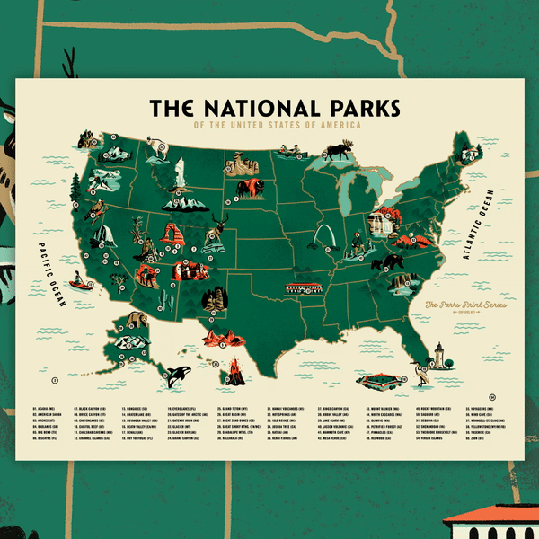
FIG. 11 — The National Parks map by The Fifty-Nine Parks Print Series and Brave the Woods.

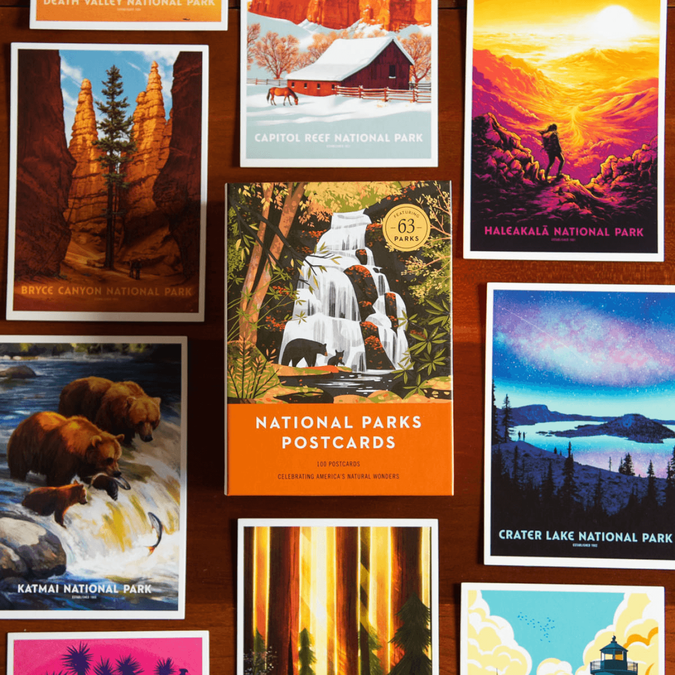
FIG. 12 — National Parks Postcards by The Fifty-Nine Parks Print Series.
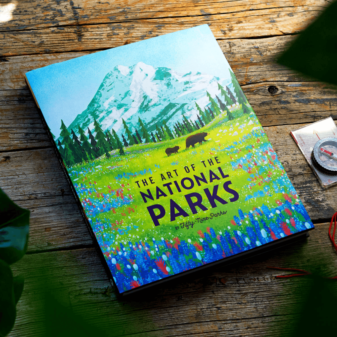
FIG. 13 — The Art of the National Parks book by The Fifty-Nine Parks Print Series and Insight Editions.
Fifty-Nine Parks has also used the Catlin alphabet in a variety of other uses, each continuing the same attention to detail and curation of visuals that we’ve come to expect from JP and the talented artists involved. They partnered with Random House to produce a series of postcards, and the fonts showed up on those as well.
And to tie up all the beautiful work, they’ve produced a wonderful book in collaboration with Insight Editions, encapsulating all the art thus far. This book is almost exactly the same size in format to 2008’s Posters for the People, and I happily keep them on the shelf next to each other in my library.

While we love creating big complicated typefaces with 80 styles, there’s a different kind of joy when only 26 letters can find their way into such wonderful artistic company as they have in the case of Catlin Sans, Fifty-Nine Parks, and Keymaster Games. Catlin Sans is a small typeface by most definitions. Just one style, just an uppercase alphabet. But in the hands of these very talented designers and illustrators, these letters have subtly and consistently added a bit of momentum to many different pieces of design. The only time you’ve ever seen these letters is in these specific uses. And Fifty-Nine Parks has consistently put them to tasteful and considered use, which is truly all that one can hope for when designing a typeface.
I’m thankful to JP, to Keymaster Games, and to all the artists involved in this sprawling series over many years, for bringing a smile to my face consistently with their beautiful work.
The Fifty-Nine Parks posters, book, and other goodies can be purchased at their website, and you can follow along on instagram as well.
And definitely pick up a copy of the PARKS board game directly from the folks at Keymaster Games.
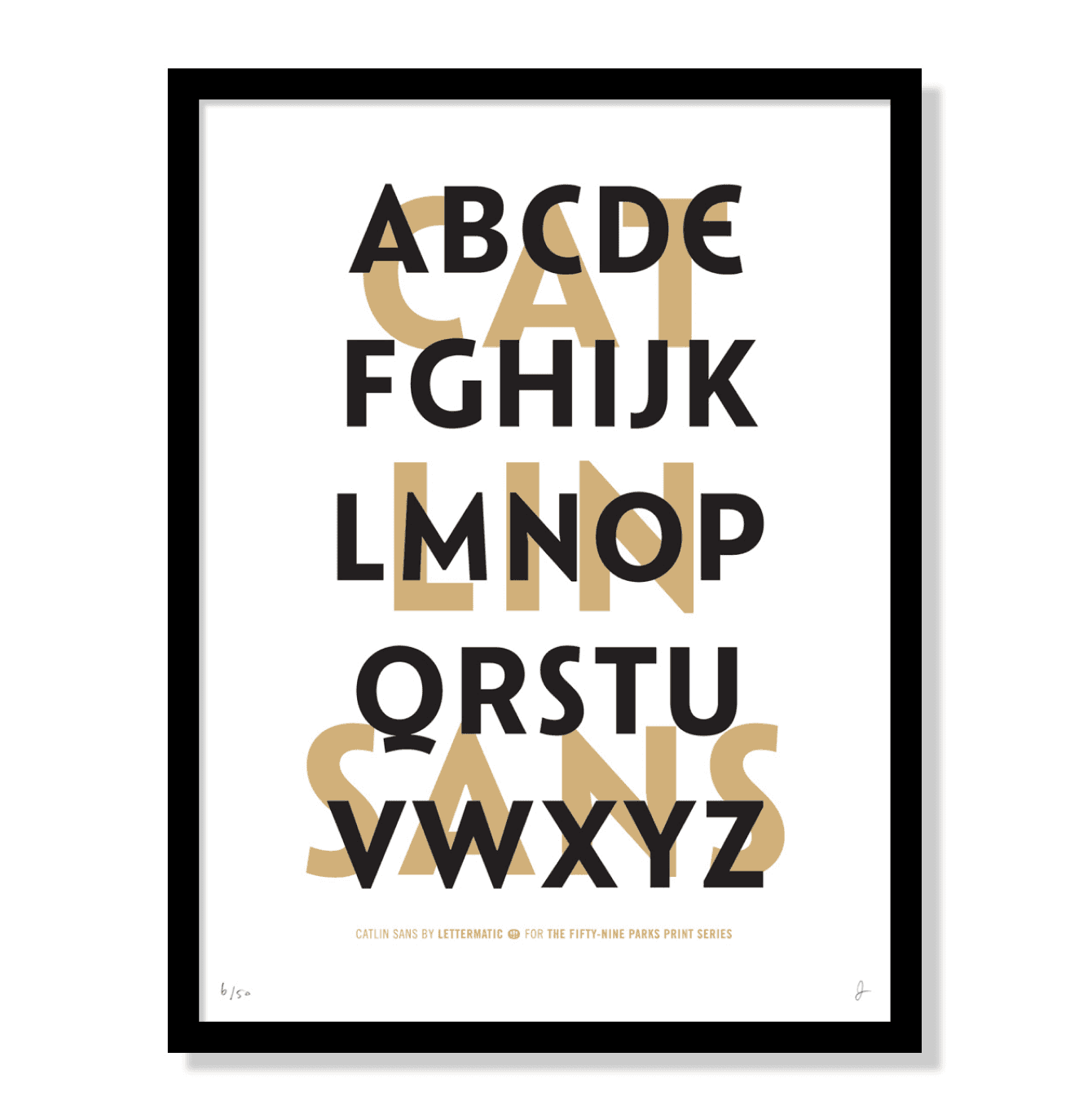
Catlin Sans Type Specimen Poster
The wonderful folks at The Fifty-Nine Parks Print Series have created this limited edition mini-print to celebrate the letterforms of Catlin Sans. You can pick one up by visiting their store!
9"x12" on 100# Cougar White. Black ink with a subtle gold sparkle ink. Signed and numbered edition of 50.