Custom Fonts For


A LETTERMATIC CASE STUDY: MONASPACE
By Lettermatic


GitHub Next, an experimental research incubator within GitHub, first reached out to Lettermatic about fonts in August 2021. As we spoke with Idan Gazit, Head of GitHub Next, it became clear that he, like all of us at Lettermatic, had a strong appreciation for beautiful and functional typography. This shared interest led us to talking about typography designed for code editors, which we all had some questions about.
Why hasn’t typography for code editors changed much since the advent of modern development tools? Why aren’t there more options available to developers who want to customize their experience of writing code? There is no shortage of opinions about document formatting, syntax highlighting systems, or color themes for editors — but why are developers expected to pick a single typeface to work with every day? These questions would lead GitHub and Lettermatic on a journey to make Monaspace: a superfamily of five interchangeable typefaces designed specifically for code, and one of Lettermatic’s most ambitious projects.
Information
- № of Families:5№ of Styles:42 static styles per family, 210 total styles + variable stylesClassification:Humanist Sans, Grotesque Sans, Slab Serif, Script & MechanicalReleased:November 2023Head of GitHub Next:Idan GazitLatin Type Designers:Riley Cran, Danelle Cheney, Heather CranLead Symbols & Punctuation:Heather CranLead Language Support:Heather CranLanguage Support Expansions:Danelle Cheney, Jane SolomonCyrillic Type Design:Heather Cran, Danelle Cheney, Jane Solomon, Lauren Dickens, Riley CranCyrillic Consultancy:Ilya RudermanGreek Consultancy:Elina KoutsogiannopoulouVietnamese Consultancy:Donny TrươngCase Study Editorial:Jane SolomonCase Study Design:Lauren Dickens, Tina Dirmyer, Anna Thomas, Laura SinisterraCase Study Illustrations:Rick MurphyWebsite:monaspace.githubnext.com
All in all, each Monaspace font contains over 6,000 unique glyphs and supports over 200 languages. All five typefaces have three variable axes — weight, width, and slant — giving users high levels of personalization and accessibility features straight out of the box. Each family in Monaspace is designed on the same grid, which means you can mix and match fonts from this superfamily without breaking the grid of your code editor. The fonts also use a novel technology that we call Texture Healing, which adds a never-before seen level of legibility to monospace typefaces. In line with GitHub’s commitment to the open source mission, the entirety of Monaspace is open source and free to download by anyone with an internet connection.

FIG. 1 — A selection of glyphs from each of Monaspace’s five typefaces on the shared monospaced grid.

FIG. 2 — Details from some of our favorite drawings in each of the five Monaspace typefaces.
The Brief & The Process
In order to have some perspective on this project, it’s valuable to do a brief tour through the history of how fonts usually work. Most typefaces in the Latin script are proportional, meaning that every glyph in the typeface is permitted to have a width that suits that particular letter. Before the term ‘typeface designer’ even existed, we had punch cutters who would cut letters out of metal with a file and punch them into molds to cast metal type. Someone would set every single letter of every single word by hand, and then lock them up on a press for printing. A lot of our metaphors for how letters are put together, even in the digital world, are informed by this history of how letters have been passed from one technology to the other. As a brief example: the terms ‘uppercase’ and ‘lowercase’ come from this era of typesetting because printers kept capital letters in their upper trays or ‘cases’ and lowercase letters in their lower trays.

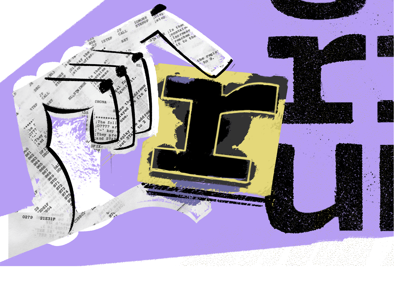
FIG. 3 — An r from Monaspace’s Neon, shown within its monospaced width.
Eventually, as handmade typography made way for more mechanical processes, glyphs often were assigned the same widths throughout the alphabet to make the engineering more straight forward. These typefaces are called monospace, as opposed to proportional. The vast majority of typewriters were designed on monospace systems. All characters have a fixed advance width, meaning that every time you type a character, the typewriter’s carriage advances the same amount.

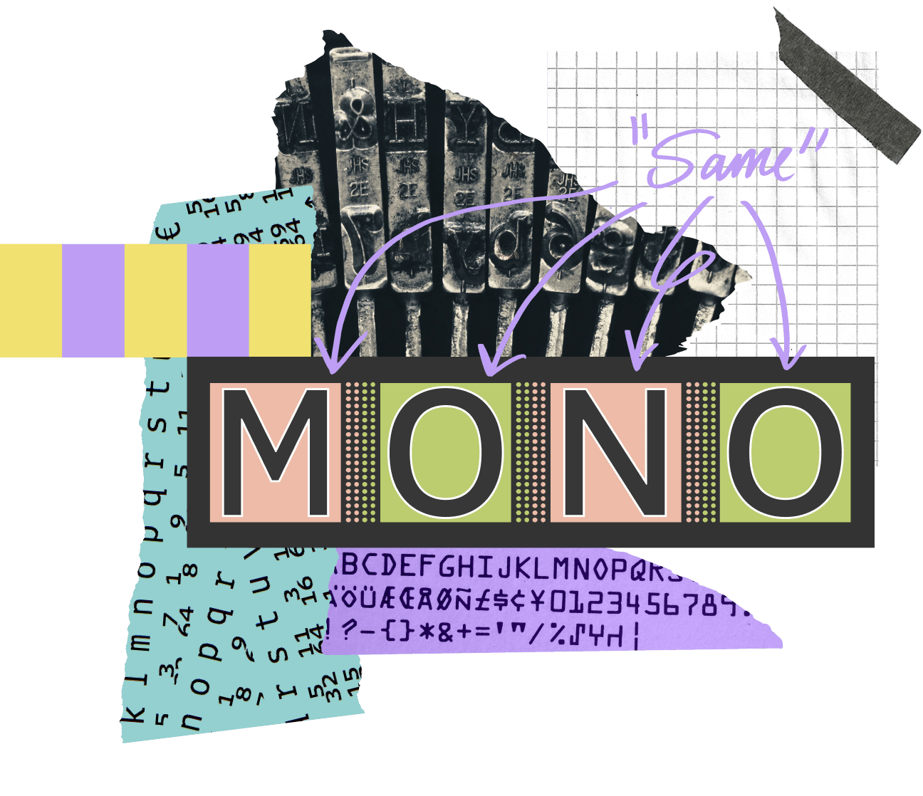
FIG. 4 — Samples of monospace forms. Each monospace font has a set width that all its characters share, and this value varies from font to font. It is sometimes called ‘advance width’, a term which comes from how much the carriage or cursor ‘advances’ along the line as letters are typed.

FIG. 5 — We interact with monospaced letterforms in all types of situations, in both obvious and less obvious forms: in our code editors, on financial spreadsheets, receipts, on travel boards, typewriters, and even on craft beads. The yellow overlay shows early prototype drawings from the Lettermatic team, exploring the edges of how far the monospace genre could be pushed with reverse-contrast and chiseled styles.
In modern code editors, we have inherited the monospace system. One particularly interesting thing about typesetting for code is that it has effectively evolved in its own branch of typographic hierarchy, separate from everything else. For example, in a dictionary we can see a differentiation between the headwords and the definitions purely by typesetting, using different typefaces, different weights, and so on. Mixing genre and style is an established way to help us tell things apart. But in the field of typesetting for code, the expectation is that there might be four or more different colors of text on a single line. No other kind of typesetting uses color coding as the expected primary method of telling things apart.
The name of this project, Monaspace, is a portmanteau of the words ‘Mona’ and ‘monospace’. Mona is the first name of GitHub's Mascot, the Octocat — silhouetted in the GitHub logo. The typefaces that make up Monaspace are, if it wasn’t already obvious, built on a monospace system, keeping with the legacy of typefaces made for coding. This project was an exercise in leveraging our expertise as typeface designers to take the weaknesses inherent in all monospace typefaces and flip them to our advantage.


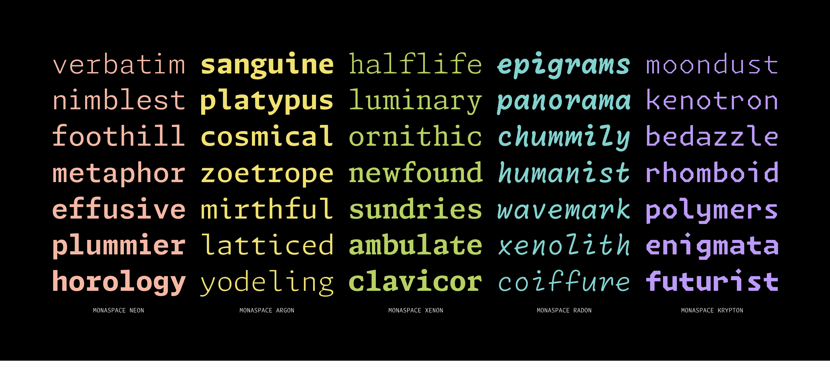
FIG. 6 — Each of the typefaces in the Monaspace superfamily are designed to capture a different aesthetic — from neutral, to contemporary, to casual — so there’s something for everyone no matter your preference.
Our conversations with GitHub about typefaces and design began with dreaming up what code editors of the future could look like. Idan lamented that while we're all walking around with supercomputers in our pockets, high density displays on our desks, and editors built on top of web browser engines that afford us ample typographical control, we're not really taking advantage of any of that when it comes to the display and editing of code. The most advanced use of typography that developers enjoyed at that point was syntax highlighting, which most commonly appears as color coding, italics, or bold text in code editors. We wondered what could come after syntax highlighting? How could we visually communicate more information to developers about their code through clever use of typography? Idan understood the transformative power of purpose-driven typeface design and knew that a project like this could change the way people think about code.
Monaspace is a superfamily of five typefaces designed specifically to give developers a flexible toolkit to do their best work. This project supports a high level of personalization using font genre, weight, width, and slant, along with a new spacing technology we call Texture Healing to make code easier to read and digest at a glance.

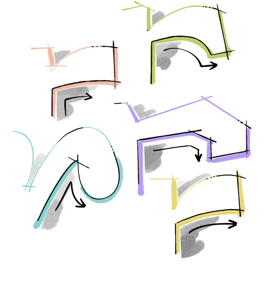
FIG. 7 — Each of the five Monaspace font families takes a different approach to letter constructions to give users a flexible toolkit of styles to choose from. The lowercase r terminal in each design shows these ideas particularly well.
Texture Healing
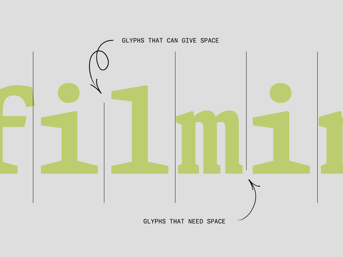
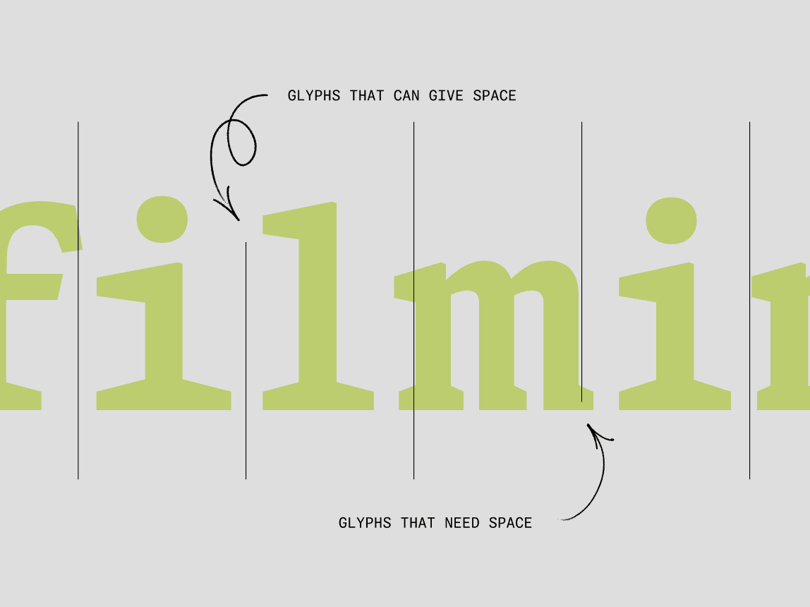
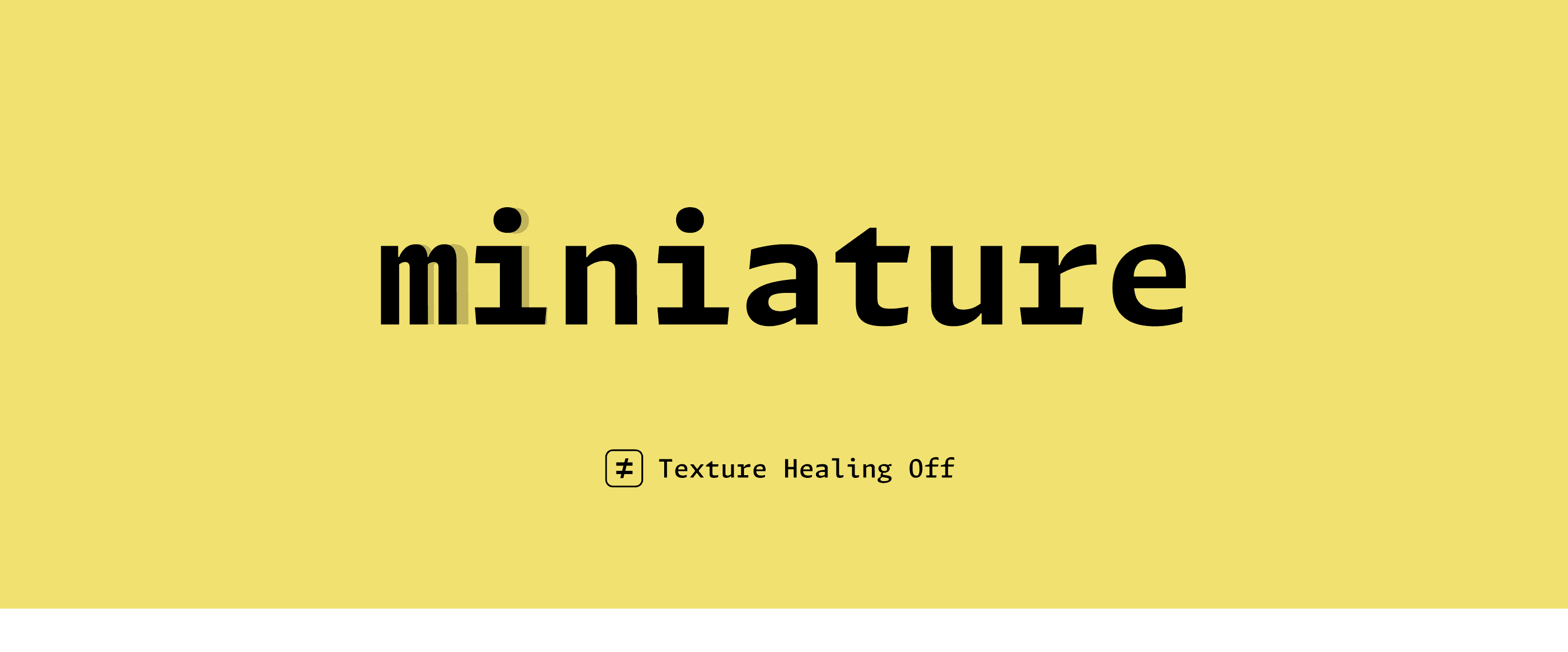
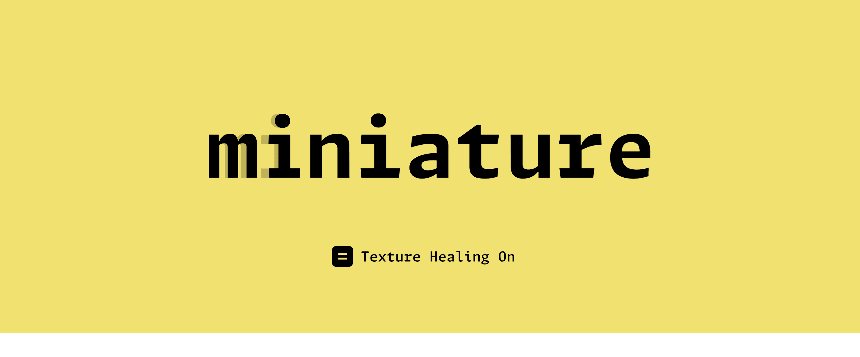
Texture Healing is the context-aware feature we developed for this project. This branch of the project grew out of our desire to solve a texture issue inherent to all monospaces: squished letters and large gaps of negative space produced when you force all letters, no matter their shape, into the same-sized box.
We wanted to explore what would happen if you made a monospace typeface which was equipped with an understanding of where these textural gaps happen in words and phrases and lines of code, and give it some mechanism by which it was capable of healing these textural problems, at least some of the time.
The biggest constraint of monospaces is that when you make all the glyphs the same width, some of the letters that like to be wider like m and w, inevitably end up looking squished. On the other end of the spectrum, the letters that like to be narrower like i and l, end up looking like they have too much empty space around them. These squeezed letters and extra white spaces make the texture of the text more of a strain to read.

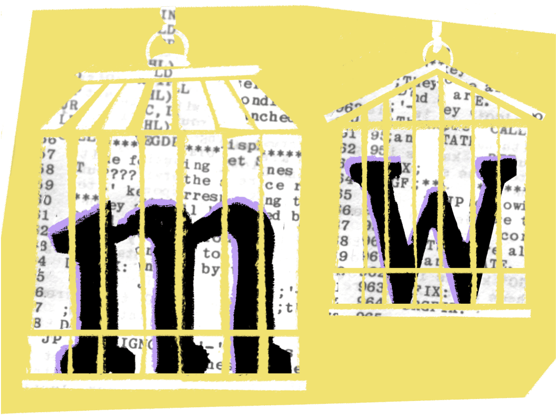
FIG. 8— The letters m and w are some of the trickiest to draw in a monospaced typefaces due to the number of vertical stems in each. They often end up looking squished in monospaced designs.
The aim was to give wider letters more breathing room when they appear next to a narrower letter, making those typically squished letters more pleasant to read, all without breaking the monospace grid. Ideally, these glyphs would redraw themselves automatically as you type, with zero effort on the part of the developer. While at the beginning of the project, we had no idea if this would actually work in practice, it turns out this was entirely possible. In fact, Texture Healing has been one of the most popular aspects of the Monaspace project since its release.

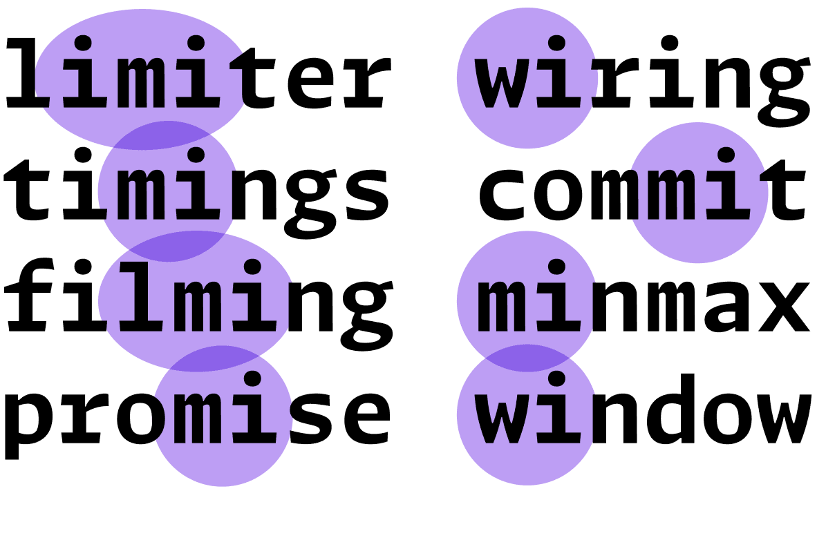
FIG. 9 — We started looking at pairs of letters in monospaced typesetting where wide letters like m appear next to narrow letters, such as i. We wondered if we could give the font some mechanism to understand where these pairs happen and help it ‘heal’ its own texture to produce more even results.
The idea of context-aware fonts has been around for a very long time. Donald Knuth experimented with this in the 1970s, and the concept, itself, has been carried through to the age of digital typesetting. It has theoretically been possible to implement a mechanism like Texture Healing since the 1990s. However, the underlying technology in font rendering is archaic and limited, and it's complicated to make typefaces that function in a context-aware way. As a result, it's rare to find examples of this kind of experimentation in monospaced fonts. We have, for instance, the idea of coding ligatures, which use context-aware swaps in a very straightforward way. Texture Healing adds a layer of sophistication to context-aware swaps, and it ultimately improves legibility without any effort on the user’s part.

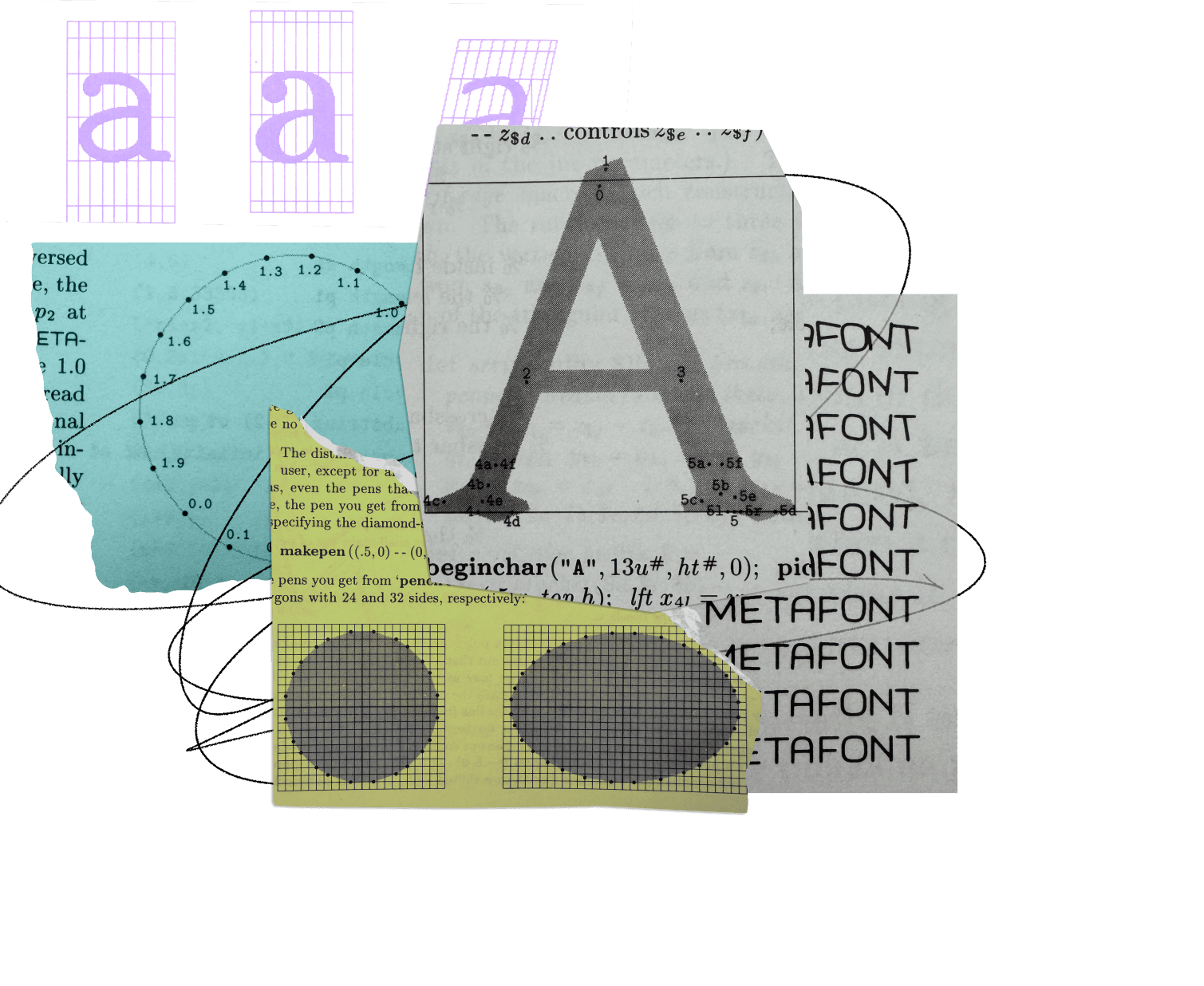
FIG. 10 — Diagrams from Donald Knuth’s The METAFONTbook, published in 1986. METAFONT is a programming language invented by Knuth, and was designed to allow users to customize type design through procedural geometry.
So what is Texture Healing? Imagine that there's a group of monospace glyphs which would like to take space if it were available. These are glyphs like the lowercase m and w, as discussed above. They want to be wider, they just can't because of the monospace constraint of the fixed advance width.
We also have this other category of glyphs like the lowercase
i and the l, which would normally be very narrow, but are forced to reach out for the edges of the monospace width, trying to convince us that they are the right width for this typeface. We like to think of these glyphs as being willing to give up some space because they have too much.


When you look at a certain word set in a monospace typeface, you can sometimes see situations in which one of these glyphs that would love more space appears right next to one of these glyphs that would like to give up some space because it has too much. What if a font were aware of that pairing and was able to redraw the letter i so that it took up less space in order to give up some space for the letter m?
One vital requirement of Texture Healing was to keep the monospace grid intact, even as letters became wider or narrower for legibility. So when the lowercase i gets narrower, it gets narrower to one side, and when the m gets wider, it gets wider in that same direction. This allows the body or bounding box around those two letters to stay exactly the same as it was. In this scenario, the appearance of both the i and the m have changed so that the pair looks visually more like it would in a proportional typeface, while still aligning to the original monospace grid.
This feature often reminds me of how-to videos about how a magician did a trick. It looks impossible at first, but upon closer inspection, they just were palming a spare coin in their hand the whole time. We are just hiding the solution where no one's going to look for it.
Texture Healing goes beyond letters. It turns out the underscore, comma, period, colon, and semicolon, for example, which all appear extremely frequently in code, are great glyphs to borrow a little extra space from for the more troublesome condensed letters.

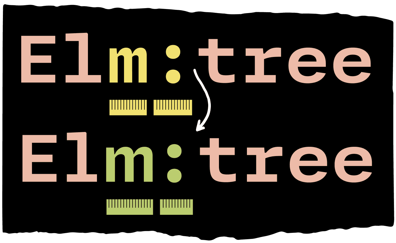
FIG. 12 — Texture Healing also includes punctuation glyphs, like the colon shown here. The colon drawing itself remains the same, but it is able to lend some space to the m glyph which benefits from a little extra breathing room — all while maintaining the monospaced grid so the appearance of text remains orderly.
All of these features just add a tiny little bit of legibility, maybe a couple times in a word or a handful of times in a line. This makes some of the things that were hardest to read before just a little bit more legible, and that makes a considerable difference when you're looking at hundreds or thousands of characters on your screen at once. Typesetting code is also an environment where swiftly and correctly identifying a particular glyph is extremely important, probably more important than it is in many other kinds of typesetting. Giving the readers just that much of an extra boost towards discerning the identity of these individual characters lends itself to a rhythm and texture of code that feels a little calmer and easier to follow.


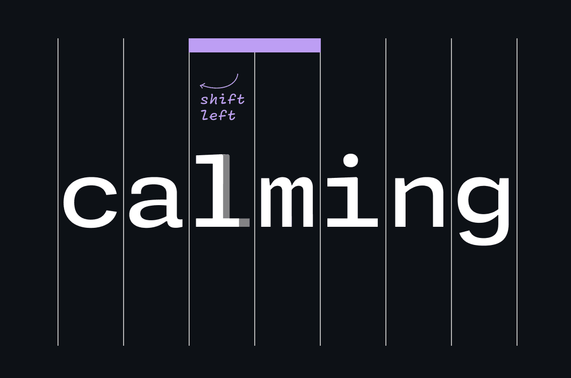
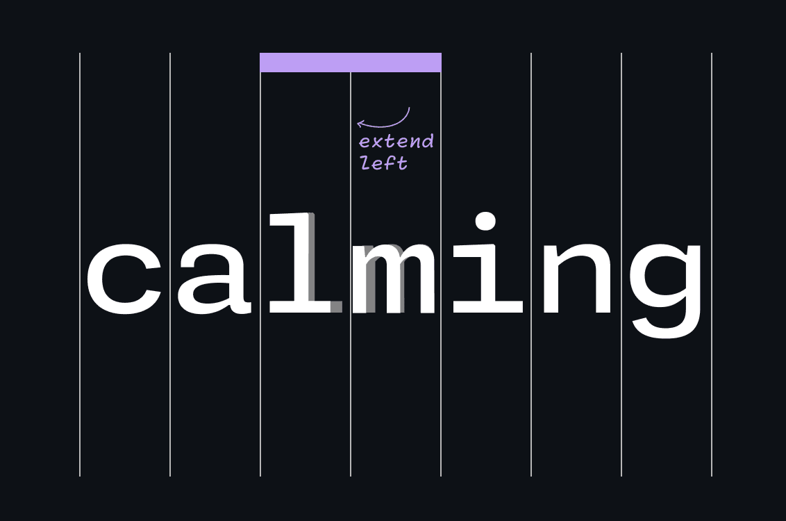
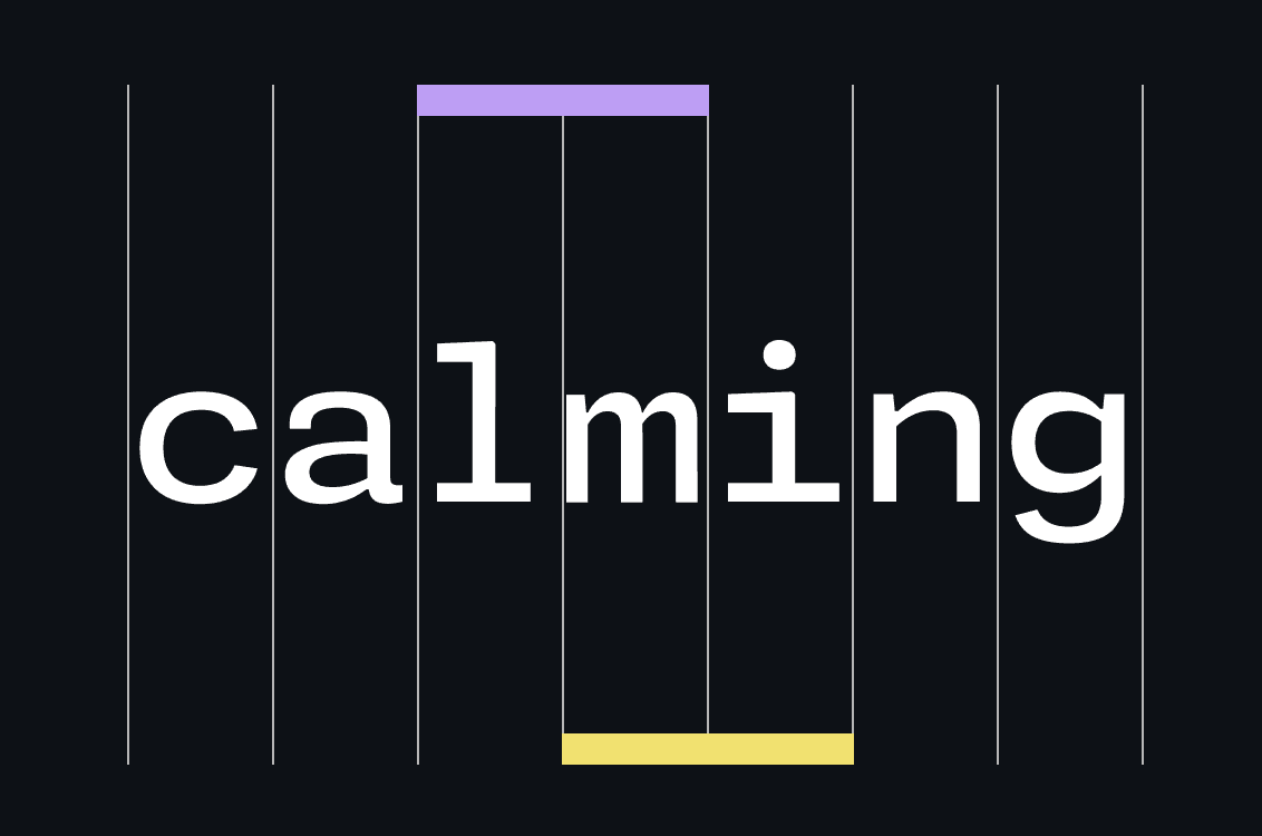
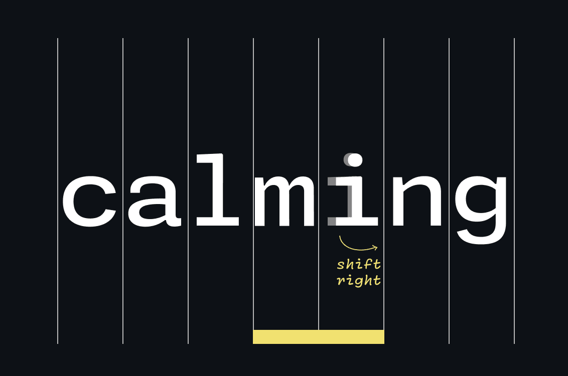
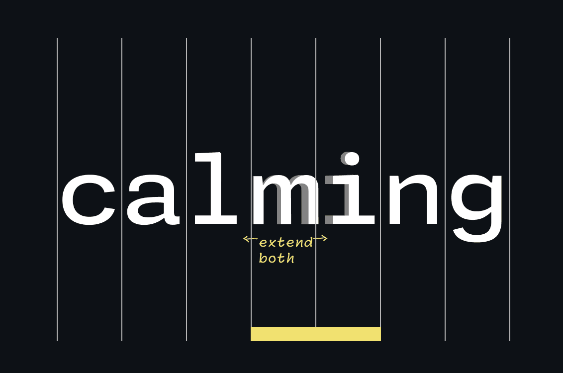
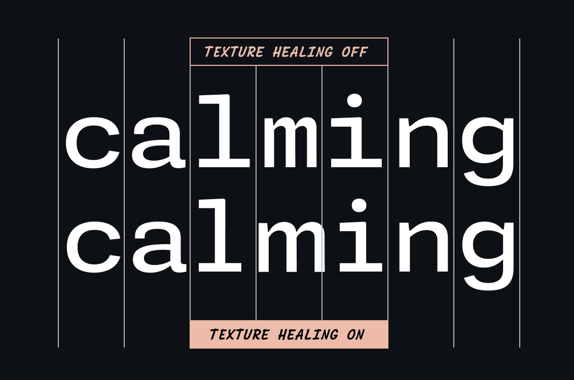

FIG. 14 — Monaspace Argon in use. Can you spot the Texture Healing?
Designing a Superfamily
The Monaspace superfamily contains five distinct typefaces, each with their own voice. Syntax highlighting, which in the past has relied on color and in some cases, bold or italics, now has an entirely separate dimension of emphasis to explore: typographic style.
Our task was to satisfy all the constraints of making legible and successful monospace fonts, while allowing each design have its own unique identity. The fixed advance width of monospacing has a tendency to make all designs feel homogenous, even if they are wildly different in their construction. In general, fonts in code editors appear at smaller sizes, and details at this size can be lost if they’re not amplified in some way. For Monaspace, we knew we needed designs that differentiated themselves, pushing the experimental shift in genre to less expected places, and indeed to voices that have rarely been tried before in the context of code.
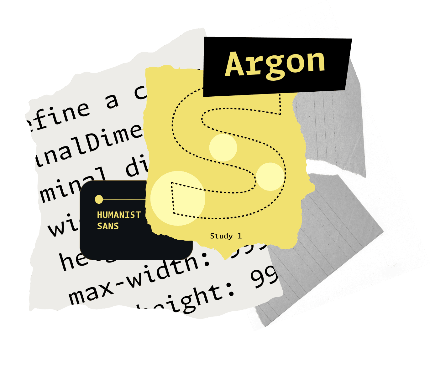
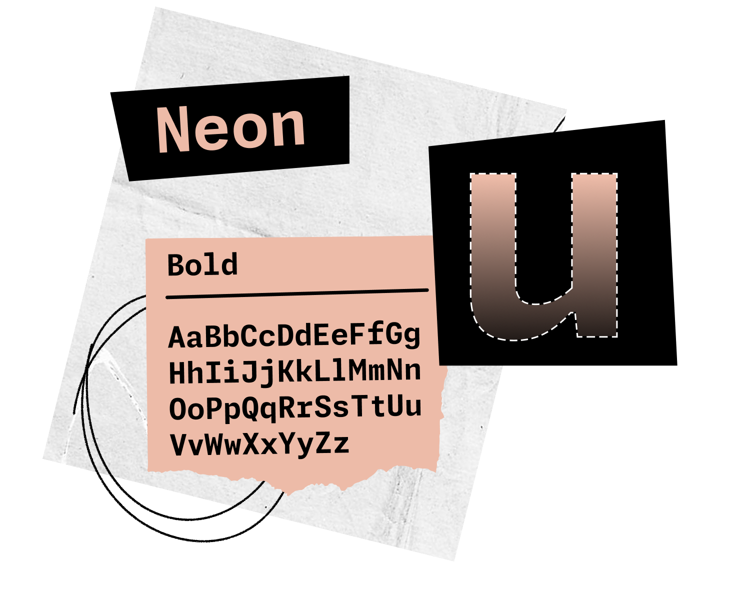
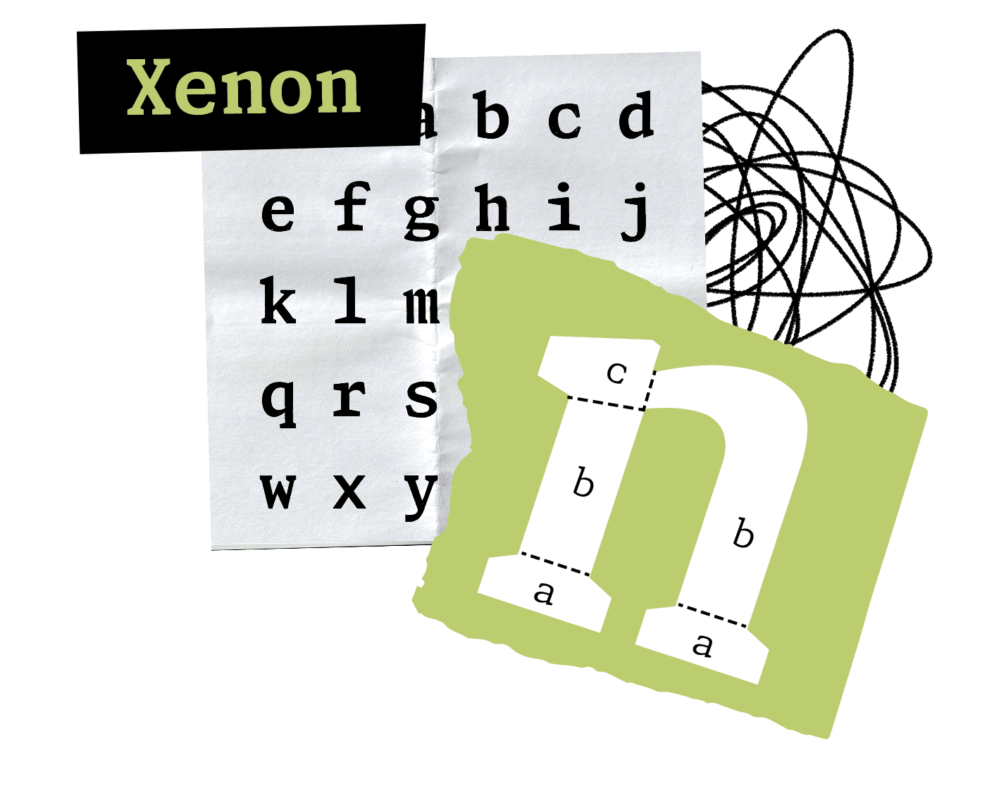
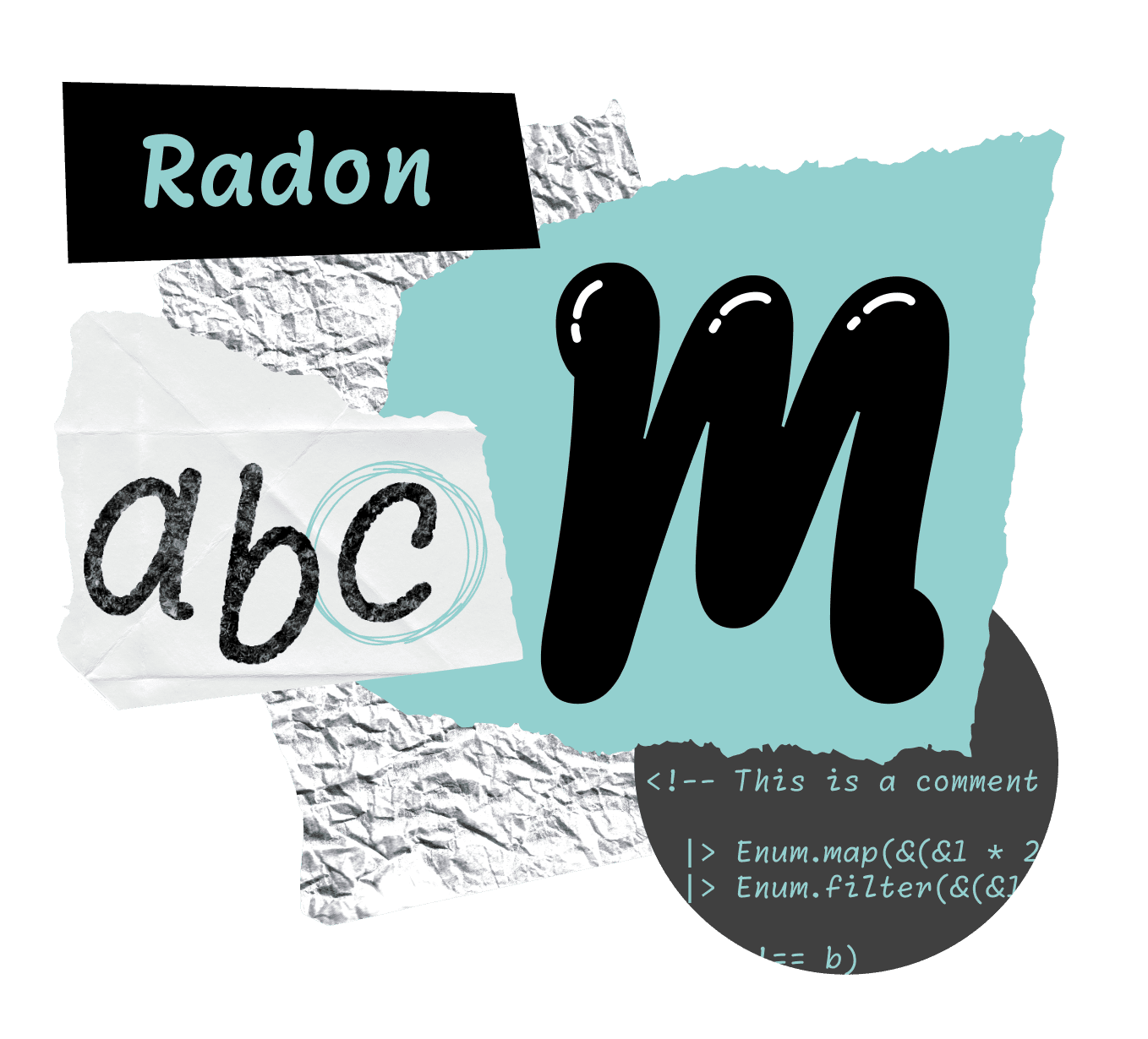
In our process, we prioritized drawing at the bolder end of the spectrum first, as proving a monospace design can succeed at bold weights is a great way to feel confident that it will work at lighter weights where space is not as precious. In all, over 500 prototype letters have been drawn for the various explorations, including a chiseled design and even a reverse-contrast exploration. A short list of ‘studies’ were thoughtfully whittled down to the five final typefaces that make up Monaspace: Argon, a humanist sans; Neon, a grotesque sans; Xenon, a slab serif; Radon, a style that resembles handwriting; and Krypton, a mechanical sans.

FIG. 15 — Each one of Monaspace’s five typefaces has details that are amplified to differentiate between the families, especially in their boldes weights. These details are crucial to each design being recognizable at small sizes, which is how most users will interact with the fonts: at small points sizes in their code editors.
Argon is a humanist sans full of little calligraphic moments that reference the history of how humans have drawn letters by hand, but put through a lens of rationality that stays calm and doesn't bring any acutely brush-like details into the design. With a calligraphy-inspired design like Argon, as the strokes of the letterforms are drawn they create this system of ‘pinches’ where two strokes join, which can be exploited conveniently to open up space where needed. Things that normally would match are often different. Shapes that would often be symmetrical no longer are. There’s a sprinkle of energy throughout the entire design as a result.

Neon is a sans serif design that adheres to the tradition of grotesque letters, or ‘The International Style’. Grotesque letters received their name because at the time they first made an appearance, it was considered literally grotesque for letters to have their serifs removed — and the name stuck. Funnily enough, grotesque sans have now become so popular as a genre, they are one of the most-used styles of typefaces in digital design. Because of this popularity, we knew that many developers would have a preference for this genre, so we wanted to make sure it was included as a voice in the Monaspace type family.

Xenon is a slab serif design that provides a sharp, lively editorial voice. As we mentioned earlier, the styles of Monaspace each needed characteristics to set themselves apart from each other. As a result, Xenon’s slab serifs are drawn to be more angular and bolder than you will find in a traditional serif design — helping it stand out from its sans counterparts in Monaspace. It’s the kind of font you might expect to see on a typewriter, harkening back to the early days of monospaced text. This more literary style produces comfortable words that are nice to read.

Radon is a design inspired by handwritten forms. It echoes how we might jot down a note with a ballpoint pen, complete with very cleverly recorded representations of the ballpoint itself entering and leaving the page. The concept of Radon came out of the dream of being able to have comments in a code editor take on the warm voice of a person writing a real note, as opposed to the cold language of a computer. This could allow developers to leverage associations we have from our life experiences to make comments in a code editor easier to identify at a glance.

Krypton is a mechanical sans design in the tradition of OCR, short for optical character recognition or optical character reader. OCR letters were originally designed to be easily readable by a computer and also have a shared monospaced grid. The OCR example by an unknown manufacturer shown here uses as 7x9 grid (image from Adrian Frutiger — Typefaces: Complete Works, page 178). Krypton provides a cold, machine-like tone, emphasizing ‘this is a computer talking’. You've seen OCR letters on the bottom of bank checks, your credit card, license plates, and ISBN numbers. It feels slightly more mechanical and robotic because of the association we have with these letterforms and computer vision. But it also has many tweaks to the design that give the human readers an extra little boost in their perception of the letters as well. It’s unlike the other designs, and yet it could function as your primary font in an editor. It is not just an aesthetic novelty via its ‘no curves’ nature, but it is in fact an extremely functional humanist sans serif in its own right.

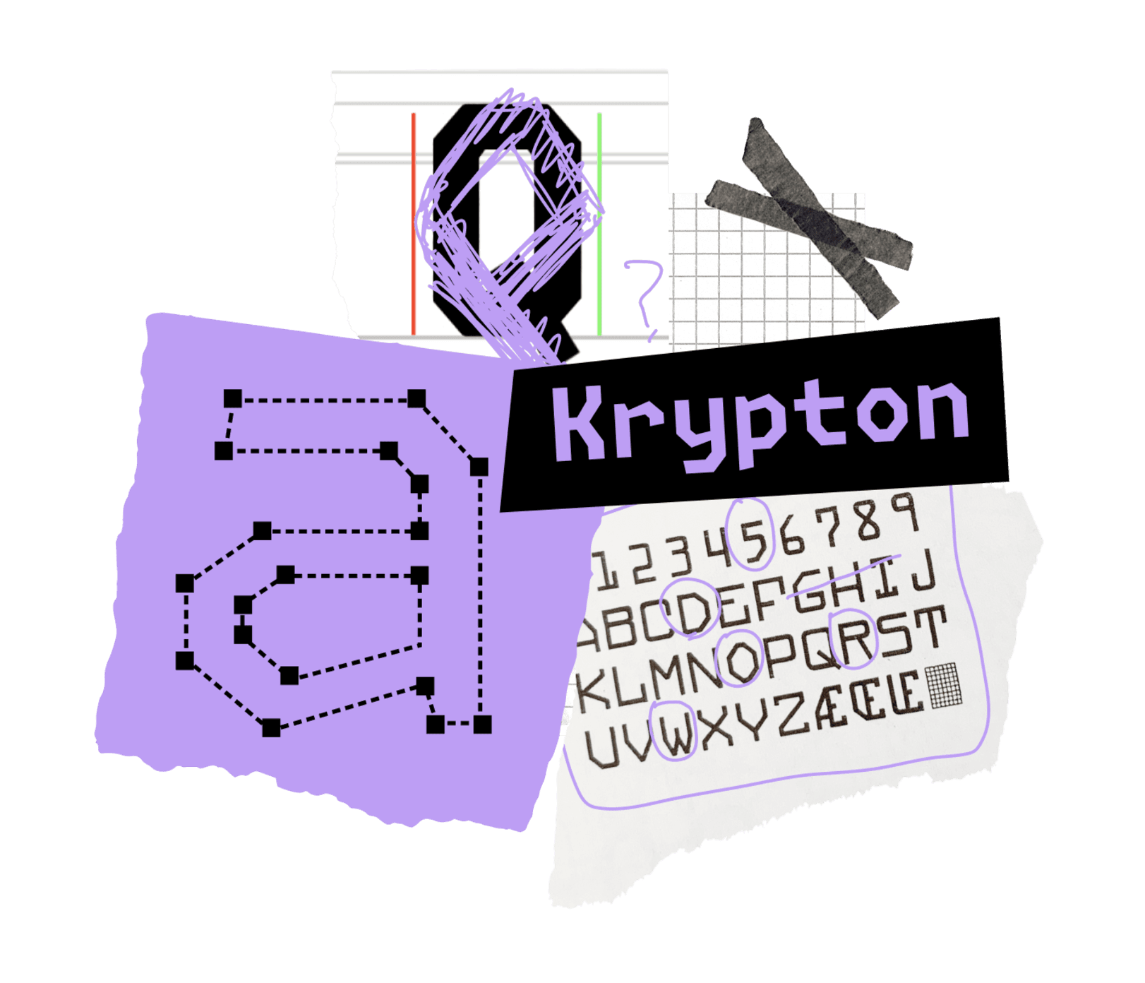

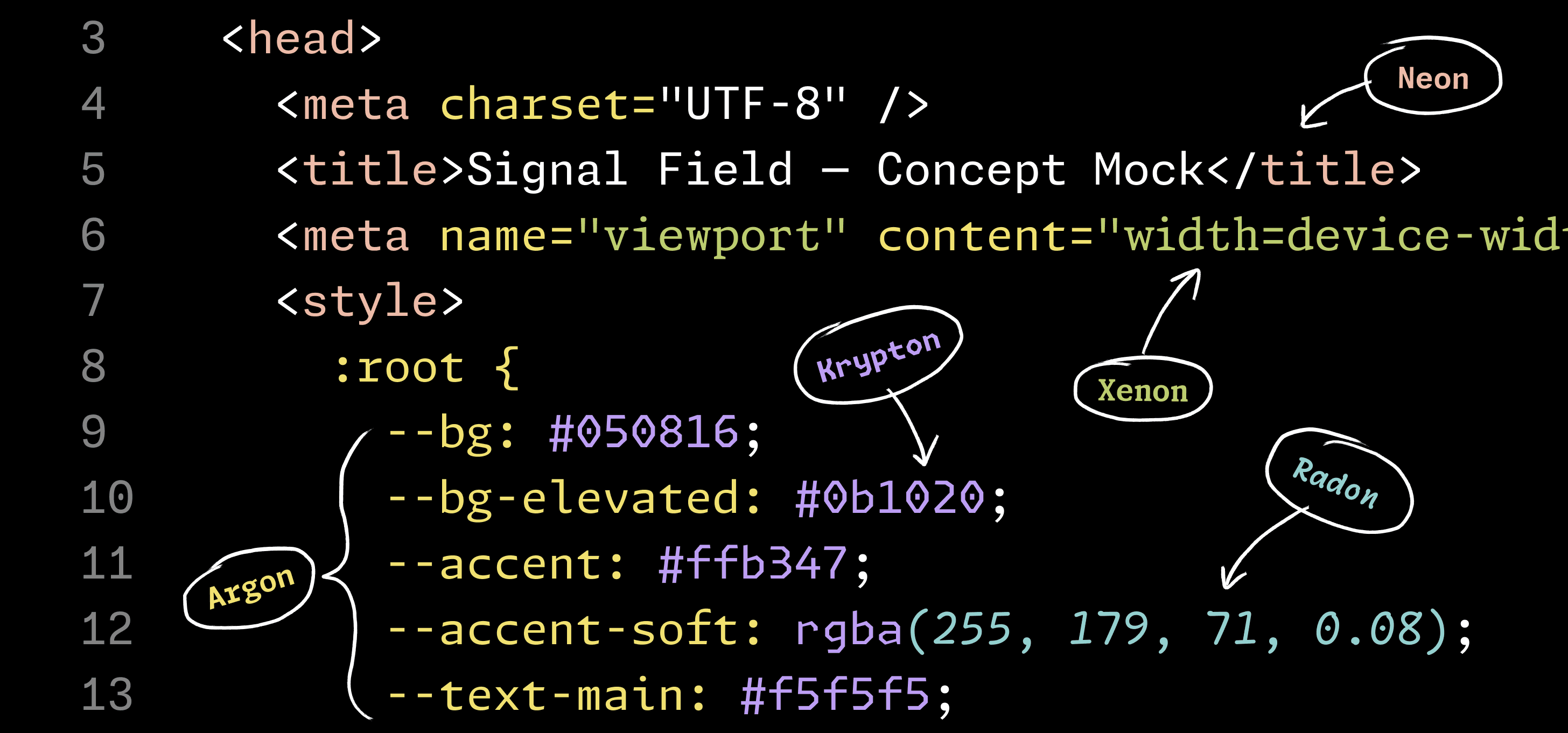
FIG. 16 — Monaspace’s shared advance width grid means it would be possible to mix and match multiple styles of type within a single document without breaking the monospaced grid that developers rely on.
Personalization
Our goal from the start was to provide a way for a reader to differentiate meaning in a code editor by seeing different genres of type mingling together in one document. This interchange-ability also allows readers to customize their coding fonts in an unprecedented way with their own choice of fonts with variable width, weight, and italic slant to suit their preferences and needs.
While other beloved monospace fonts exist, they are all built on different grids with different advance widths. This means it would be impossible to mix and match various monospace typefaces within the same project without breaking the monospaced grid, which keeps code tidy. Something special we are able to offer with Monaspace is a wide variety of styles and letterforms, all vertically and horizontally aligned on the same grid. This interchangeability offers the opportunity to create enhanced hierarchy of meaning.

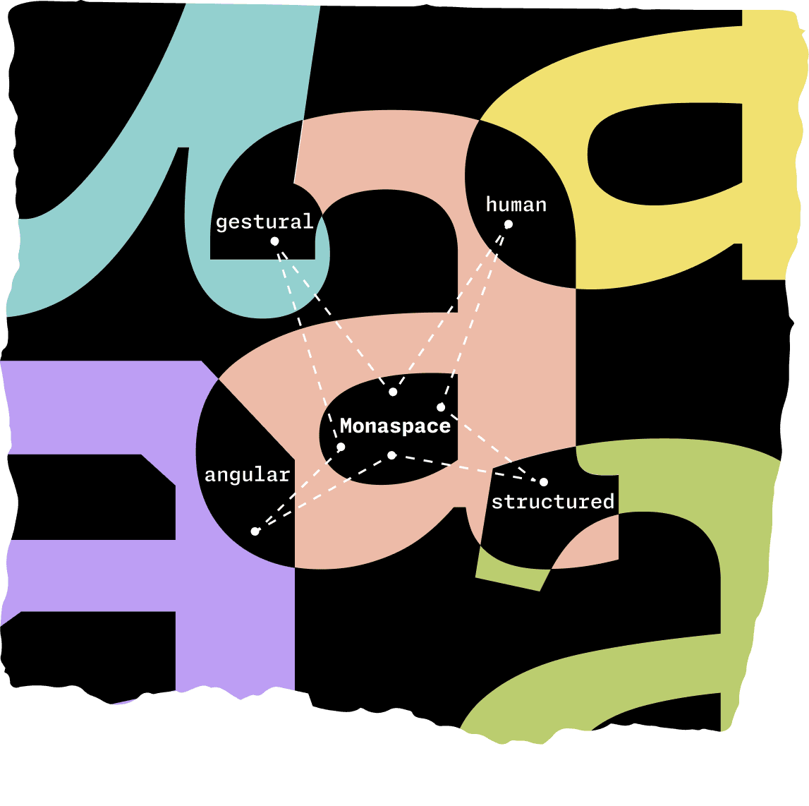
FIG. 17 — Each family in Monaspace is designed to provide another hierarchical layer of meaning beyond aesthetics alone. For example, the angular OCR-inspired Krypton is great for visually saying ‘this was written by a computer’, while Argon contains details inspired by calligraphy — evoking a human touch.
All of the Monaspace typefaces are available as variable fonts, meaning users have fine-tuned control over different aspects of their appearance via a slider. For all typefaces within the Monaspace superfamily, the qualities of weight, width, and slant exist on user-controlled axes. What’s more, the bounding boxes of all glyphs remain the same regardless of how heavy, light, or slanted the letters appear, meaning that you can have bold text next to hairline text next to italic text of one or more of the Monaspace typefaces all working together seamlessly in the same code editor, while still preserving the monospace grid.
We view the monospace grid as an asset rather than a limitation because it allows levels of interchangeability among fonts within the Monospace superfamily that have never before been tapped into, giving users opportunities for enhanced clarity when looking over their code.

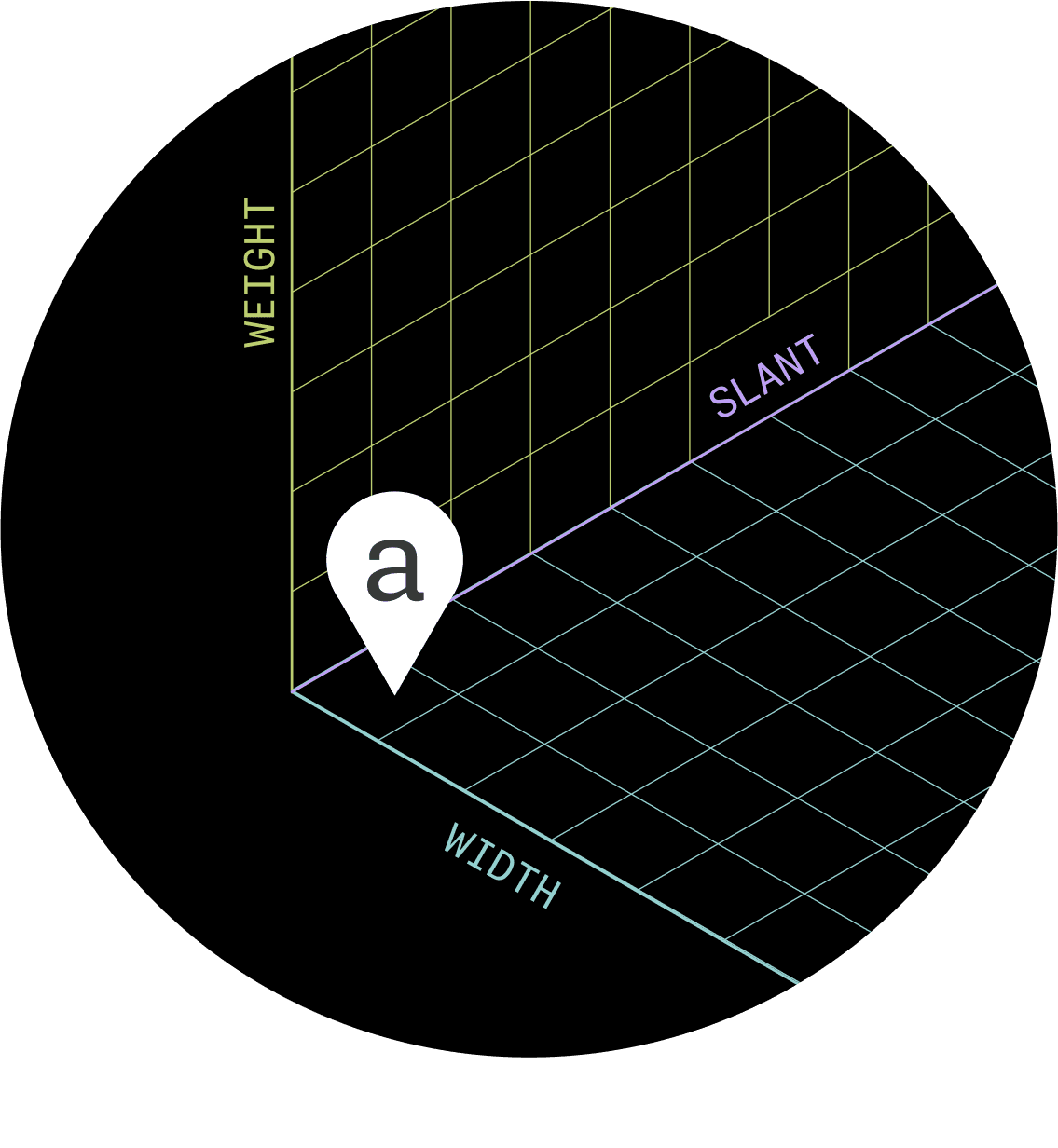
FIG. 18 — Monaspace lets users modulate three major characteristics of each of the five typefaces: weight, width, and slant. The variable font format makes it possible to customize each of these characteristics via sliders, giving users fine-tuned control of the appearance of their text.
From the very beginning of this project, going back as far as the original pitch, we knew wanted to incorporate accessibility features as a standard within the Monaspace type system. What are the ways in which a developer might customize the appearance of their code to accommodate their individual needs?
If a developer who has low vision chooses to use Monaspace in their code editor, they can adjust various settings to benefit their reading experience. With control over weight and width, it may very well be that they can reduce the overall point size of their type, see more on screen, scroll less, and interpret meaning more quickly.

Additionally, it could be helpful for people who have color blindness, for instance, if we can create hierarchy that does not rely on color at all. With the Monaspace type system it’s entirely possible to build that hierarchy through the seamless mix and match of typefaces and weights.
In many ways this is a return to form for typographic hierarchy, both within typesetting history and the history of editing code on a screen itself. All of these features work in service of helping developers find a typographic voice in their code editor that suits them best, regardless of if they have low vision, colorblindness, or typical sight. Too often accessibility features are an afterthought in the design process, which can lead to slapdash results. That’s not how we think about accessibility at Lettermatic. For us, accessibility is the foundation of any successful typeface, and that is certainly the case for the Monaspace type system.
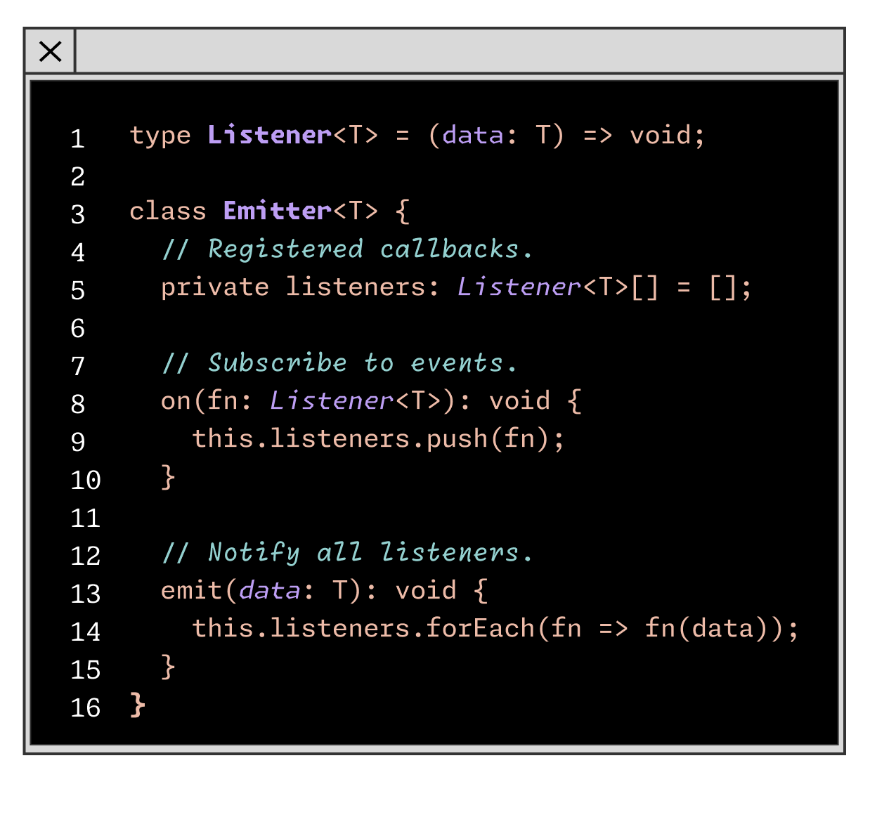

FIG. 19 — In addition to weight, width, and slant variable controls, users can also mix and match several sets of coding ligatures and activate character variants. Shown above are just a few samples of how users can customize all types of glyphs: arrows, numbers, letters like 'l' to help distinguish them from '1', html ligatures, and even a five- or six-pointed asterisk, depending on what they prefer.
At the heart of Monaspace is the idea that developers should be able to customize their coding typefaces in a way that works for them as individuals. In addition to the ability for users to customize weight and width to best suit their needs, Monaspace contains a wealth of personalization options in every family and style that can be mixed and matched as desired. Texture Healing, for example, is recommended for maximum legibility, but can be toggled on and off.
There are also nine categories of character variants, letting users personalize how certain letters, symbols, and even the zero appears in their code editor: each style of Monaspace includes a dotted zero, a slashed zero, a reverse slash zero, a cut-out slash zero, or a traditional zero. Users can even personalize the alignment of an asterisk and how many points it has (five or six). Each of these categories of personalization options can be endlessly mixed and matched to create the ideal experience for any user.
Every programing language has pairs of symbols that often appear together called ligatures, so we added almost 100 custom ligatures to visually improve these pairs automatically. For example typing --> swaps in a fully drawn arrow, strings of ### become connected, and === is replaced with a triple stroke equal sign, to name just a few. These ligatures are all controlled with OpenType, so users can mix-and-match to best suit their preferences and needs. There are ten separate categories of ligatures alone that can be individually enabled, giving developers control to personalize those settings to best suit the language and project they’re working with at that time.


The initial Monaspace release supported over 200 languages, a standard for all Lettermatic typefaces. Additional support for Cyrillic, Greek, and Vietnamese character sets across all typefaces and styles has arrived with the latest Monaspace 1.4 update. These new additions bring the total amount of supported languages in each style to just over 220. The team at Lettermatic worked with independent consultants who specialize in each of these alphabetic systems to ensure these additions are high quality and extremely legible within the monospaced system.
The 1.4 update represents a total of over 6,400 completely new drawings added to the Monaspace superfamily. We are very excited to have this update in the world representing a larger set of languages, allowing even more users a deeper level of customization while they write code and make other beautiful and interesting things.

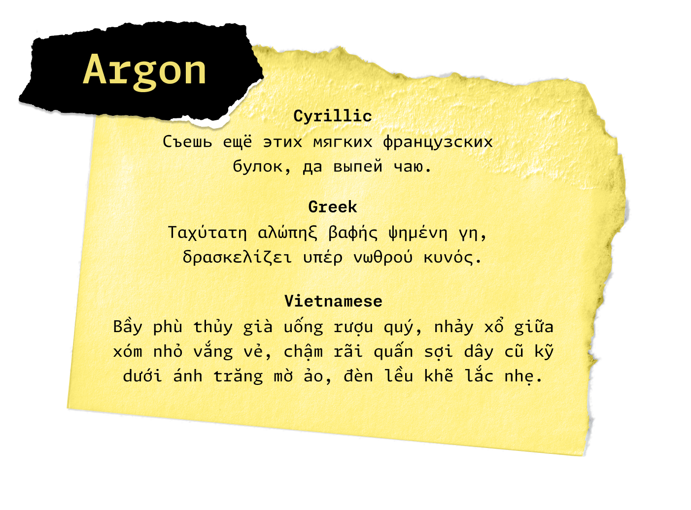
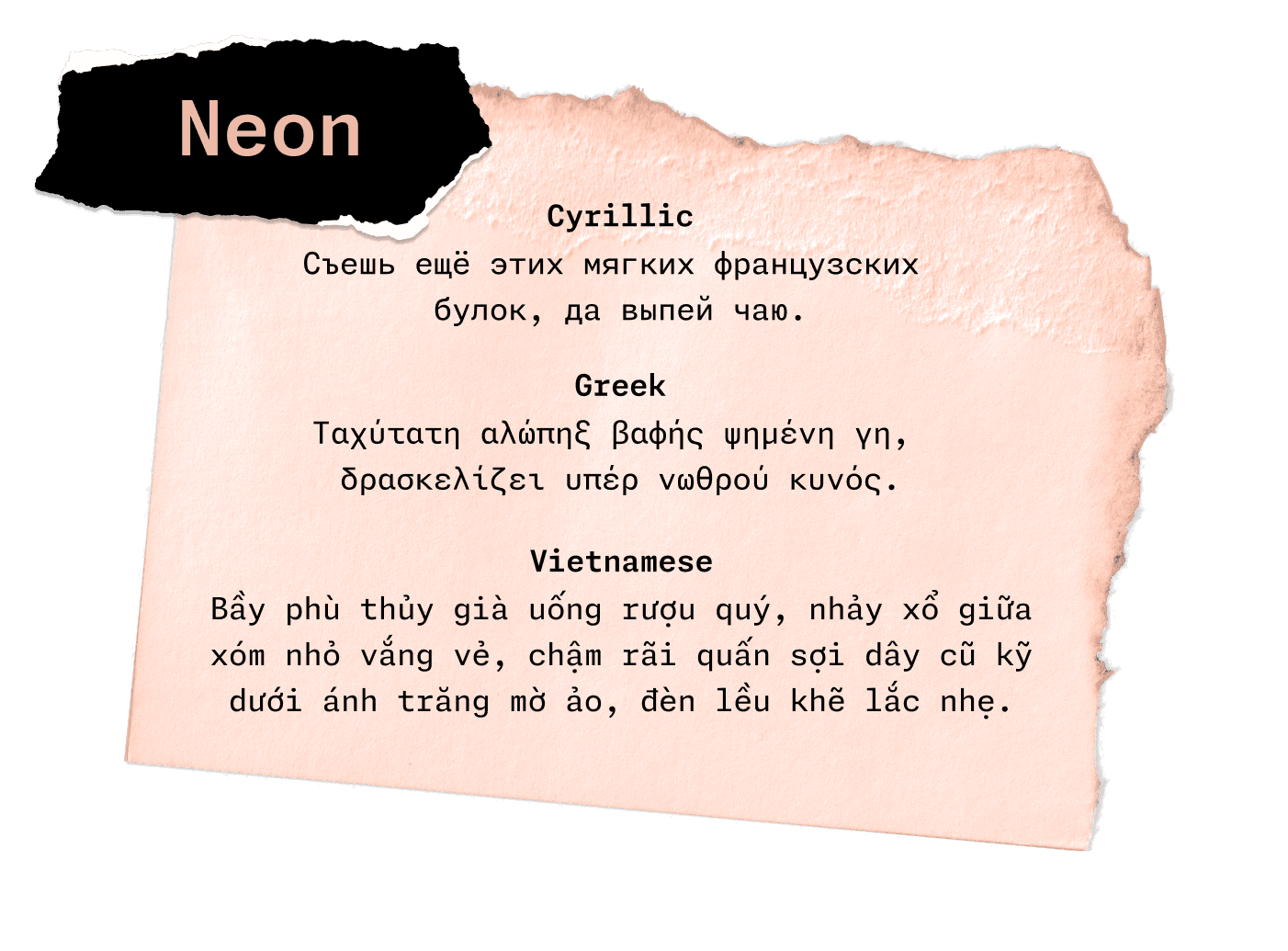
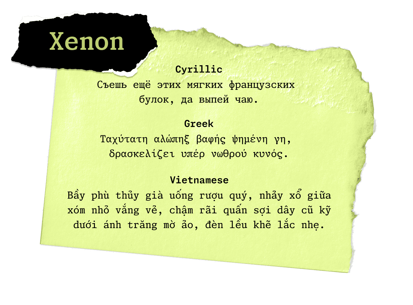
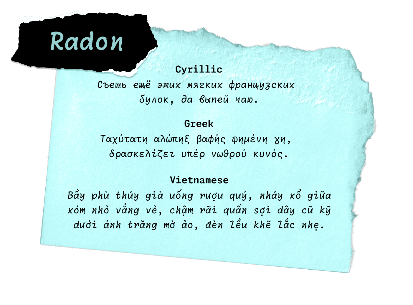
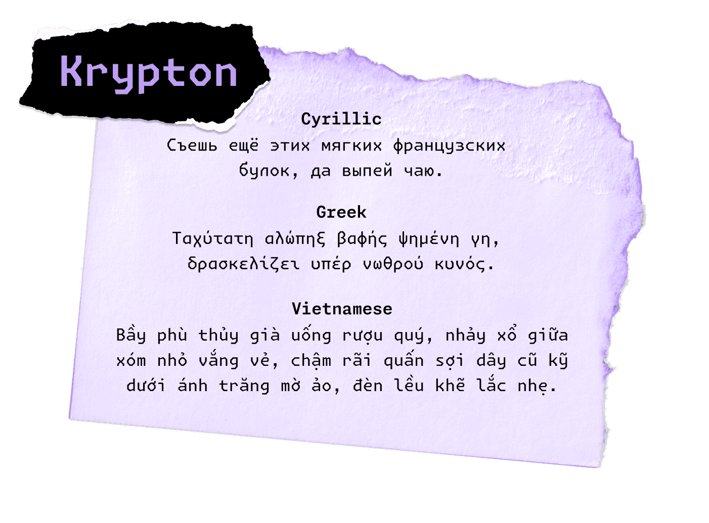
At Lettermatic, we want all people using our typefaces to have the same top-notch experience, independent of what language they happen to be using. With this in mind, we knew that all languages in the Monaspace type system would include Texture Healing. One of the most rewarding moments of this work was testing Texture Healing for the first time in languages that use the Cyrillic alphabet. Because there are multiple glyphs with wide stances in Cyrillic-based languages, we’ve found that Texture Healing makes a significant improvement in the legibility of words. After seeing the beautiful results of texture-healed Cyrillic, we couldn’t wait to implement the same feature in the other language additions. Cyrillic, Greek, and Vietnamese in the new Monaspace 1.4 release include Texture Healing in all styles.

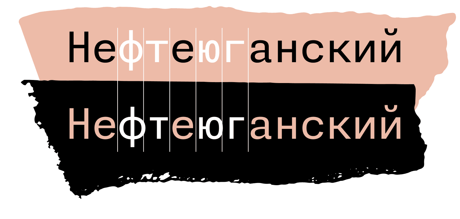
FIG. 20 — The Monaspace 1.4 release will include new support for Cyrillic, Greek, and Vietnamese languages. Texture Healing benefits Cyrillic-based languages in particular, and will be included by default in the upcoming release.
In addition to supporting Ukrainian, Russian, Belarusian, and several other Cyrillic-based languages, every Monaspace family also includes localized support for Bulgarian and Serbian, with alternates specific to each language. The Cyrillic alphabet shares a common historical reference point with Latin in that they both have been influenced by the Greek alphabet, but Cyrillic is a younger set of alphabets. Because of this more recent development, languages that use the Cyrillic alphabet have unique drawing conventions in their respective languages and regions. For example, the Cyrillic letter De (derived from the letter Delta in Greek), has a flat top Д in its Russian form, but appears as a triangular-topped form Д in Bulgarian. Including these form variations adds another level of customization capabilities, so every user can choose what represents them personally as they use Monaspace.

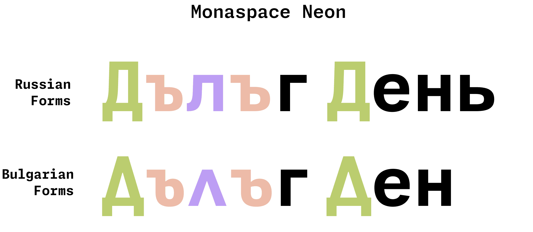
Fig. 21 — As part of the new Cyrillic support in all Monaspace styles, users can select either Bulgarian or Serbian alternates for a more personalized experience in their preferred language. These features are available through Character Variant settings.
All in all, Monaspace contains tens of thousands of symbols and shapes. When deciding on the scope of Monaspace’s character set, we prioritized symbols people might find useful. Our first release began with a basic set of math and punctuation symbols, and we expanded from there.
We wanted to make our offering of symbols to feel like a complete set to users. Take superscripts and subscripts used in mathematical notation, for example. Only about 85% of superscript and subscript letters have unicode values assigned to them. In our process of adding those to Monaspace, we also included all other letters as superscripts and subscripts, just to future-proof our work. Similarly, we added the entire alphabet in a blackboard bold style. Should someone want any given letter as a superscript, subscript or in a blackboard bold style in the future, inside or outside of mathematical contexts, it will be there waiting for them in the five different typefaces that make up the Monaspace type system.

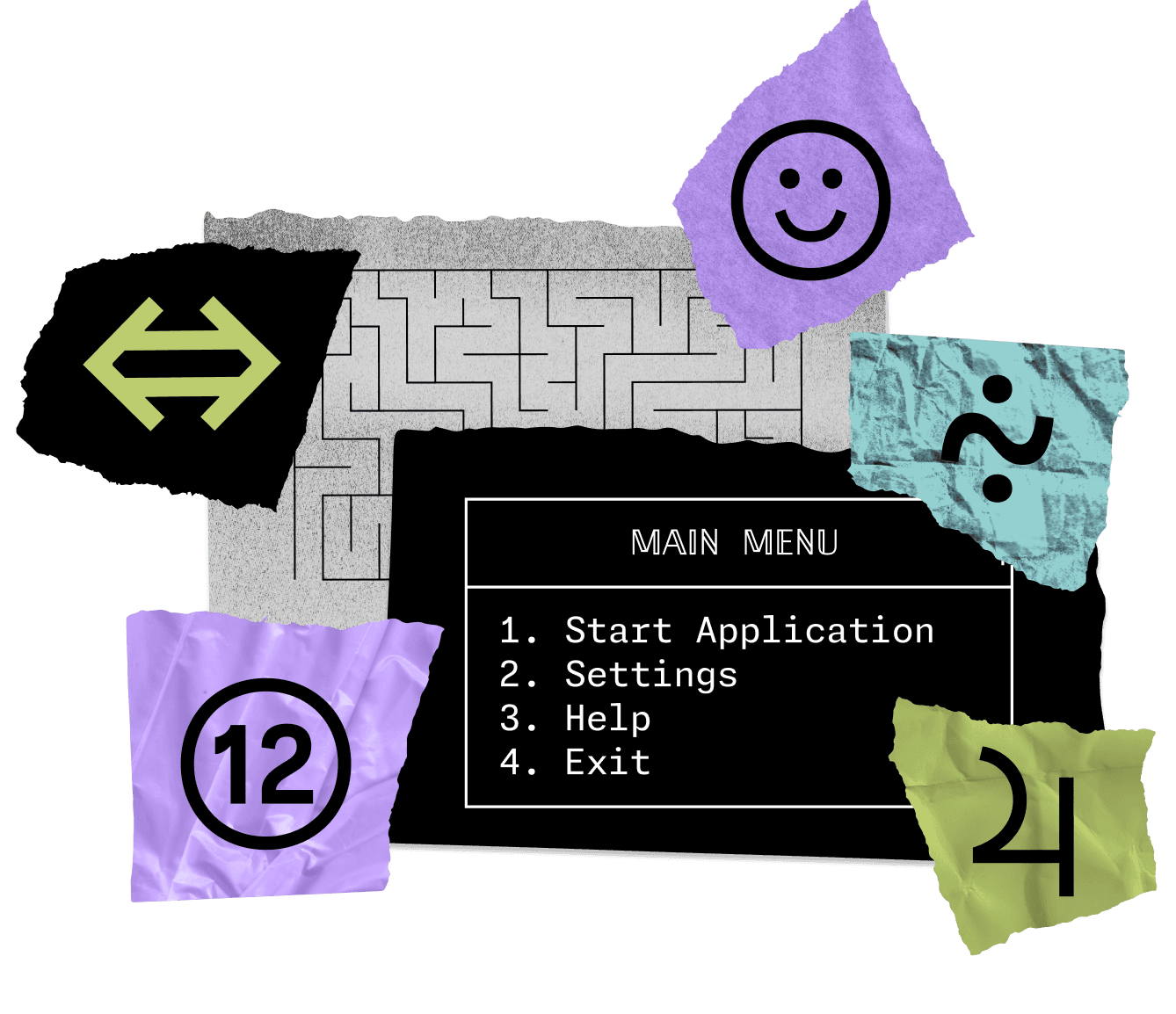
FIG. 22 — The massive symbol set in all Monaspace styles lets users draw their own tables, menus, or even mazes, include emojis to show feelings about certain lines of code, notate complex mathematical equations, and write anything in a complete superscript alphabet.
Knowing that the fonts would be mostly be used for programming, we added box-drawing characters to allow users to create tables in their code editor, as well as lots of geometric shapes and pictographic symbols that might be useful to users in their work.
Another addition to the Monaspace is a complete set of symbols for the International Phonetic Alphabet, or IPA, across all styles. The IPA is commonly used in the field of linguistics, in pronunciation keys in dictionaries, and by vocal performers to aid them in pronouncing words in foreign languages accurately when they sing.

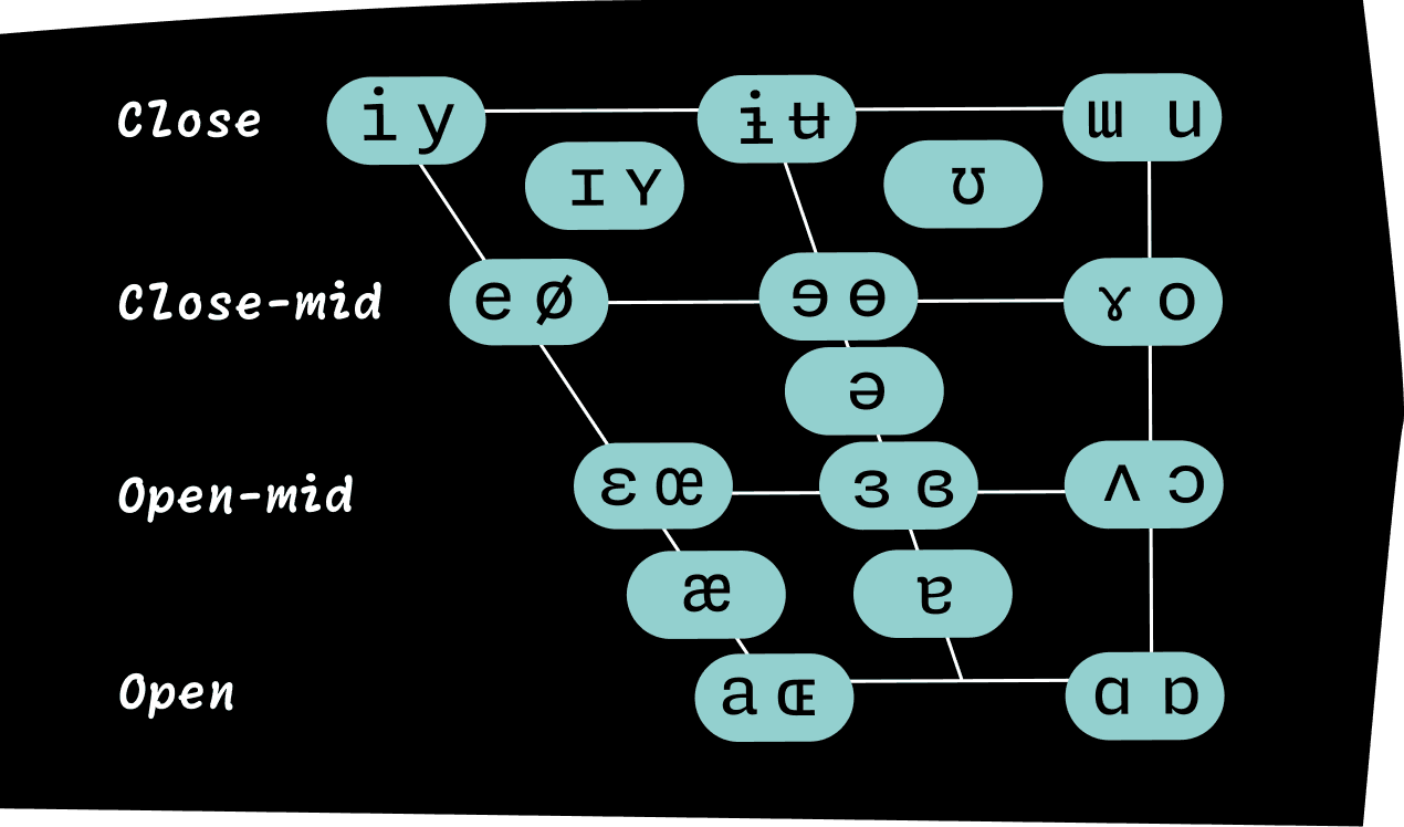
FIG. 23 — In the IPA Vowel Chart above, Monaspace Neon diagrams vowel sounds according to their placement within the mouth. All five typefaces within the Monaspace superfamily will support the International Phonetic Alphabet as part of the upcoming 1.4 update, expanding the language support Monaspace offers even further.

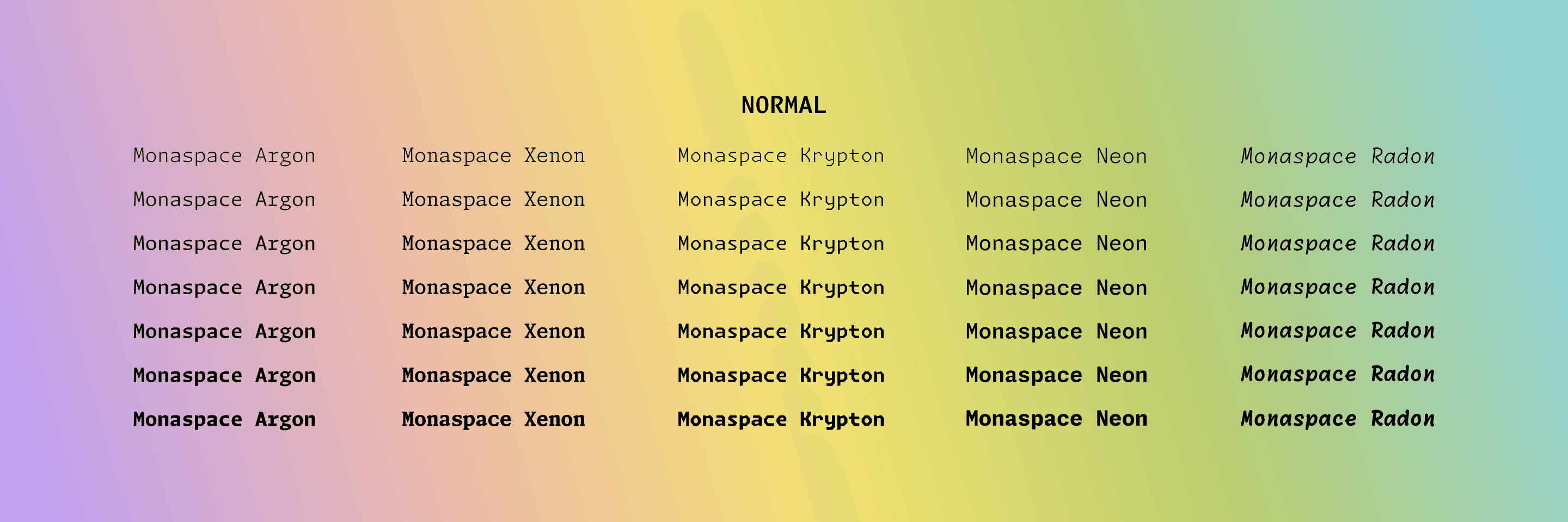
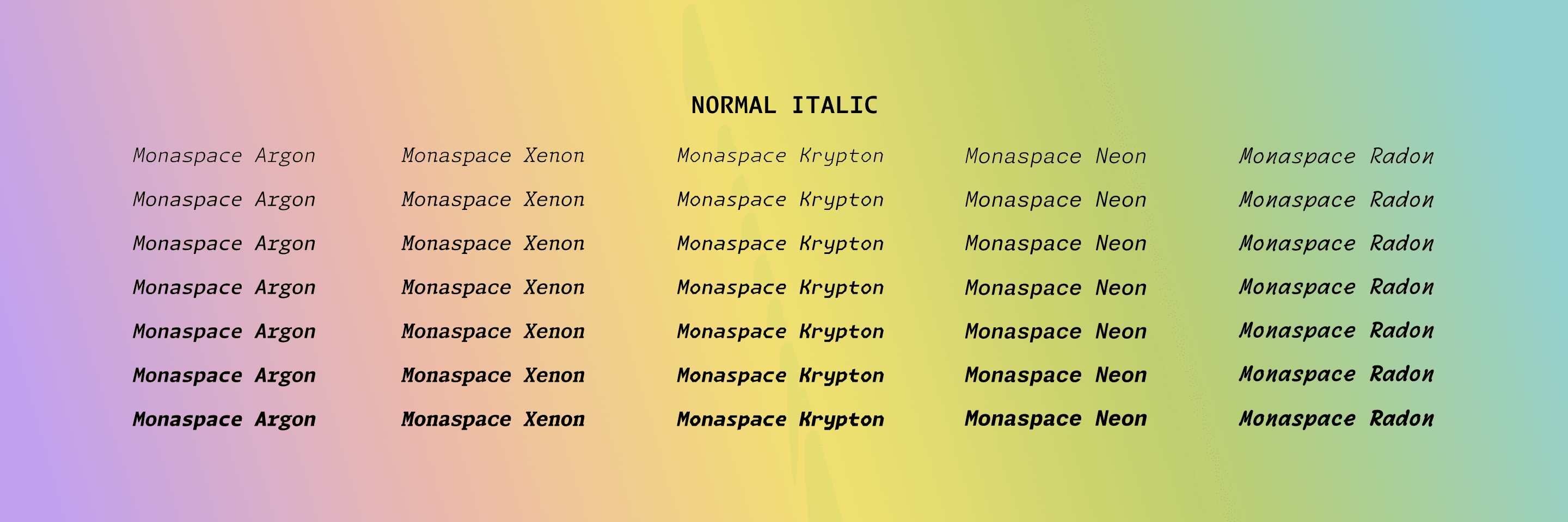
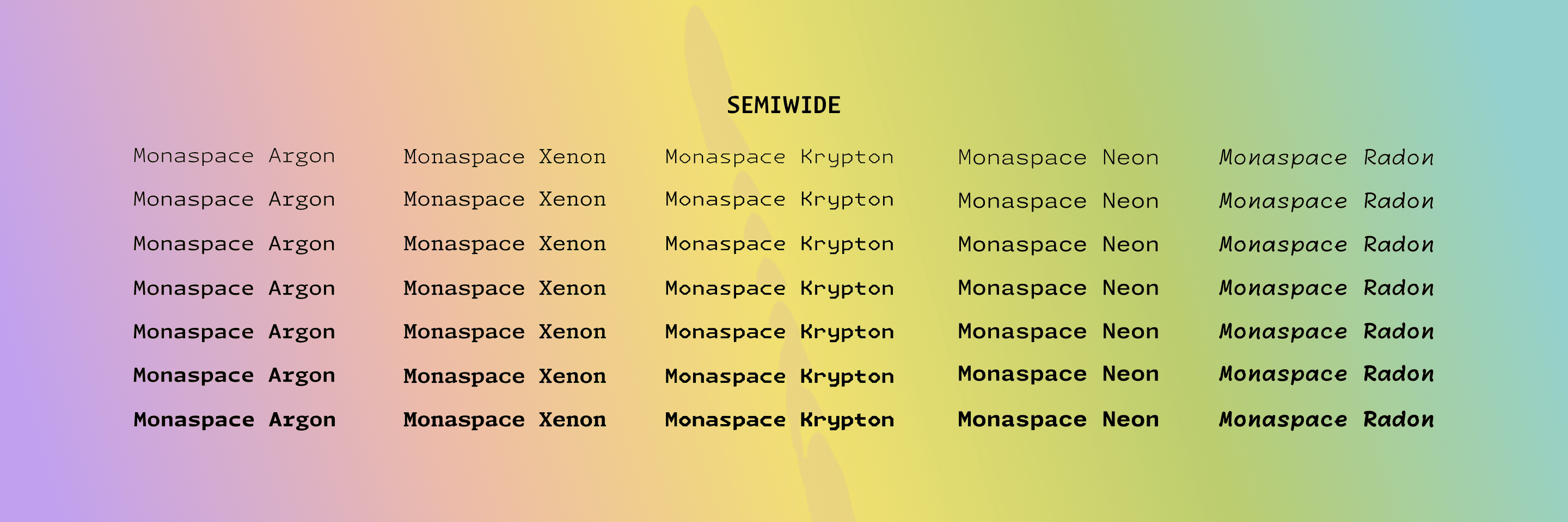
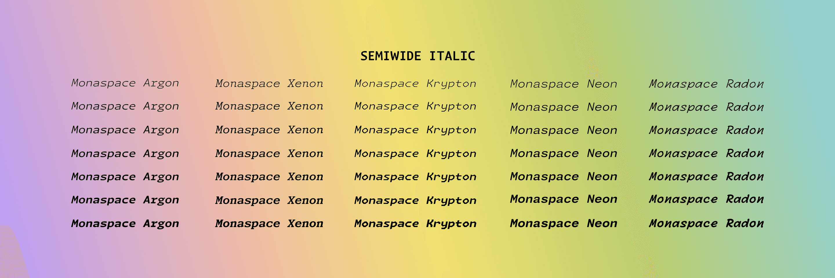
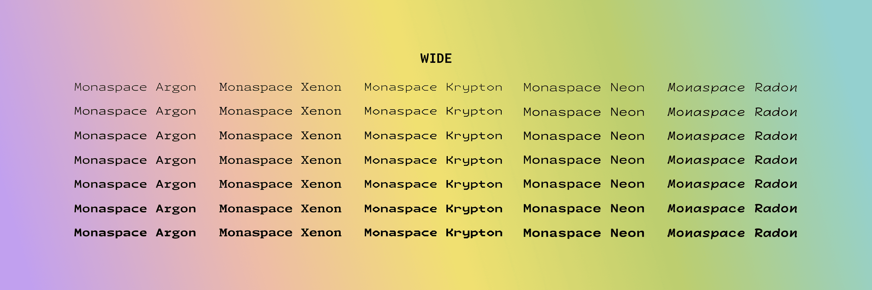
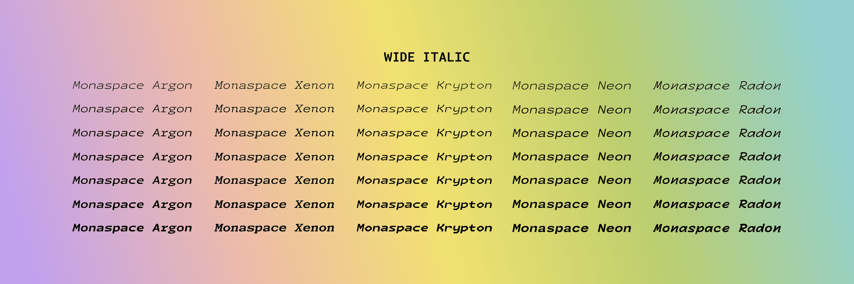
FIG. 24 — All five families in the Monaspace system contain options for width (ranging from Normal to SemiWide to Wide), weight (ranging from ExtraLight to ExtraBold, with many weights between), and slant (or, italics). Monaspace is available in both Static and Variable font formats. The Static fonts have predetermined styles along these axes, while the Variable fonts give users access to the full range of widths, weight, and slant to deeply personalize the appearance of the Monaspace styles.
In total, Monaspace contains nearly three-quarters of a million glyphs. The entire Monaspace type system is open source, in line with GitHub’s foundational belief in the open source mission. This means all of the typefaces in Monaspace are available to download for free to anyone with an internet connection. It also means that developers can add any additional glyphs they might want included in the Monaspace typefaces, should they wish to make contributions, for all Monaspace users, or just for their own private use. Additionally the open source nature of this project means that even the code that makes Texture Healing possible is publicly available.
In designing Monaspace, we have learned a great deal about how the monospace genre works, what it does well, what it doesn’t do particularly well, and how to ‘heal’ its flaws while no one is watching.
We’ve found ways to provide extra clarity between typographic voices, when mixed concurrently in one document. We’ve found a neutral set of styles for the ‘center’ of the spectrum, and departed further towards various kinds of experimental voice from that calm and predictable anchor. We have designs which could reasonably be your primary font in an editor, and designs which shout ‘I am not typical!’ in a convenient way. We have found ways to add voices to code which are more human, and voices which are more distinctly mechanical. We have given developers something expected, and unexpected, with the hopes that both will be useful to them in the future.
The Monaspace type families are open source, and available for anyone to use thanks to GitHub. Download them here, and we hope you’ll enjoy using them as much as we enjoyed building them.