custom fonts for


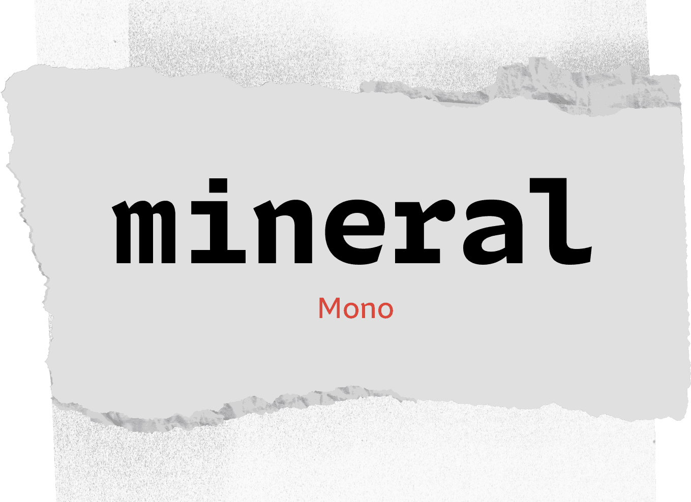
A LETTERMATIC CASE STUDY: PORTAMENTO
By Riley Cran

When Lettermatic was commissioned to make a custom type family for Google Developers, my mind drifted to code. There is a natural psychological connection between ‘computers’ and ‘monospace fonts’, via the way code has been rendered on screen since people first began seeing code at all. The brief mentioned that a monospace was interesting to them, and it further added the direction that a typeface that ‘feels like code’ was the goal. The result is Portamento, a type family with a wide variety of styles, and a design process anchored in engineering. Naturally I didn’t want to get it wrong. Here’s the story of how I created a process that helped make sure I got it right.
Information
- Released:April 2021Lead Designer:Riley Cran№ of Styles:98Classification:Sans Serif№ of Families:3Contributing Designers:Heather Cran, Dave Bailey, Danelle CheneyCase Study Design:Anna Thomas
Google Developers provides a variety of resources, including documentation, tutorials, code samples, and support forums, to help developers build applications that integrate with Google services. Additionally, Google Developers hosts events such as hackathons, developer conferences, and code labs to bring developers together and foster collaboration. When I see a list like this, I begin thinking of how much typesetting is involved in these pursuits, and how a type family might be made to help the talented folks at Google Developers speak to their wonderful community. In addition to these resources and events, they also cultivate and support developer communities around the world.

FIG. 1 — Comparison of Portamento’s Proportional fonts with Portamento Compressed (left) and Portamento Normal (right).
To explain how this typeface came to be, I am going to walk you through the underlaying ideas, in the order I dreamed them up. I had never designed a monospace typeface when this project began, and so I began daydreaming about how I would go about it. Most typefaces are ‘proportional’, which means that each glyph in the typeface is permitted to be any width that suits that glyph. A monospace typeface is one in which every single glyph in the typeface has a fixed width which cannot waver, in order to create the organized rows and columns of code.

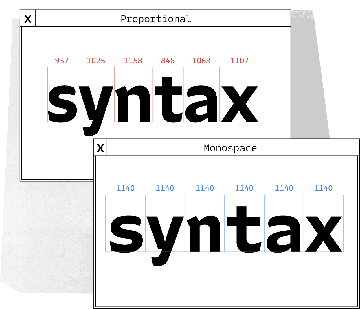
FIG. 2 — Comparison of Portamento’s Proportional and monospace fonts with Portamento Proportional (left) and Portamento Monospace (right).

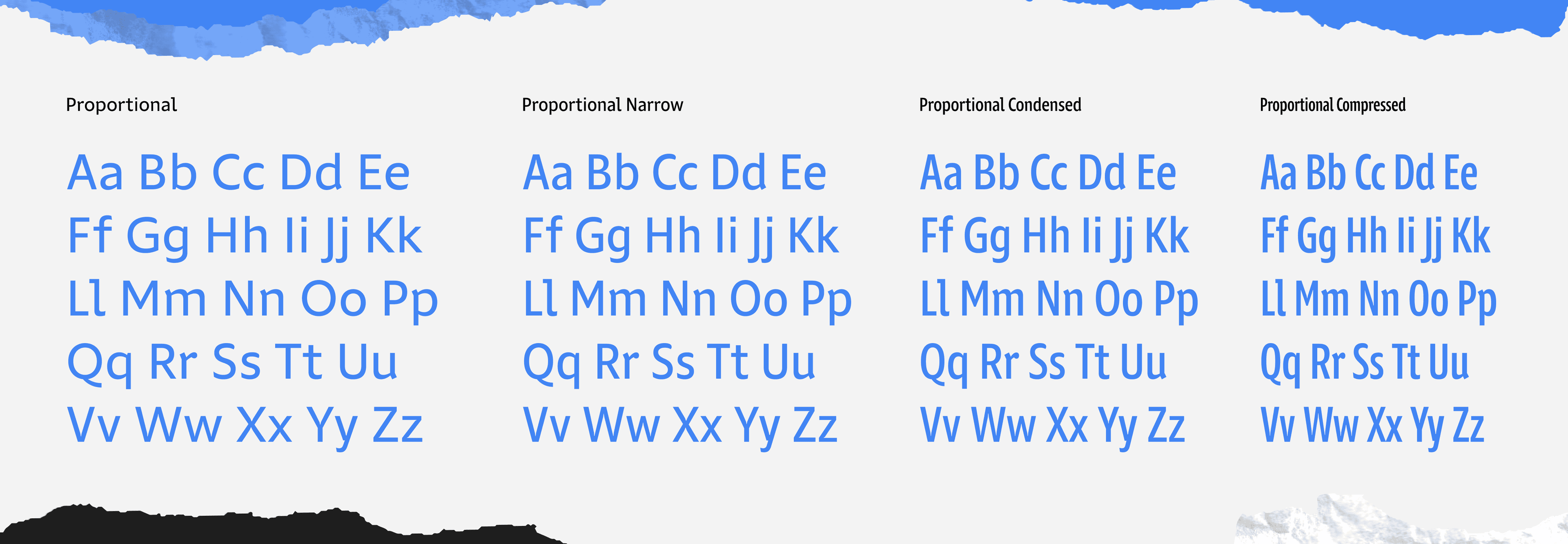
FIG. 3 — Comparison of Portamento’s Proportional fonts progressing from Normal to Compressed.
I first imagined the constraint of the monospace width, this immovable fixed space in which all the glyphs must exist so that they can achieve the orderly appearance of code in an editor. I pictured a piece of paper with the containing boxes drawn in advance, on which I would be drawing sketches. I imagined the idea of needing to make letters wider or narrower to make them fit, and how natural that would feel to me after having drawn typefaces with a range of widths before. I knew how to make letters wider or narrower, and that should help with this process of making them a very specific width… right?

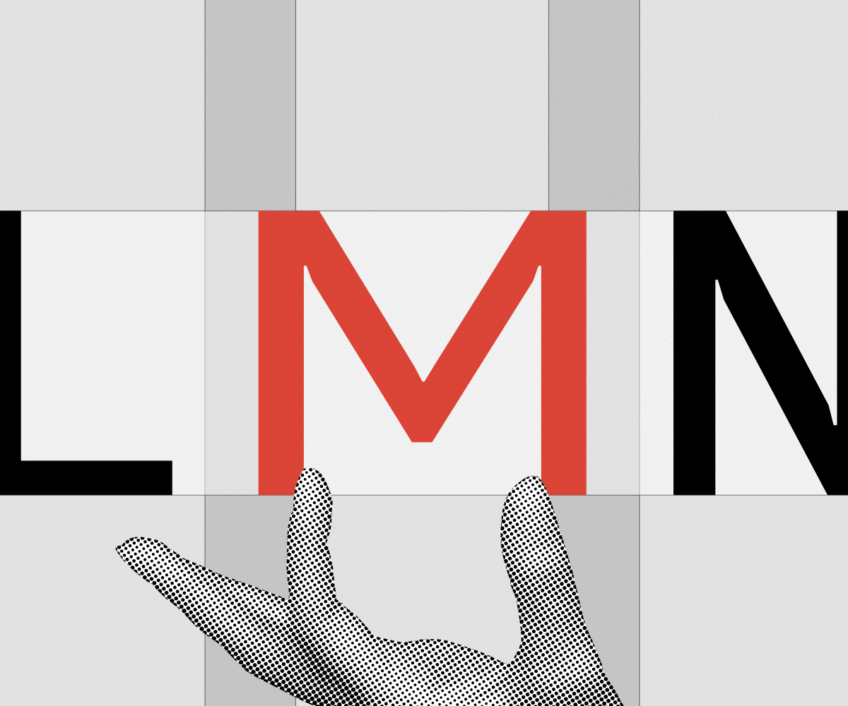
FIG. 4 — The constraint of a monospace typeface means that all letters must fit within the same width.
The more I thought about it, the more I began to see animations play out in my head, of a letter that changed in width until it slotted perfectly into the allotted space. Rather than distorting the letters to be wider or narrower by stretching or squishing them, they would be redrawn carefully to have the right appearance of width. When it occurred to me that I was often imagining this as an animation, where the letters drifted from one extreme of width to another, it made me wonder: what are those extremes exactly? If I drew those, could I convince a computer to assist me in making a monospace? And this is precisely how Portamento was made.

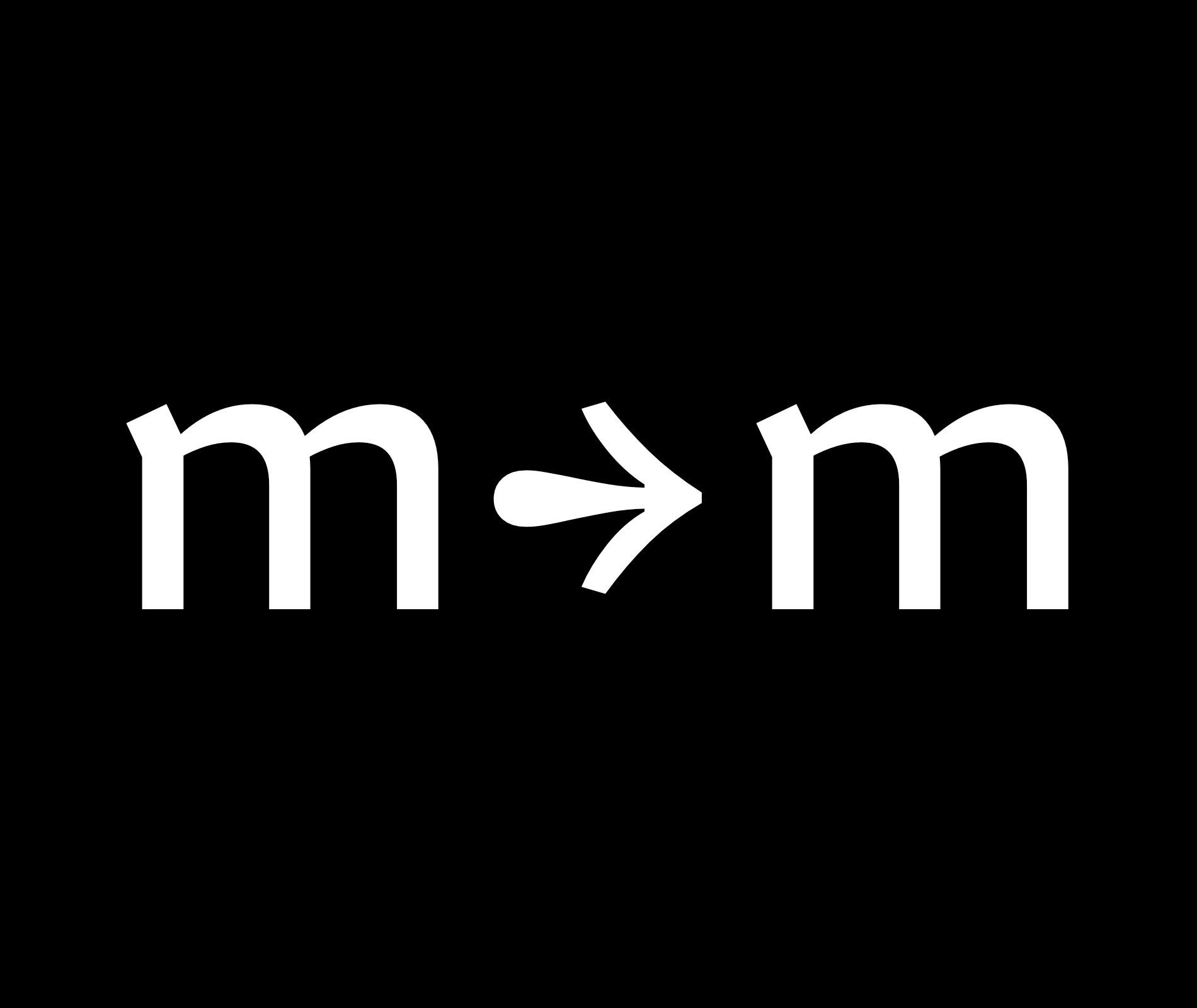
FIG. 5 — Squishing letters to fit within width constraints distorts the letter. Instead, letters must be drawn to fit within the width.
In typeface design we often leverage the concept of interpolation, which in this situation means ‘we blend two vector drawings of letters together to produce a drawing in between’. In most typefaces, this technique is used to create a range of weights from lightest to boldest, by drawing only the extremes at either end of the range. Sometimes we arrange these so that a typeface has a ‘width’ axis. We would draw the narrowest and widest versions, for instance, and then blend them to produce the widths in between. This typically means we’re taking an entire character set of glyphs, and interpolating them at the same value. But what if the interpolation was done uniquely for every glyph?

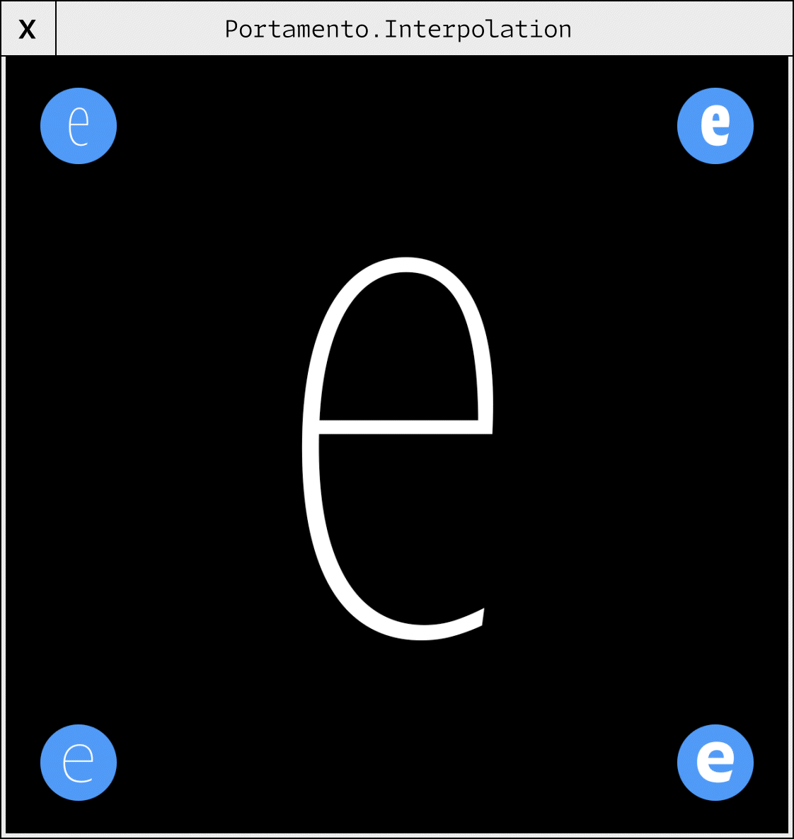
FIG. 6 — Portamento Proportional’s interpolated landmarks range from wide to narrow widths and light to heavy weights.
At some point it started to feel natural, that this process of making a typeface for a platform of developers would involve writing code. I began imagining the project as a fully proportional typeface, made with the same level of care that Lettermatic applies to all of our projects. But, through the lens of a custom piece of software, this proportional typeface would be carefully translated into a monospace design, with the same underlaying DNA of shapes and harmony inherited from the ‘parent’ design.

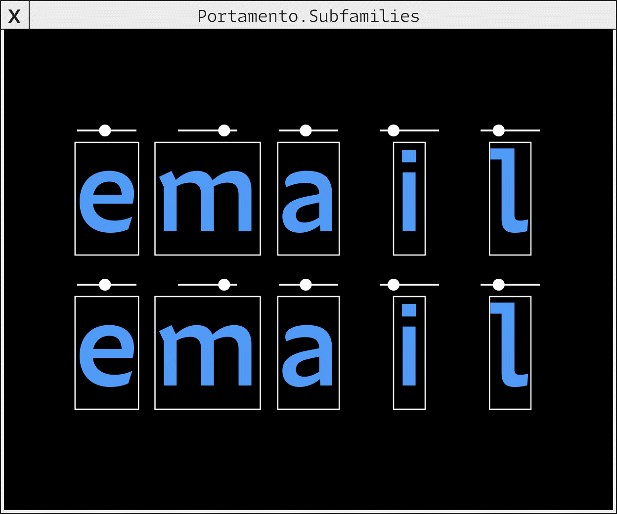
FIG. 7 — Portamento’s Mono inherits all of its shapes and harmony from the Proportional family within the width constraints of a traditional monospace.
Imagine an alphabet that is very narrow. And imagine a companion alphabet that is sufficiently wide. Imagine we briefly borrowed just the two drawings of ‘a’, and we asked a piece of software ‘at what ratio would I need to blend these, to give me a version that is precisely as wide as the monospace glyph width I am aiming for? And then imagine this same logic applied to ‘b’, and then to ‘c’. And then to hundreds of other drawings, until the entire proportional design has been utilized as a dataset to create a completely new monospace typeface which is wholly derivative of a proportional design. This way the deliverable to Google Developers could include proportional fonts (suitable for long-form reading) as well as monospace fonts (great for code). I presented a diagram to Google which featured a flow chart of the design process, including a mysterious stop along the flow chart’s path simply labeled ‘computer magic’, representing this way I would convince a computer to assist in this process.
This was now a project where its fundamental identity was wrapped up in engineering. This would be a collaboration between myself and my code, my computer and I dreaming up this design together. I decided that this typeface would need to be built of letters that dealt very well with being redrawn wider or narrower, where the function and charm of the letters wasn’t lost as they changed in width. I looked at it like picking what material to build an off-road vehicle out of. It should be made of metal, right? It should be strong and roll well with the punches, no matter if I’m driving it on a city street or a sand dune. These could not be fussy letters that have to be carefully coddled by someone typesetting them. They had to be capable and adaptable, even just purely via the nature of the engineering plan for the project — and drawing something in the genre of a humanist sans seemed like the fitting choice with that flexibility and strength in mind.

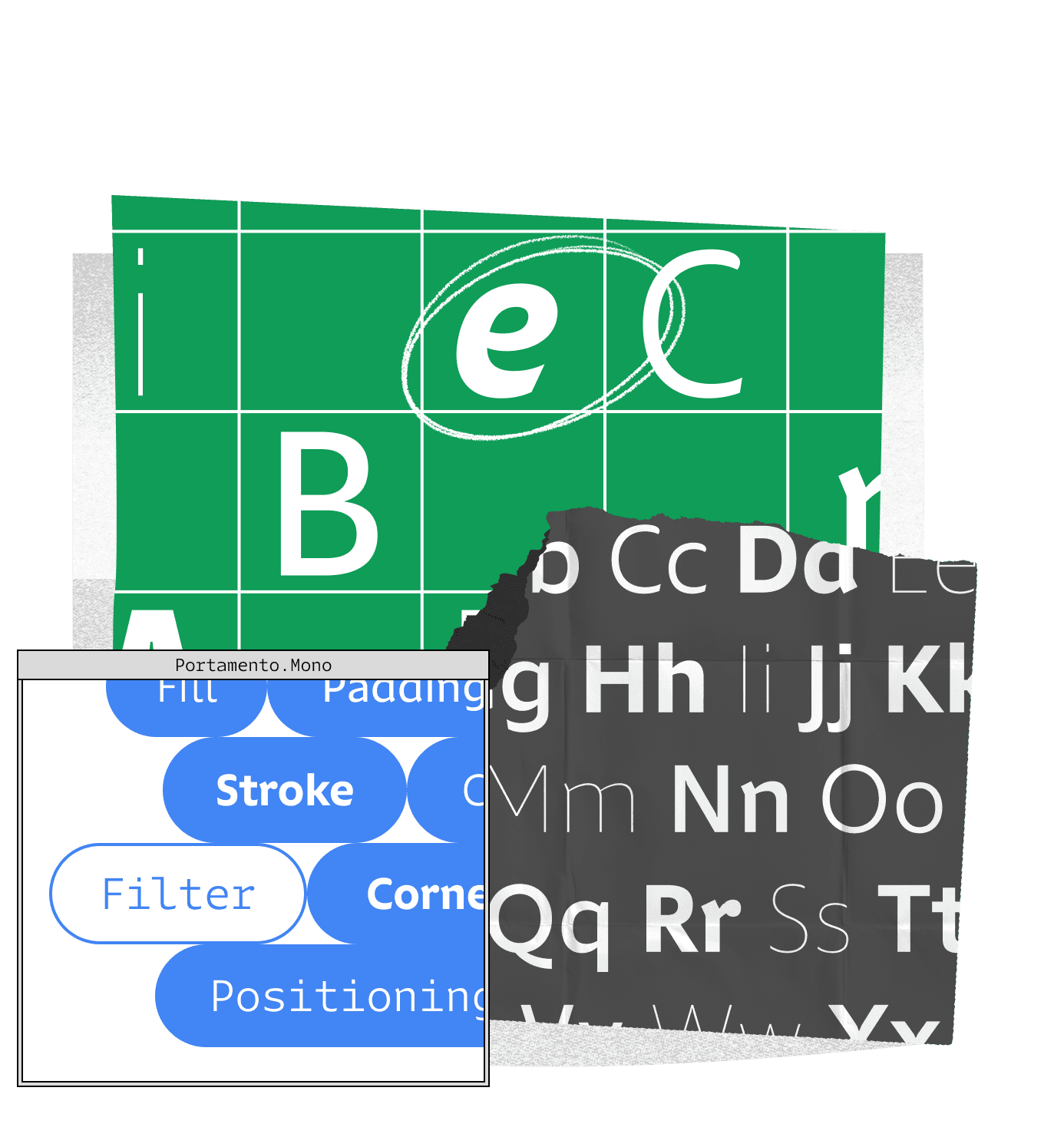
Portamento is a design which carefully dances around contradiction in its repertoire of shapes. Rather than aiming for monotony and same-ness, where one could produce a ruler and gauge the success of the design on how closely aspect 1 matches aspect 2, Portamento specifically punctuates words with systematic contradiction. I didn’t want to make a typeface that felt mechanical and heartless. I wanted to incorporate moments of charm and friendliness, where the forms were almost organic, and sometimes even calligraphic. Glyphs like ‘C’ and ‘G’, ‘a’, ‘c’ and ‘s’ all feature calligraphic, rounded terminations. But the dot of the ‘i’, the period, and the dot in the center of the zero are literal rectangles. It has occurred to me over time that there’s a certain magic of readability that comes from playing this tiny game with the reader’s expectation, and eschewing sameness for a controlled chaos — teaching the letters to cycle through a toolbox of harmonized difference to create words and sentences and paragraphs with rhythm and intrigue.

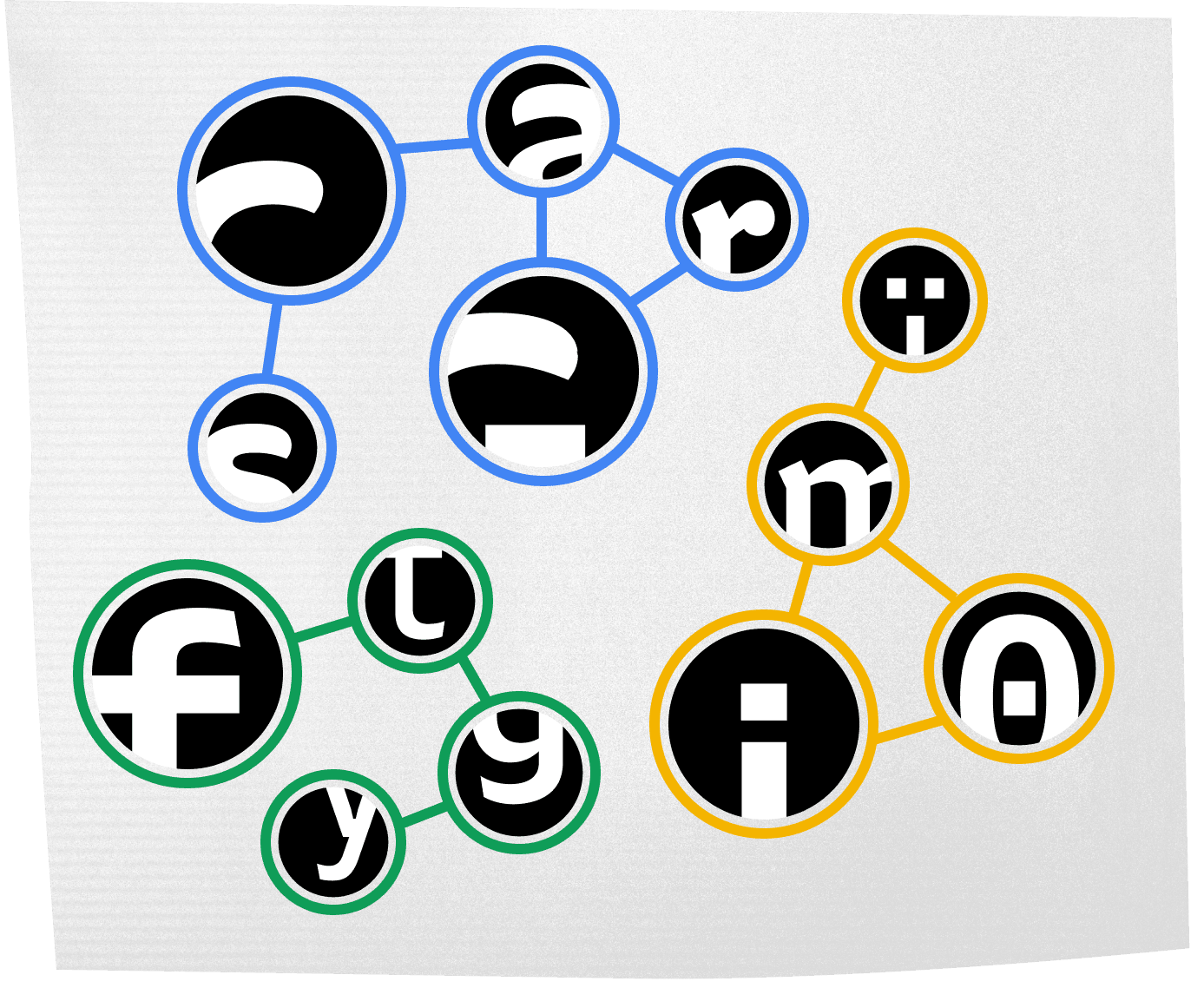
FIG. 9 — Portamento blends a constellation of shapes with rounded terminations (blue), rectangular features (yellow), and angular terminations (green).
One of the most rewarding aspects of this design process was when the software I had written began to reveal the monospace design to me. It felt sort of like watching bread rise; that thrill of knowing just hours ago that these were each isolated ingredients, and now their combination was something new and magical. As I improved the proportional design, I would continuously ask this code I’d written to synthesize a new monospace font that inherited all my improvements and changes. ‘Synthesize’ ends up being the perfect word here; assembling a list of individual parts and combining them into a whole. The moments of charm and character that were present in Portamento’s proportional parent designs were now finding their way into the monospace, where they provided disambiguation to help a reader tell one letter from another. Yet another moment that shocked me a bit was when I realized I’d spent an entire day coding software for this project while reading the beta fonts of Portamento Mono in my code editor. The fonts were now directly collaborating with me on the mission of bringing them into the world. I helped the fonts, and they helped me.

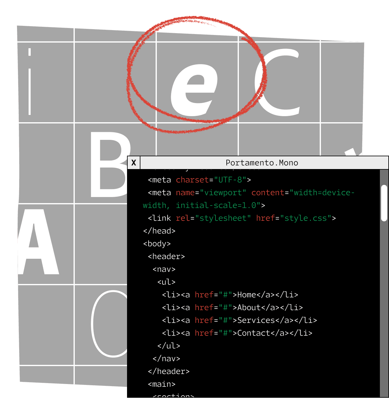
FIG. 10 — Portamento Mono was used in the process of making these fonts.
For some letters like ‘r’, ‘i’ and ‘j’, it was necessary to give Portamento the idea of an alternate letterform construction specifically suited to a monospace. These letters’ constructions help narrow letters to feel like they are taking up more space, as tends to be necessary when you ask a letter ‘l’ to take up the same width as a letter ‘m’. Slowly, I found ways to make construction changes that improved the texture of the monospace fonts, where the results still felt like Portamento.

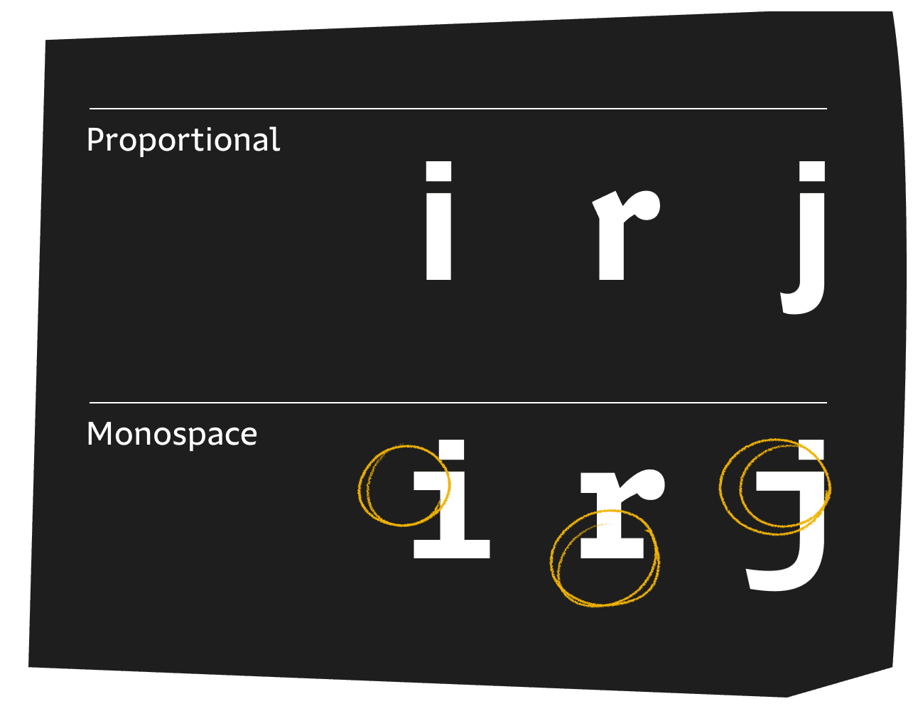
FIG. 11 — Some letters require an alternate letterform construction suited for a monospace.
Once the monospace design had arrived through the 1s and 0s of my computer, I started thinking about how profoundly different the texture of the proportional and monospace fonts were. Rarely can we compare, so directly, the consequence of asking every glyph to be a fixed width. But in Portamento the comparison is extremely direct — the monospace is literally derived from a companion proportional design. One design has inherited thousands of years of lessons on pacing and texture from generations of people making sentences and paragraphs, and the other is a much more recent voice of rigid and mechanical letters set at a fixed pace.

I thought back to the original brief: a typeface that ‘feels like code’. I was very intrigued by this phrase, because it implied the existence of something that was neither traditionally proportional or monospaced, but instead was some third thing. I began to imagine a design called ‘hybrid’, which began its life as the monospace, but had some clear departures. What if, where the monospace ‘m’ felt dense and compact in its monospace width (as every monospace ‘m’ tends to feel), this new hybrid design could let that ‘m’ breathe a little more. The lowercase ‘i’, forced to feel too wide in its monospace form, could be allowed to drift a little narrower. What if, instead of a single width for every letter, each glyph was instead sorted into 1 of 6 widths? The structure would still be very mechanical and organized, but the letters could be allowed to drift closer to their appearance in the proportional design. In this sense, this hybrid design would feel like code, inheriting ideas of form and texture from the monospace, but wouldn’t literally be like code, in that it wasn’t actually a monospace. Portamento Hybrid could be an impersonation of code, without all the textural baggage.

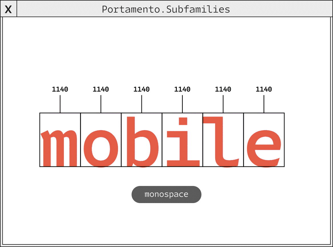
FIG. 14 — Comparison of the letter width differences between Portamento’s subfamilies.
And, perhaps most importantly, there would be no need to manually draw a single glyph in Portamento Hybrid. It could be derived through the same software mechanism that created Portamento Mono, by changing some values and helping my computer to understand what I was going for. I asked my code if it could please take the carefully drawn Proportional fonts, as a dataset, and produce a new family with the rules I had assembled for Portamento Hybrid. And there it was, on my screen, a new voice I had not originally anticipated. I would liken Portamento Hybrid to the dither of offset printing — its voice comes from mechanical rules, from the goal to produce something with machines that serves a purpose, and just as the rosette dither of a printed image at a distance become a smooth and interpretable image, Portamento Hybrid conceals the process of its creation completely when typeset in paragraphs of text. I absolutely love this design because I simply never would have thought to draw it, had it not been worked out as a collaboration between me and my code. I never would have drawn the letters at these proportions, and the overhead of work to create them was so high I may never have even tried. As I get older, I come to respect the relationship we have as creators to our tools more and more. Making my own tools has allowed me to create things that I never otherwise would have made.

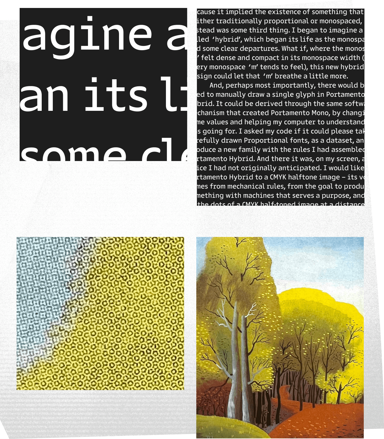
FIG. 15 — Top: comparison of Portamento in detail and in paragraph text. Bottom: comparison of printing detail and completed work of Poster for London Transport by E. McKnight Kauffer (Color in Advertising, 1956).

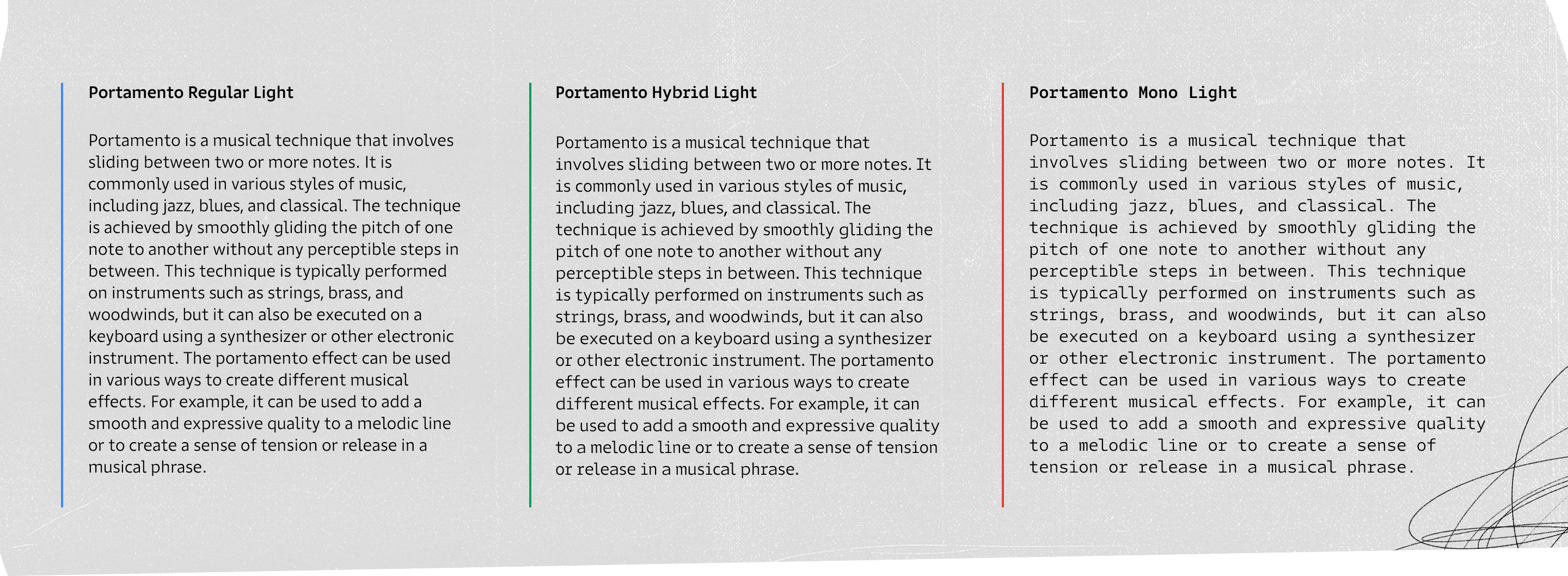
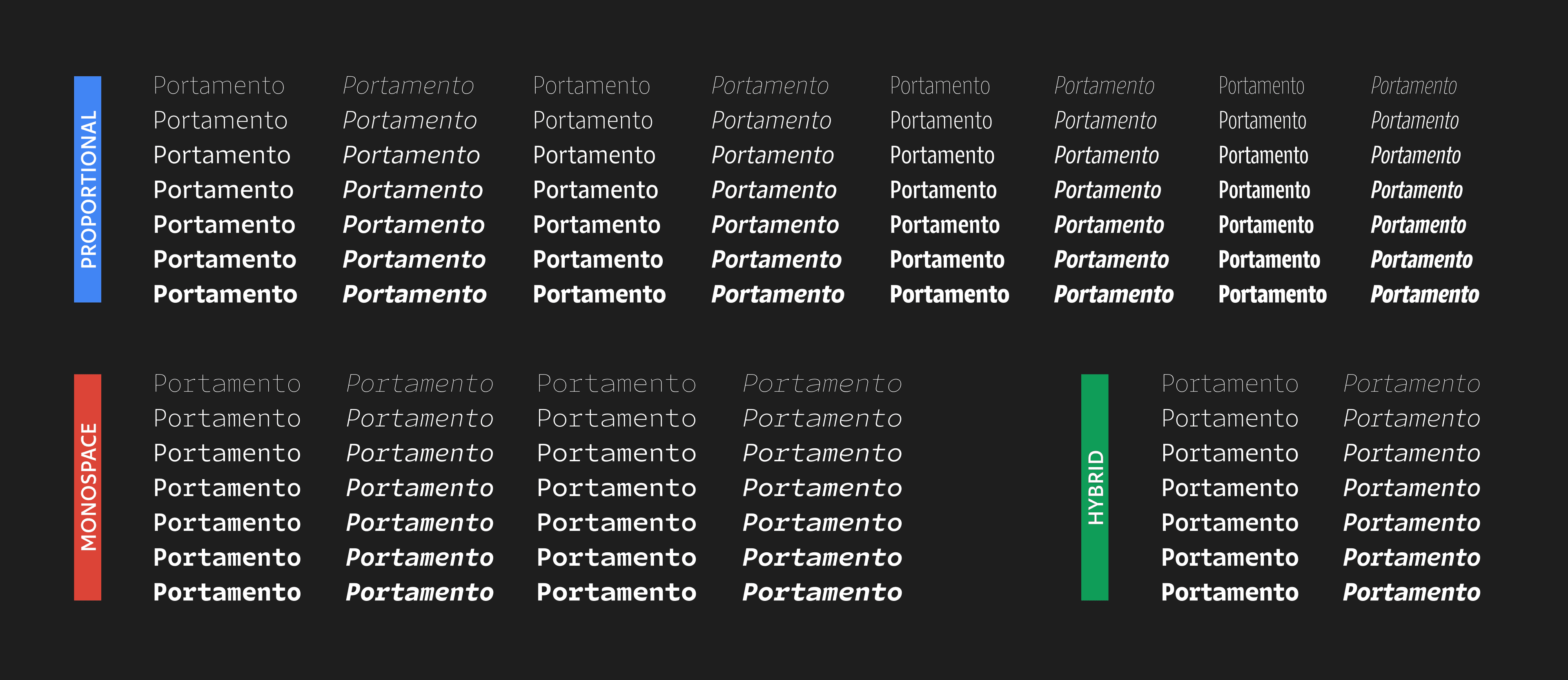
FIG. 16 — Comparison of Portamento’s subfamilies in body copy.
I always eagerly anticipate the moment in this process when I bring the design to my colleagues at Lettermatic, and ask for their help in turning it into a completed type family, because it means I’m about to see the fonts mature and gain features day by day. Danelle Cheney audited all my drawings, carefully adjusting the symbols and punctuation to make them sing both in code and in proportional headlines. As she improved the proportional fonts, the Mono and Hybrid subfamilies gained those benefits, as her work was translated through the lens of this software I had written. She added symbols that would be useful to folks who write code, and created punctuation that would feel sufficiently bold and clear to read in the monospace fonts, where telling a comma from a period is of the upmost importance.

FIG. 17 — Portamento’s symbols designed for use in code.
Dave Bailey, who had worked on early prototypes of Portamento with me, did a first pass on language support. Heather Cran later picked up that work, and set up Portamento to speak in over 150 languages, as most of our typeface projects do at Lettermatic. This meant we had to plan not only for how diacritic glyphs would be designed and incorporated in the proportional fonts, but also how they translated to the Mono and Hybrid sub-families.

FIG. 18 — Portamento supports over 150 languages.
Portamento has a wide variety of numbers. This way, if teams at Google are writing code demonstrating a mathematical equation, sending an event invite, or even (at some future date, for some future reason) displaying a chemistry formula, Portamento has the right numbers to get the job done. We even included enclosed figures, with fill and outline versions, which change in width as the fonts do. The Portamento fonts were also delivered in variable font format, so that their width and weight can be finely adjusted to suit the needs of a particular reader, for instance.

FIG. 19 — Portamento has a wide variety of number sets for every use.
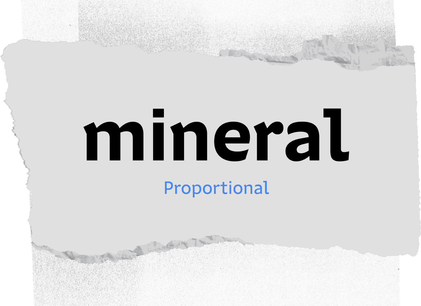
I chose the name Portamento for this type family: a term from music, that means ‘a slide between two notes, which contains all the notes in-between’. Portamento is a family that has narrow fonts, wide fonts, and everything in between (including harmonized monospace fonts, each cooperating like the notes of a chord). The first subfamily is simply called Portamento, a proportional typeface which comes in a range of weights and widths. Many voices can be found within this subfamily, from narrow bold headlines, to airy hairline caps. This piece of the puzzle, in itself, is a sprawling set of tools which could be leveraged by designers at Google when they need to do some longform typesetting, or simply when they need to typeset something that is not code. For instance, I imagined: what if you’re typesetting documentation for a javascript library, and you’d like to give people a couple paragraphs of explanatory text that is easy on the eyes, and pleasant to read through?

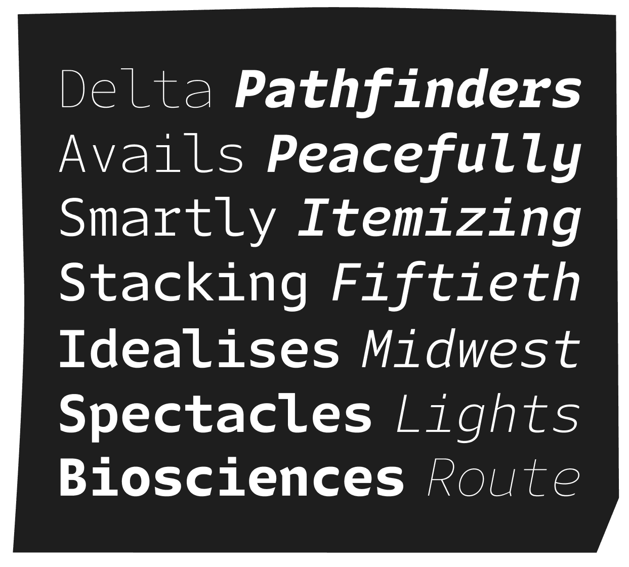
FIG. 20 — Comparison of Portamento’s monospace fonts Roman (left) and Italic (right).
Then perhaps designers would like to typeset a code example, to show an audience on screen at an event like DevFest, or on their website when providing a tutorial? In that setting, the talented team at Google Developers can reach for Portamento Mono, which works nicely in a code editor, and provides code typesetting that feels precisely as familiar as we expect code to be. You can even switch the styles in the context of a single sentence, and see perfect harmonization between the proportional and mono fonts because they are all engineered to work together.

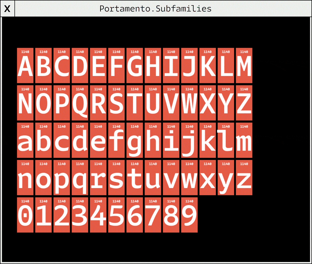
FIG. 21 — Comparison of Portamento’s subfamilies of Mono (Red), Hybrid (Green), and Proportional (Blue).
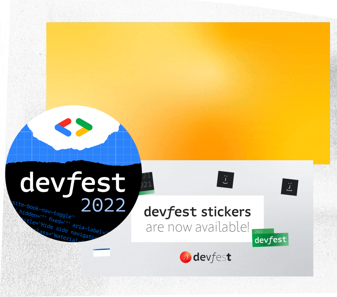
Then, when the goal is to convey the look of code, without needing literal code, Portamento Hybrid is particularly useful. It’s been implemented in the identity for DevFest 2021 and 2022, and has been used in the supporting materials like on-screen graphics, animations for social platforms, and more. Through all these various uses, we’ve seen Portamento in the palm of our hands and 25 feet wide on a projected screen at an event.


FIG. 22 — Portamento in use for DevFest 2022 and OpenXLA.
I am very excited to see what Google Developers does next with Portamento, a custom typeface exclusive to their use, made with their broad set of uses in mind. We are toolmakers at Lettermatic, and this project involved making tools to make tools. I had an absolutely wonderful time working on this project, and I am very pleased that the underlaying ideas worked so readily here, to create a typeface whose design process is very likely unique in the history of typeface design. I enjoyed collaborating with my computer on this project, just as I enjoyed collaborating with Dave Bailey, Danelle Cheney, Heather Cran, and Anna Thomas, who helped to assemble all the details of this project into the final font files.
Thank you for reading! To keep up with Google Developers and join their thriving community, consider following them on instagram. You just might see a future use of the Portamento fonts, too.