custom fonts for


A LETTERMATIC CASE STUDY: MADE TO PERFORM
By Riley Cran


In 2016 I started having long conversations with Travis McCleery, who had joined a company named Root Insurance as their Chief Creative Officer. They were at a point where it was becoming a priority to choose typography for their brand, as well as the mobile app product that the brand represents. Travis and I spoke for hours about what a custom typeface could lend to a project like this one, and with each call I became more and more intrigued by what a big brief this was.
The type was to be used both in the marketing of a product, and in the product itself. On the web. On a portrait orientation screen that sits in the palm of a user’s hand. On a billboard. In an email. On the side of a bus. The uses varied greatly, and within three months of the fonts being delivered I am proud to say they have already been used in nearly all of these capacities.
Information
- Design:Riley Cran Version:2.0Released:10.17.17Direction:Travis McCleeryProduction:Danelle Cheney, Dan Gneiding№ of typefaces:2№ of fonts:56Lang. Support:Dave Bailey, Heather CranNo. of widths:3Classification:Humanist Sans + Serif
Mobile app typesetting is still in its infancy, when compared to the broader spectrum of typesetting historically. We’ve really only been designing for these narrow, portrait orientation screens for 15 years or so, and in that time a lot of trends and expectations have emerged. For comparison, humans have been typesetting novels for 250-300 years. Travis and I spoke at length about what typeface(s) a company in Root Insurance’s position would be expected to use, had they not been commissioning a custom one. It was an interesting place to begin the discussion, because it highlighted the narrow pool of typefaces that mobile apps often use at this point in time, and how we might do something different for Root Insurance.
A vast majority of mobile applications are set in one of a small handful of typefaces. Often these are ‘default’ typefaces provided by the operating system (Apple’s San Francisco and Google’s Roboto, for instance), and nearly all of them fall into one of two categories — geometric sans and grotesque. These typeface genres are not going anywhere anytime soon, they’re all around us in our daily lives, and we’ve begun reading type from these genres all day on our mobile devices. Geometric letters often have a feeling of friendliness and charm to them, and grotesque letters (I’m thinking of typefaces like Helvetica or Akzidenz) radiate a feeling of calm, stoic cleanliness.
But they’re not without their quirks and functional limitations. And in this case it seemed to me that a third major genre of sans serif — humanist sans serif— might have more aptitude for success in the case of Root Insurance’s typesetting.
My instinct at the outset of the process was to take some influence from typefaces of the past that were made to survive in less-than-ideal conditions (like small point sizes in print, or wayfinding signage at a distance). If I could isolate any shared themes or approaches to those designs, I thought perhaps I could translate that influence to something new, and prepare this new typeface for a wide range of possible uses. I wanted to future-proof this typeface as best as I could, so that Root Insurance didn’t need to be searching for new letters in a matter of months or years.
When visiting an airport, you’ll often find humanist sans type anchoring the wayfinding signage. This is largely due to the influence of the genius Adrian Frutiger (1928–2015), whose Roissy typeface for French airports eventually became his eponymous Frutiger typeface. Humanist sans serifs are often characterized by open terminations that allow counter forms to breathe.


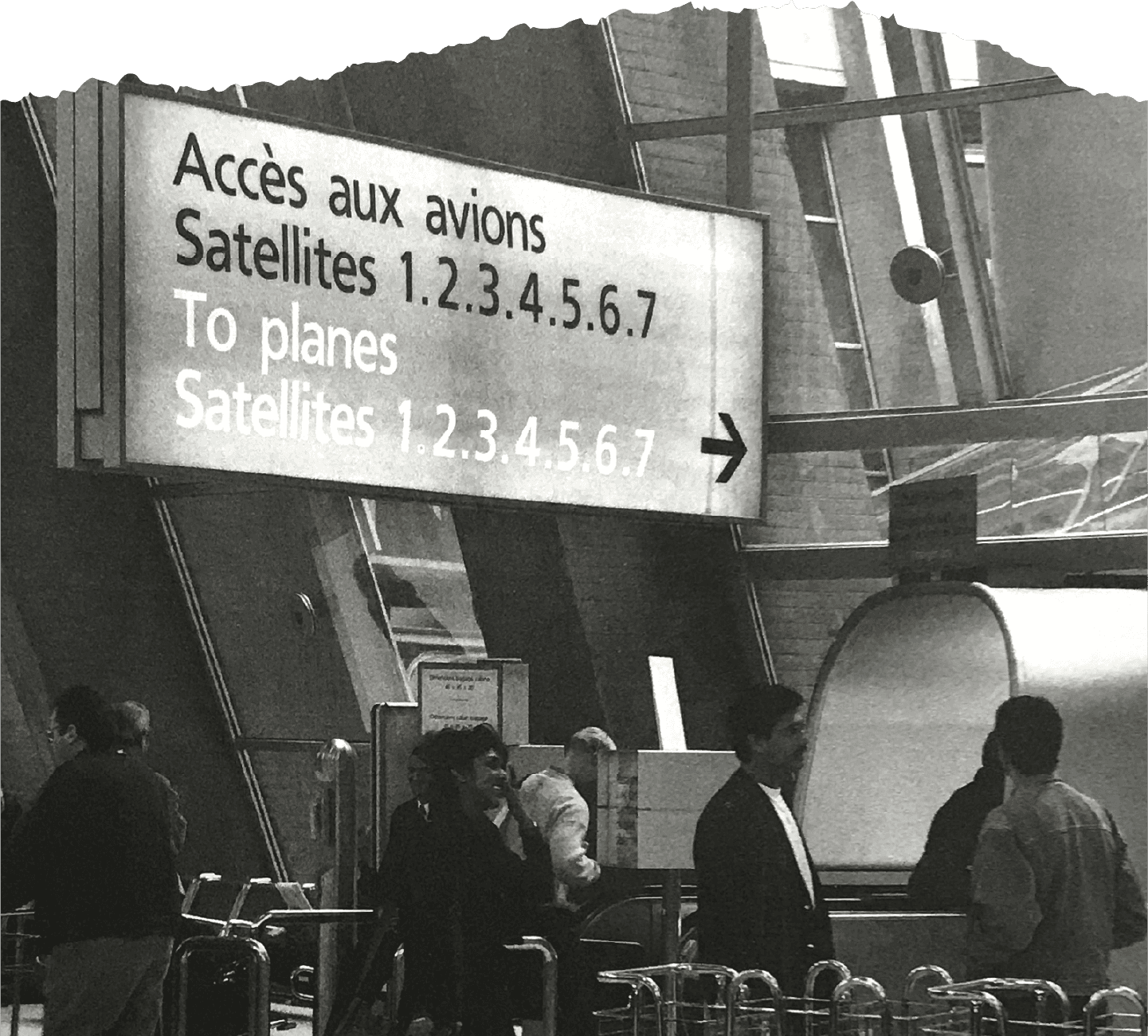
FIG. 1 — Adrian Frutiger’s typeface Roissy in-use at the French airport Roissy-Charles-de-Gaulle north of Paris. From Adrian Frutiger – Typefaces: The Complete Works by Heidrun Osterer and Philipp Stamm. Photo by Erich Alb.
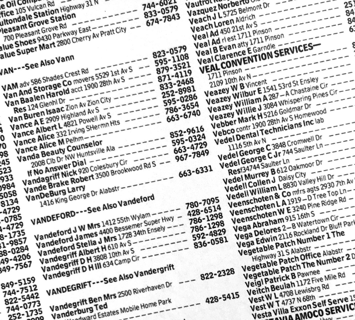
FIG. 2 — Bell Centennial by Matthew Carter in-use. Specimen from The Visual History of Type by Paul McNeil.
As a result, the individual character identities are preserved when viewing type from a distance. Racing through an airport with luggage in tow is a great example of a moment where raw function in typography is necessary. No one should think of what type they are reading — instead they should feel the signs are helping them to get where they are going. I liked this idea, and I thought quite a bit about the concept that humanist sans letters reproduced at a large point size on a sign 40 feet away are somewhat similar to small point size letters on a mobile phone a few feet away from your face.

I also thought about one of my all time favourite typeface designs, Matthew Carter’s Bell Centennial. Matthew and Adrian were good friends, and they both have careers full of letters drawn to do something difficult, very successfully. Tasked with drawing a new typeface for use in the Bell System phone books, Matthew faced a tough challenge. Their corporate typeface was Helvetica, a grotesque with closed terminations, and part of the brief was to make his resulting typeface somehow related to Helvetica, while still being legible at very small point size on cheaply printed newsprint. Matthew’s resulting design was painstakingly drawn pixel by pixel for 1980s cathode ray tube photographic typesetting.
These letters held up much better in the poorly printed, unusually small point sizes of the phone book. Amongst the choices he made for his new type was the choice to open up the terminations and let the counter forms breathe, which is a specific departure from their identity typeface, Helvetica.
Although both of these historical typefaces were made for entirely different (and quite specific) uses, they shared a genre. And they shared an ability to hold up better in worse conditions. They seemed more prepared, from the outset, to deal with lots of potential uses, like an athlete that is universally in good shape. It seemed to me that a humanist sans was the way to go for Root Insurance.
One thing I really admire about Travis is his willingness to discuss the true scope of a design process’s potential. We set up the scope of work knowing that a sans serif was a mandatory contribution to this family. We also decided there would be a second harmonizing family of type to accompany the sans, without specifically deciding at the outset what genre of type that would need to be. As such, the early explorations allowed me time to test the addition of both a matching serif typeface, and narrower widths of the sans design, to see which might be the most suitable companion to the sans.
During the initial phone calls, and solidified during the exploration phase, was an idea surrounding trustability. A modern consumer with a mobile device has a variety of apps installed, each potentially focusing on a different aspect of their life. Some apps help them casually stay in touch with friends and family. Some allow them to read the latest top stories. Some are full of memes and jokes.
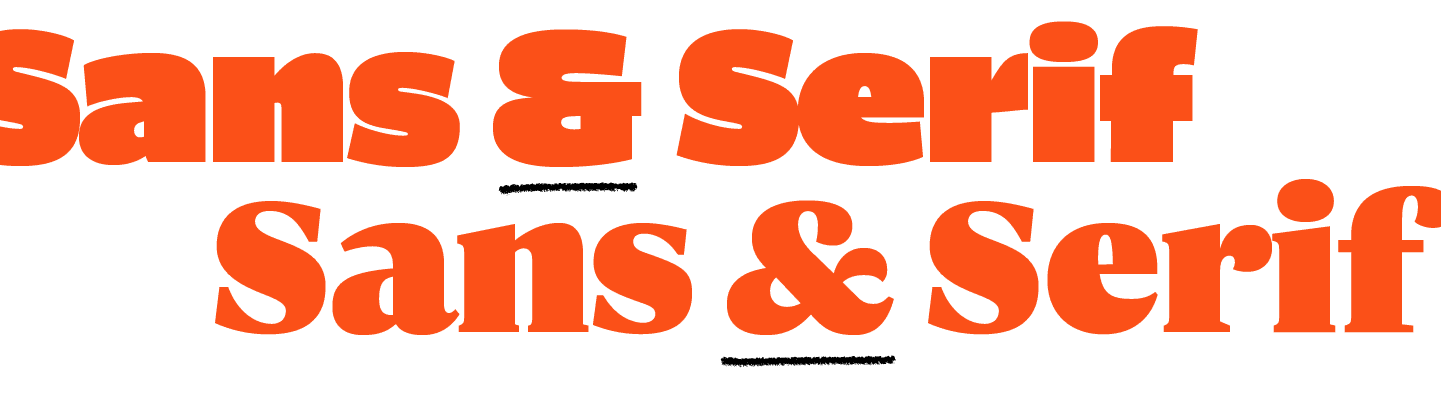
All often use the same typefaces to communicate. Root Insurance was adding one that helps you get a better rate on car insurance, a process that is typically quite formal. It occurred to Travis and I from the start that there was a branding opportunity simply in giving Root Insurance it’s own typographic tone of voice. Because Root’s content also involves editorial articles made to educate consumers, it occurred to us that a companion Serif design would help add a formal voice as well.
Including both a sans and serif was also a good way to avoid aesthetic trends that made one or the other feel less ‘relevant’ at any particular moment in time. Graphic designers often voice a feeling that the aesthetic pendulum has swung between the use of sans and serif typography over the past 100 years, and chances are it will continue to do so.
I drew Root Sans and Root Serif in parallel with each other, rather than in sequence. This allowed both designs to influence each other, and allowed me to fine tune them throughout the process to harmonize them more successfully.
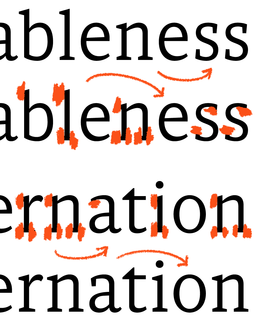
FIG. 3 — Early drawing explorations for Root Sans and Serif, which were drawn in parallel with each other, rather than in sequence.


FIG. 4 — Early drawing explorations for Root Sans and Serif, which were drawn in parallel with each other, rather than in sequence.
One of my first steps in the process, after I had letters that could form sample sentences, was to proof the type on my iPhone screen, in the palm of my hand. Through these tests, I arrived at a slightly narrow proportion for Root Sans, which helps to give the typeface better ‘economy’ in narrow columns. This allows Root Insurance to fit more letters onto a line, and consequently allows a user to read more with less scrolling. Although it made most logical sense to begin the sketches with a ‘regular’ weight, simply because that part of the family will likely be used most often, I also started to think about what the extremes of weight might feel like. I wanted to avoid building a family that was on the ‘bland’ side of functional, and instead build a typeface for Root Insurance that included fonts designed primarily to provide eye-catching charm, in addition to the ‘workhorse’ styles for running text.
Furthermore, I wanted the family to relate quite linearly, meaning I’d have to find a way to evolve the DNA of the ‘regular’ style to provide that kind of display potential. And in this pursuit my instinct was to crank the weight of the boldest style up to the point where it becomes charmingly outrageous. There’s something unusual about seeing truly ultra bold letters. Historically, type founders were too afraid to cut letters at the true extremes of weight, simply because they will inevitably be used less often. It was probably hard to imagine selling thousands of pounds of ultra bold sans serif metal type in the 1950s. But today’s digital tools give us the freedom to design what we like, and carefully choose how the resulting fonts are used. I knew the talented team at Root Insurance was more than capable of using unusually bold fonts in the right moments, to draw the viewer’s eye. The day that I sent in my first samples of these ultra-bold letters, the design team sent back advertising mockups already putting them to use. It was quickly added as a must-have for the sans family.

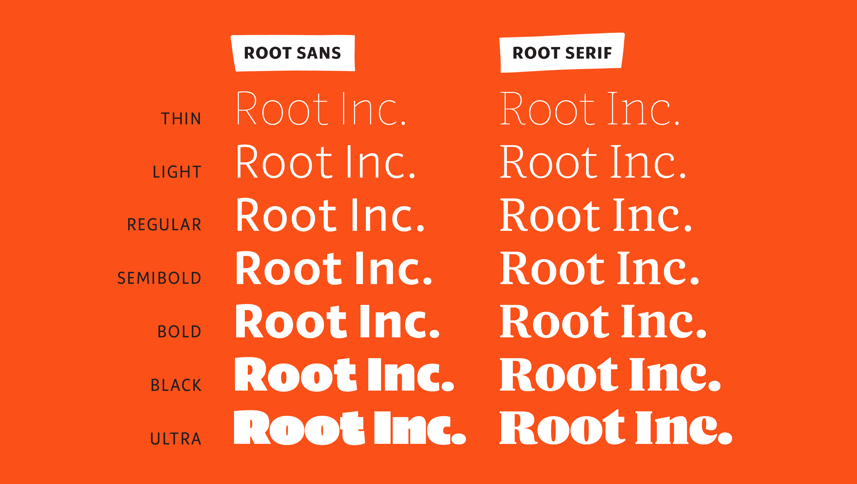
FIG. 5 — Root Sans & Root Serif Roman Family Chart. You'll see there's the same amount of weights in each family, so there's a companion style for every weight.


The serif design began to find its own footing as well, becoming less like a slab (as it had been in earlier iterations), and gaining contrast. The higher contrast serif design provided a nice harmony to the low contrast sans design, and the similarities in their skeleton ensured a fundamental relation between them. I incorporated more organic termination shapes, departing from the brute slab terminations and adding things like the ‘hook’ shape found in the ‘c’, ‘f’ and ‘r.’ In a sense, it was time to move the serif design further away from the sans, to ensure they were two voices in a choir, instead of two voices holding the same unwavering note.
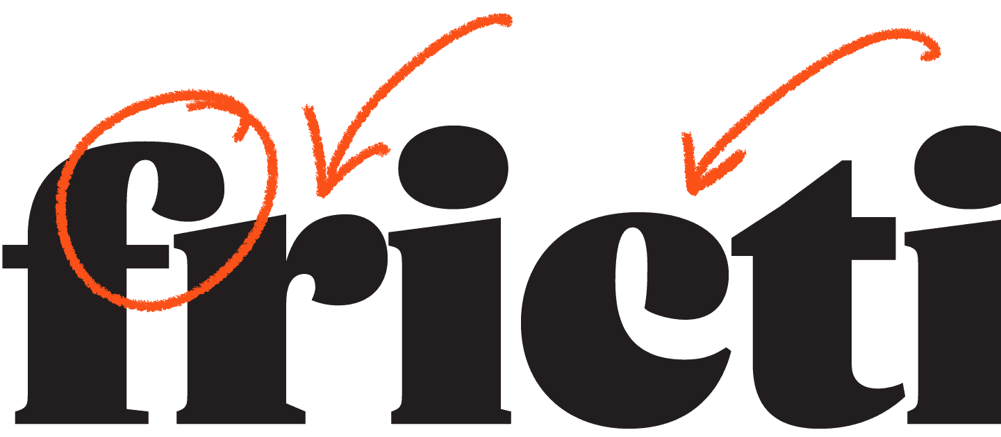
FIG. 6 — Root Serif 11 Black Organic terminations: the ‘hook’ termination repeats across several forms.
Serif designs have a lot more metaphorical clay to mould. You have parameters such as serif length, serif shape, bracketing of the serifs, etc., that are not at your disposal in a sans serif design. Both Root Sans and Root Serif take subtle calligraphic influence from the broad-edged pen, and I gave the serif design asymmetrical bracketing of the serifs, to subtly suggest the motion of a pen. This small detail can subtly add a sense of motion to the reading rhythm, and it works as a display detail at larger sizes as well.
It occurred to me that the serif design, too, could scale to an extreme of weight. The results were reminiscent of display type of the 1970s; tightly spaced and heavy in weight, creating dense words that felt at home in advertising headlines. When designing type for a client, I really enjoy the opportunity to add a font to a family which feels like it will be useful in the future, even if its not earmarked for immediate use. Working with the designers at Root Insurance meant they began to sculpt the brand expression around their new fonts—it doesn’t get any better than that.
Designing latin type has a certain way of pointing out exactly how disparate the traditions of capital and lowercase letters are. We think of them as being inextricable today, but they come from vastly different historical backgrounds, and they were not designed together. It would be more accurate to say they merged over time, and typeface designers look for ways to make these differing groups of letters work together harmoniously. I carried the asymmetrical bracketing through to the capital letters, as a way of relating the caps and lowercase. This produced some moments that I’m very fond of, such as the capital ‘R’, which shows the juxtaposition nicely: round things and sharp things, working together.
FIG. 7 — JUXTAPOSITION
Root serif has both sharp things (circled)...
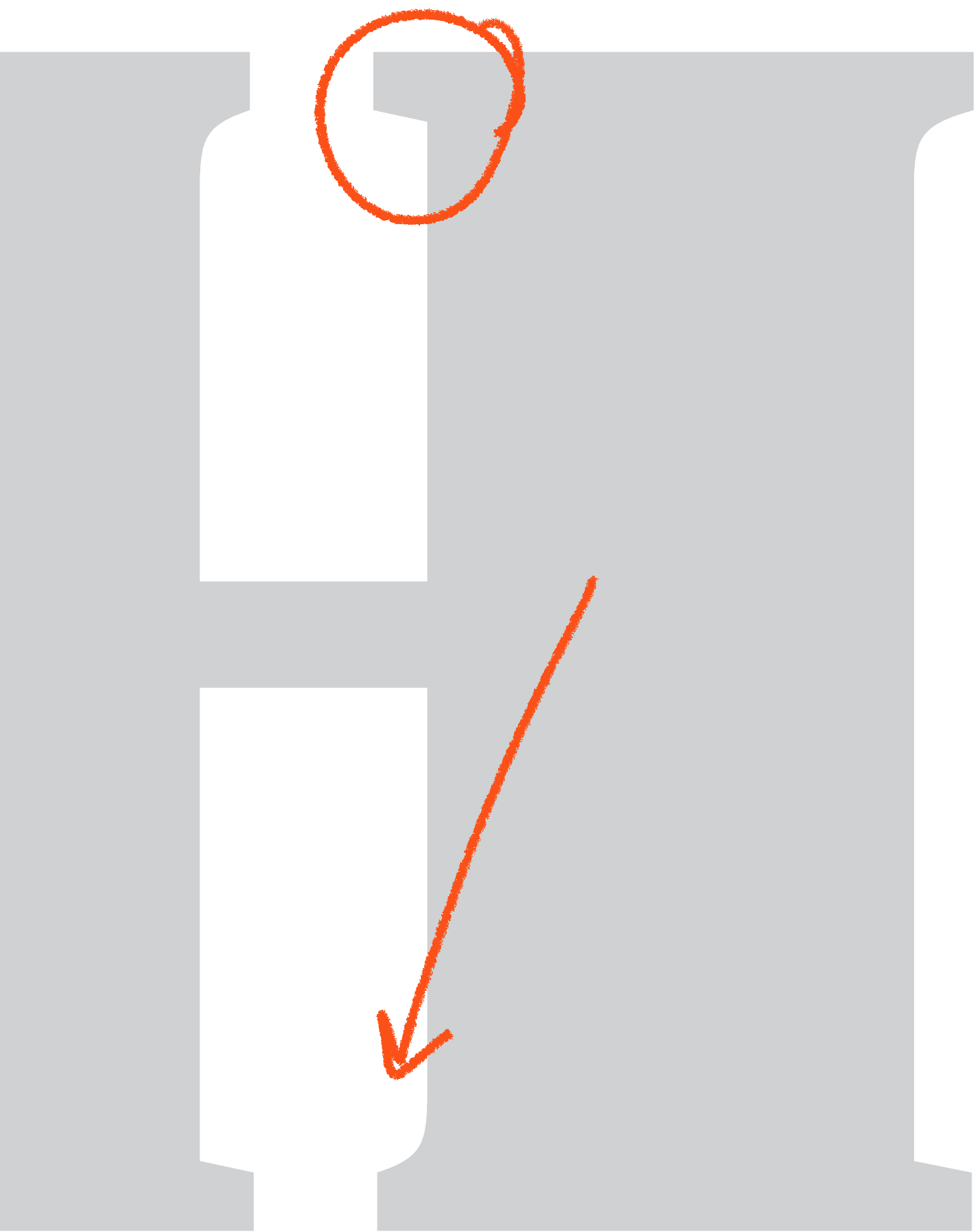
... And round things (arrow).

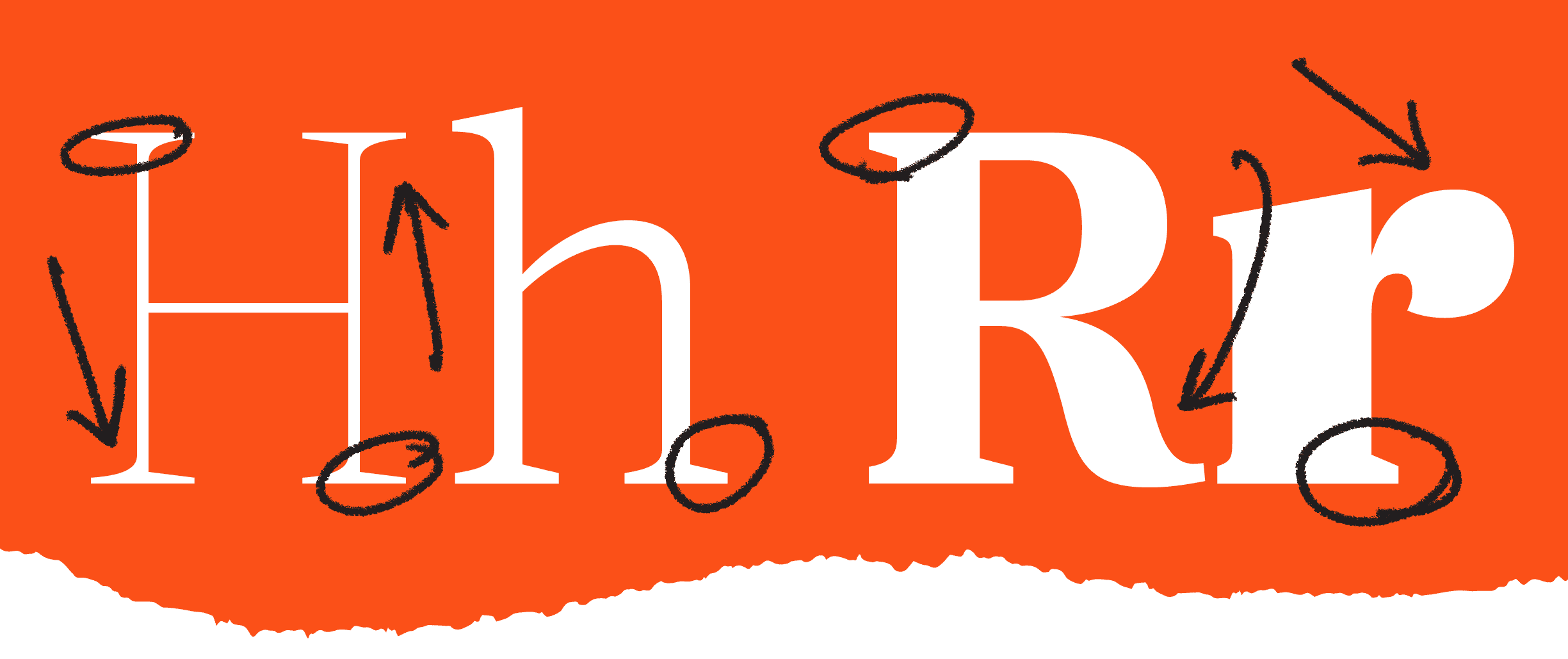
FIG. 8 — Sharp things (circled) and round things (arrows) in Root Serif.
Despite their harmony, and in some cases quite literal similarities, Root Sans and Root Serif also have some qualities that are purposefully very different from each other. A good example of this would be the ampersand drawings, where the overall construction of the ampersands are nothing like each other.
Instead they suit their six individual sub-family, and provide differing voices. I liked the idea of a designer setting an invitation to a Root Insurance event with the classical feeling of the Serif ampersand, then setting a social media headline with the powerful, succinct ampersand found in Root Sans.

Another way in which they differ is the drawing of numbers. The lining figures in the two families (upon which the other groups of figures are based) share some qualities, but also have some very different moments, particularly as weight increases. The sans figures have the open terminations found elsewhere in the design, with constructions chosen to be familiar, and scale the range of weight comfortably.
The Serif figures gain the asymmetrical bracketing when relevant, and they make frequent use of the hook termination shape found in the ‘c’ and elsewhere in the serif lowercase. The choice to make the serif figures adhere more closely to the lowercase is also a way to disambiguate them from capital letters in context.
Additionally, the non-lining figures (intended to feel more texturally similar to the lowercase in running text), benefit from sharing the hook construction with the lowercase as well.

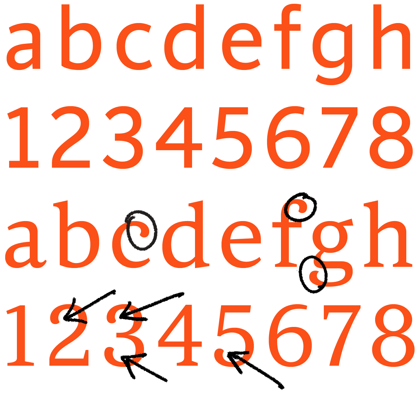
FIG. 9 — Root Serif alphabetic construction details (circled) emulated in the corresponding figures (arrows).
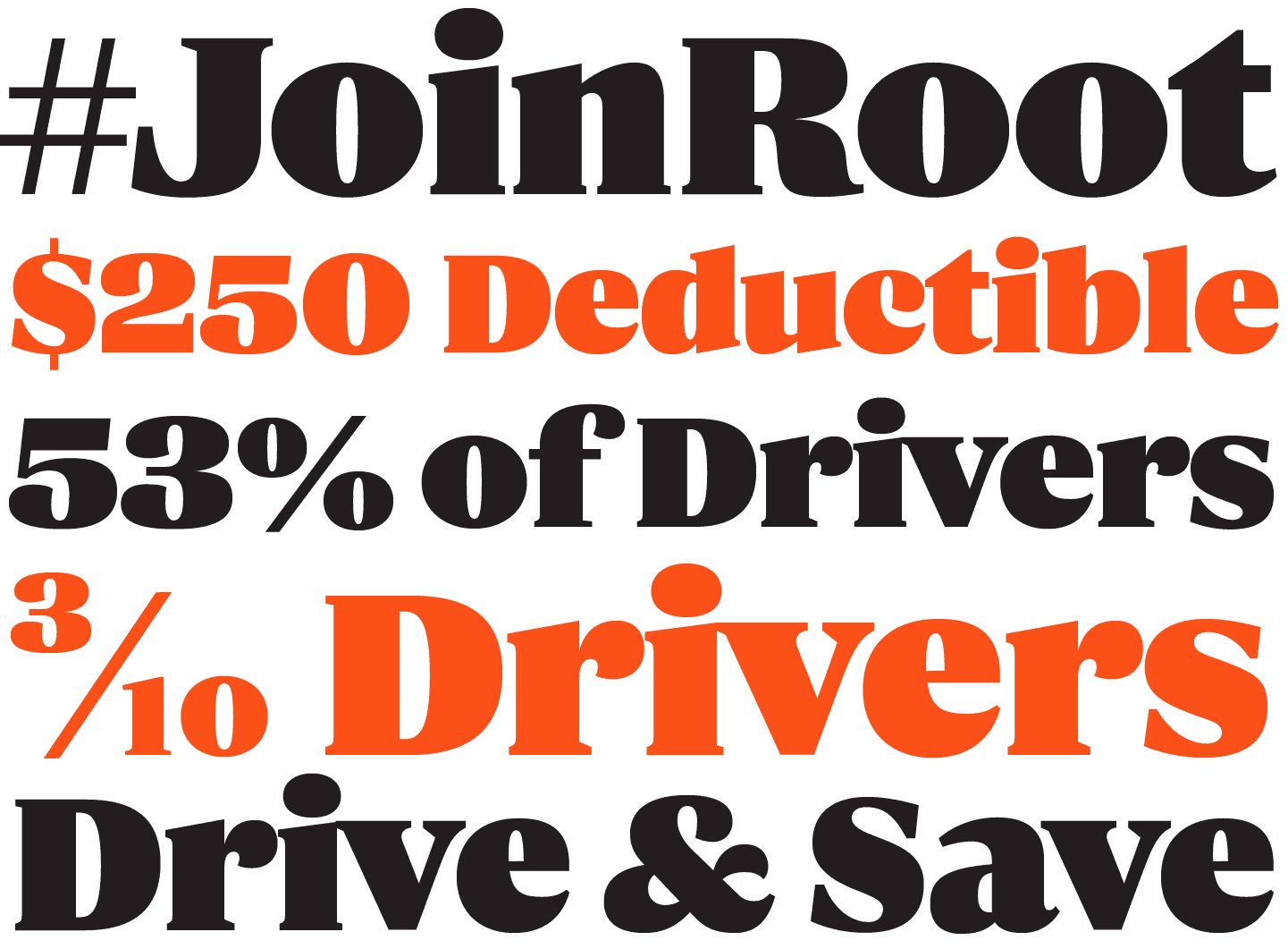
Just as the alphabetic designs had spanned a spectrum from function to character, the figure designs follow the same pattern. In running text, Root Sans and Serif regular weight figures feel comfortable and functional. But at the extremes of weight, their qualities are overdriven, allowing designers at Root Insurance to use powerful, impactful figures for dates, statistics, prices, percentages, and anything else they might need to refer to with some character.
During the process of exploring the serif design, we also experimented with widths of the sans design to see what kind of typographical hierarchy could be created by mixing the widths. Initially we had considered an either/or approach between the sans widths, and the serif design, but Travis and his colleagues liked everything and saw a potential use for each piece, so we elected to move forward with the entire scope.

I enlisted the help of Dan ‘Grayhood’ Gneiding to assist me in building out the character sets for these fonts, equipping them with all of the necessary bells and whistles. The fonts gained additions such as arbitrary fractions built from numerators and denominators, as well as superscript and subscript numbers. Who knows, maybe an insurance company has a reason to write exponential notation or … a chemistry formula?
I also enlisted the help of Dave Bailey to design the language support additions to these families. Each Root Sans and Root Serif font speaks over 100 languages, which will come in handy in a broad set of uses all the way from entering a non-English speaking market (should Root ever decide to do so), to hiring an Icelandic employee with a ‘thorn’ in their name. We also engineered a system of three widths for Root Sans so that they match in structure; a regular width, a narrow width, and a condensed width. Each width has its own italics, matching weights, and full language and numerical support, so a designer at Root Insurance will never find themselves reaching for a part of the family that is not there.
I also introduced a numbering system into the fonts so that they can be more easily referred to in guidelines documents, conversations between designers and developers, and other situations.
Each of the 56 fonts in the Root Sans & Serif family have a purpose. Some of these fonts are ‘anchors’ of their respective sub-families, intended for specific uses such as a paragraph of text on a mobile phone. The rest of the fonts build upon those anchors, pushing their qualities to the extreme with an eye towards the future, and the ways in which the brand might change over time. Trying to future-proof a typeface doesn’t always mean that many styles are required. But Travis’s willingness to trust me with building a larger system has meant that what most other teams would typically need several typefaces to accomplish, can all be found within this custom-built family of type that shares a typographic voice.
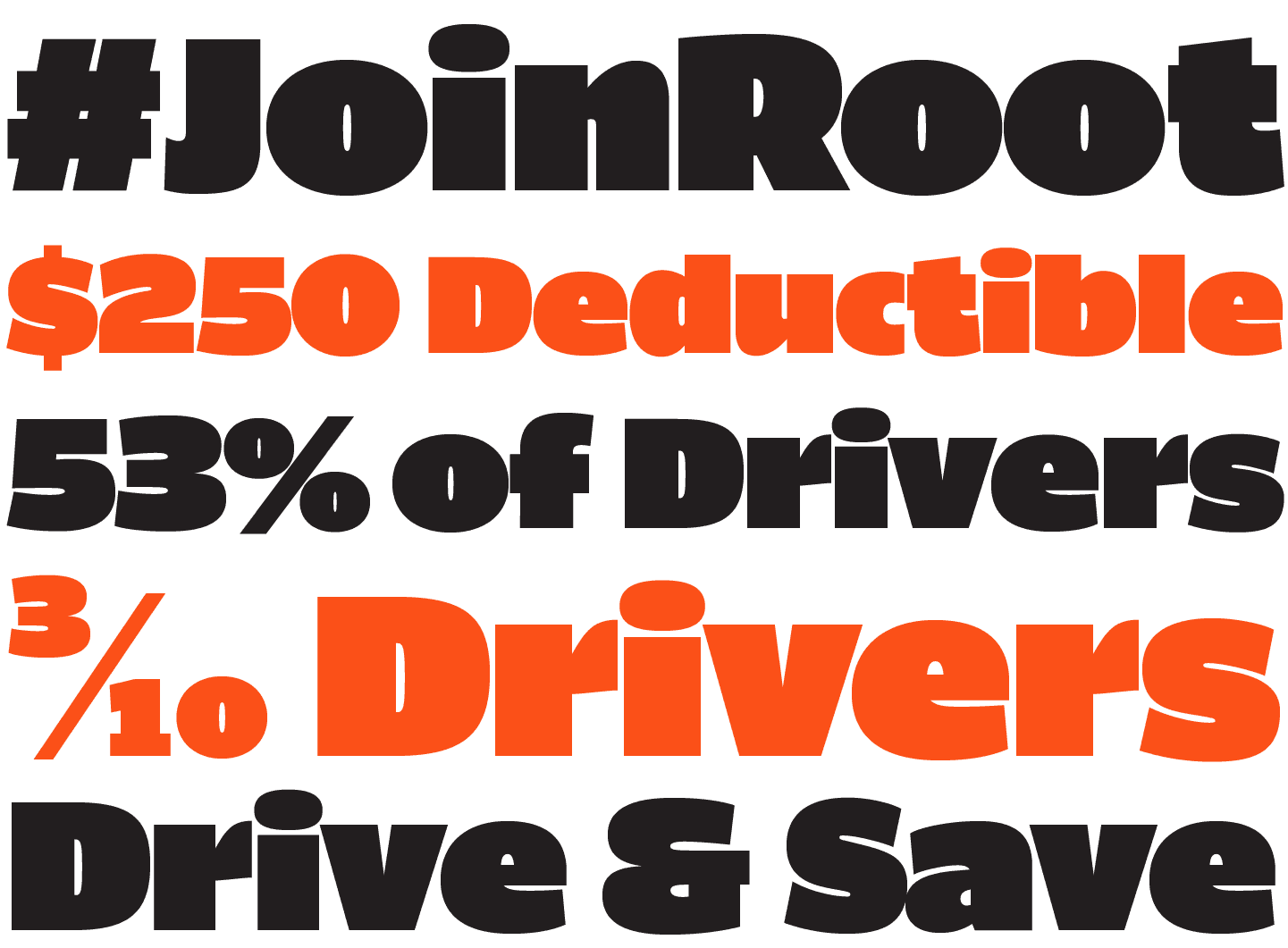
That thoroughness has already come to benefit Root, who have taken many of the 56 styles for a spin already in vehicle wraps, social media posts, statistical driving reports, clothing, stickers, and other uses. Even the glass windows of the meeting rooms in the Root Insurance offices are labelled with Root Serif figures. The type has become a focal point of the brand, and a user who interacts with Root has the opportunity to see the same typeface in literally all of their interactions with the company, from the advertisement that grabs their attention, through to the product interface itself. This is an opportunity provided to modern digital brands that has rarely been seen in the history of advertising and brand expression.
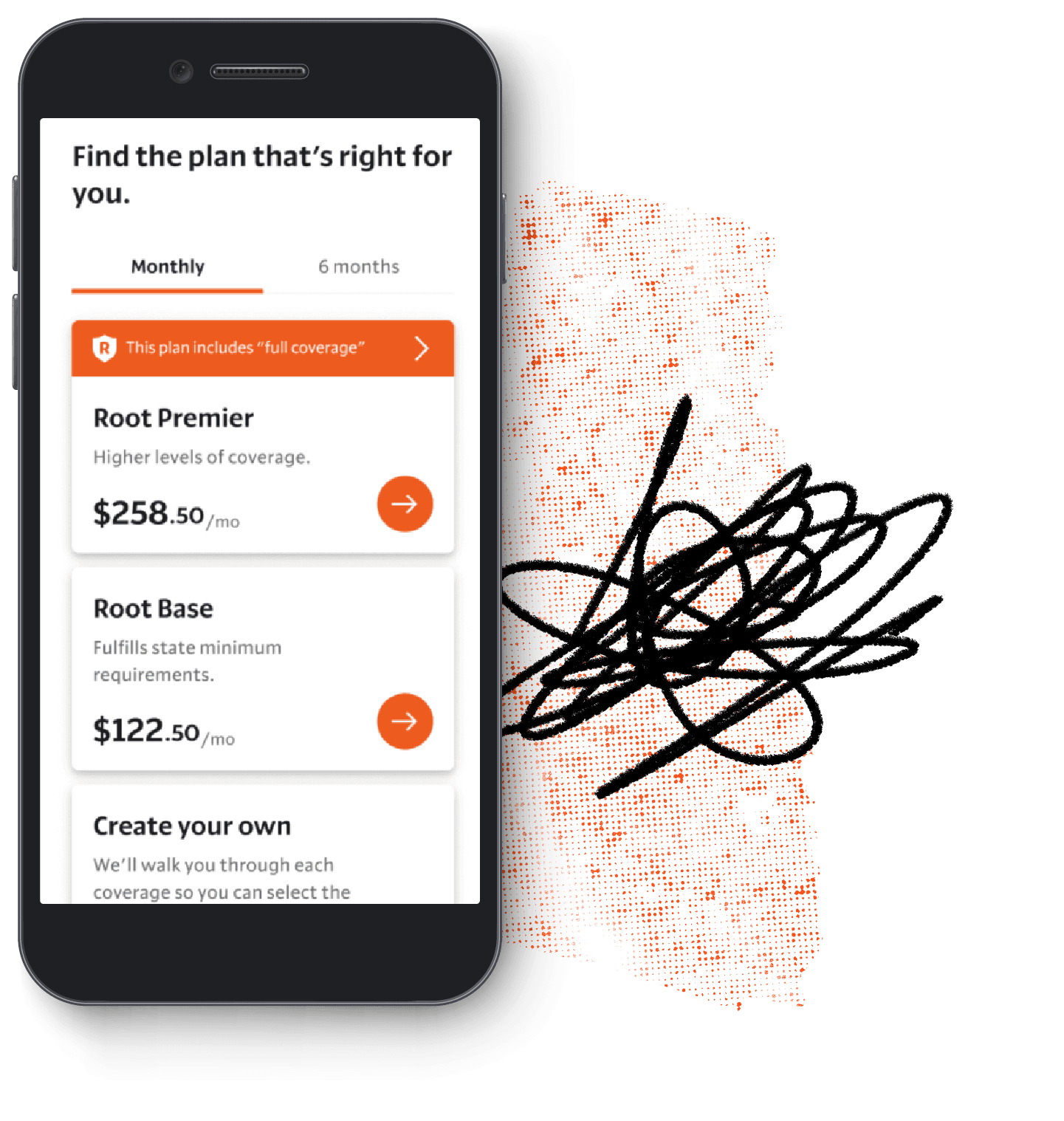
FIG. 10 — Root Sans in-use for onboarding new customers.
Design: Root Insurance

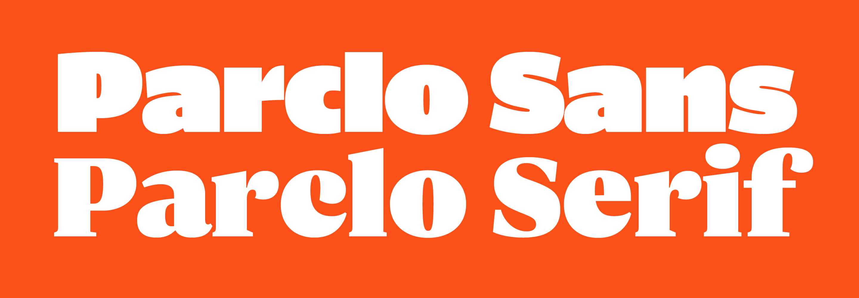
Parclo Sans & Serif
Eventually the Lettermatic team returned to these designs, to prepare them for distribution to designers around the world. We did so by returning to the details, reviewing our past work, and making a few additions and upgrades. In the process we gave the designs a new name: a 'Parclo' is a type of highway interchange, short for 'Partial Cloverleaf.' A nod to the automotive inspiration for the origin of these fonts, and perhaps the luck we had at being asked to work on them. Amongst the changes we made — we revisited the weight range in each design, adding Medium fonts (for a style that functions as a more dense text style), and ExtraBlack fonts for an extra step of control at the bolder end of the families.

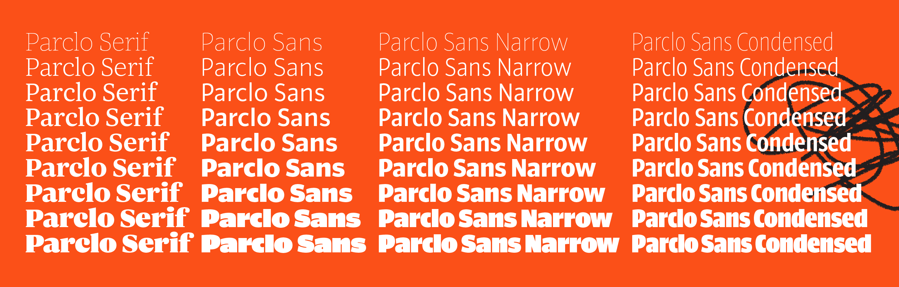
FIG. 11 — The full family of Parclo Serif and Parclo Sans.
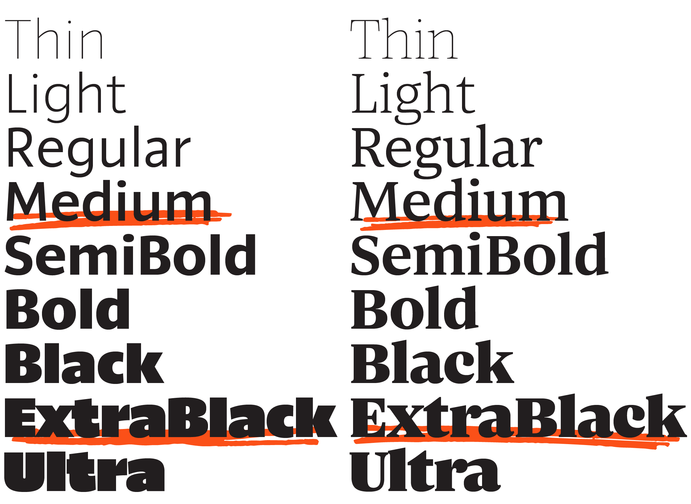
The Parclo Sans and Serif families have an equal number of weights, and every roman has an italic, so you can switch between the two families without missing a style. They also have equivalent character sets. These new fonts (72 of them between Parclo Sans and Serif) have a combined total of over 43,000 glyphs. Heather Cran reworked some of the language support details, and Danelle Cheney added many helpful features such as the enclosed figures and arrows; useful typographic features directly inspired by the field of wayfinding signage that inspired the project.
We are proud to introduce Parclo Sans and Serif, and we can't wait to see how you use these new fonts in your design work. We had an absolute blast working on this project, and we'd like to thank Travis McCleery and the team at Root Insurance, for the opportunity.

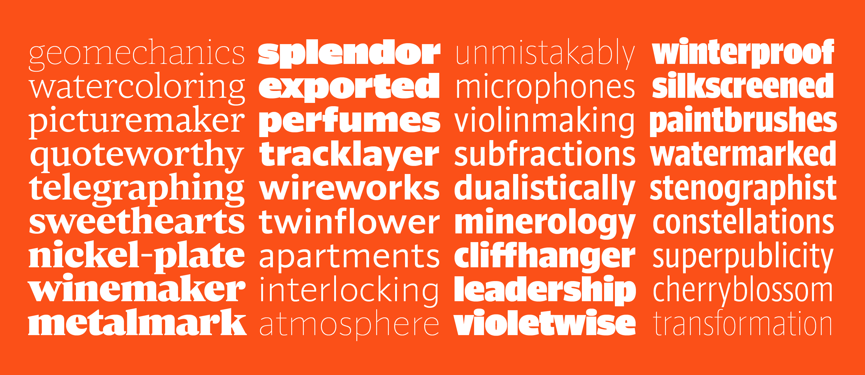
FIG. 12 — Parclo Sans and Serif.
Buckle Up
No matter the destination, Parclo Sans and Parclo Serif can help get you where you’re going.
We made this for you.